Fishink in Manchester. From Fashion to Fire station.
Hello everyone, welcome to Monday once again. I am seriously questioning where the week goes in between my blog postings. Am I just getting older or is time literally flying by these days lol ? Does anyone else feel the same ? I completed a commission piece for a client in the week…. this was the basic layout for it.

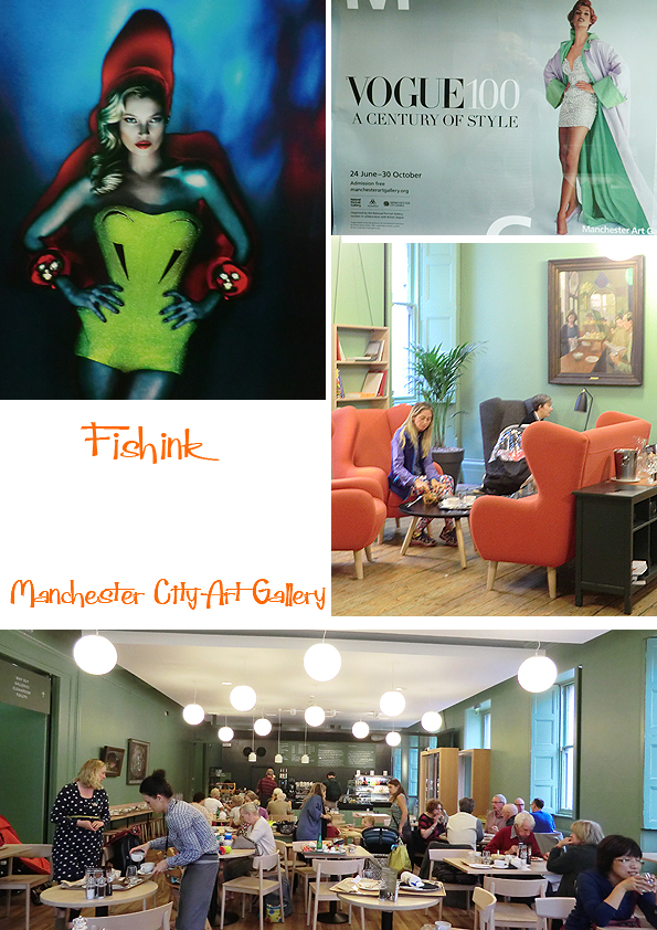
I had a chance to visit some exhibitions and places around Manchester over the last weekend, that I had been meaning to get to for quite some time. I seized the opportunity. First stop was Manchester Art Gallery and three exhibitions. The first was called ‘Fashion and Freedom’ and looked at the change in women’s fashion from pre-war to afterwards. Looking at how styles had altered and also some modern designers responses to a brief using Restriction & Release as a starting point.
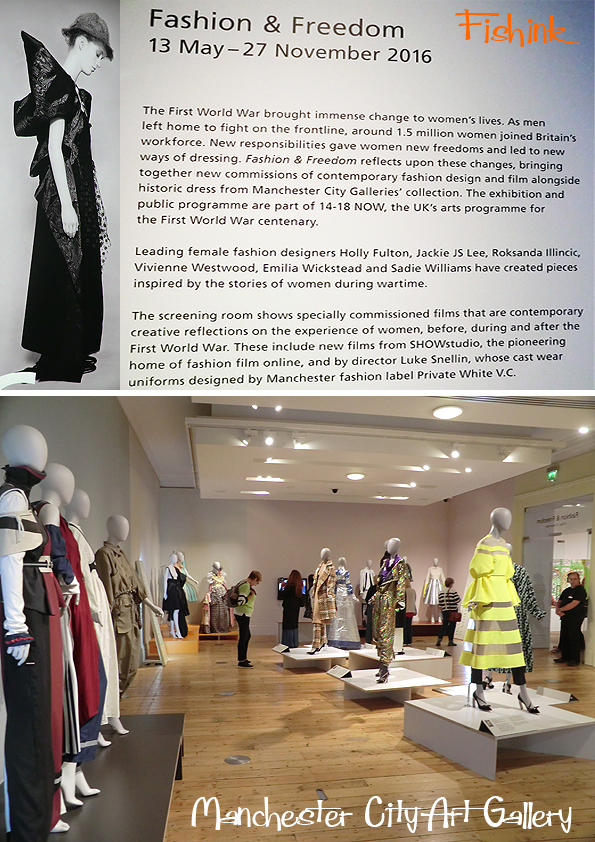
Some pretty bizarre outfits I must admit, but also some clever use of ideas in terms of restriction and freedom, like in these two outfits below, top left .

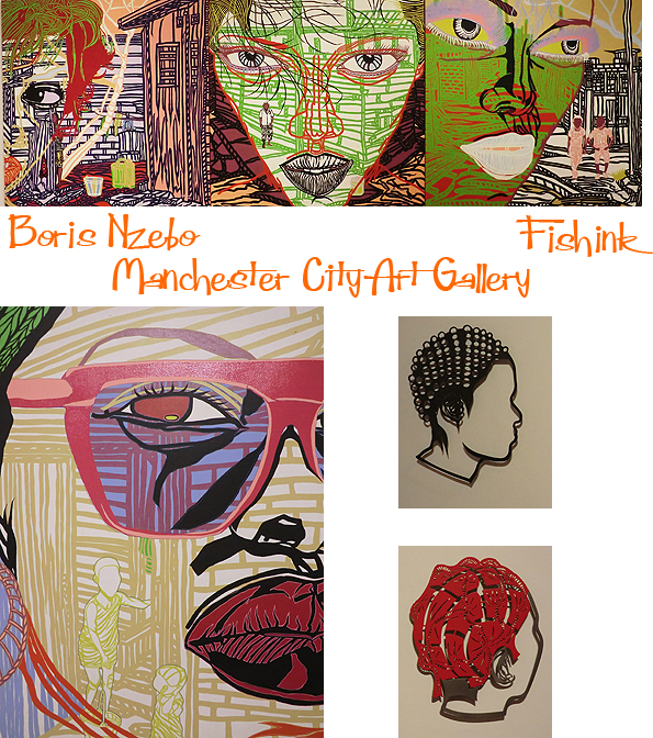
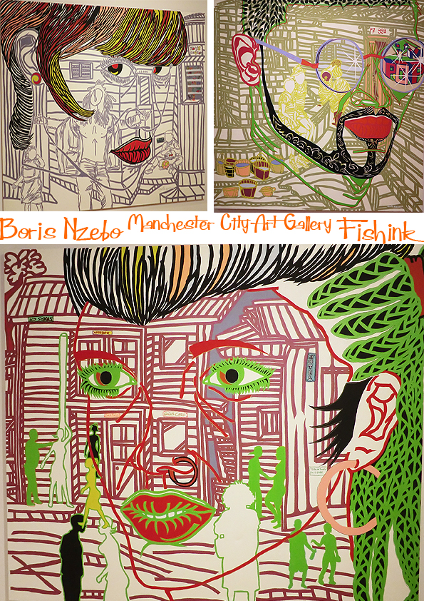
Boris Nzebo who was born in Gabon, central Africa in 1979, uses large canvasses to tell stories from daily life in the city of Douala, Cameroon, where he now resides. He explores themes of urban life and identity and uses bright colours, influenced by the posters he used to see in beauty/ hair parlours when he was small. Made me think of Bowie and Grayson Perry all at once.
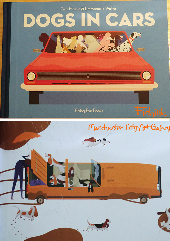
There is always a top collection of children’s books in the gallery bookshop to tempt one’s pocket.
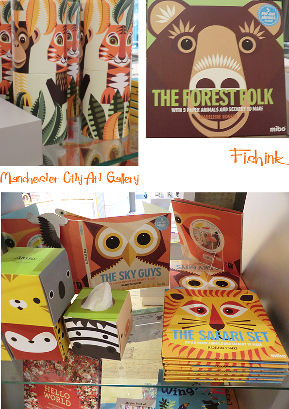
I wonder why this one caught my eye : )
The real ‘must see’, free exhibition is the 100 years of Vogue photos and covers, on show until October 30th. A fascinating social, photographic commentary on changing themes, styles and trends. Beautiful, captivating shots by the likes of Lee Miller, Horst, Bruce Weber, David Bailey and
And if you need a break, there’s always some great food and rest spaces to be found in the cafe, for when the art gets too much lol.
Worth popping in to see the Japanese Design exhibition too. I always admired the work of Comme des Garçons, Rei Kawakubo and Issey Miyake from my early days studying Fashion design at Ravensbourne.
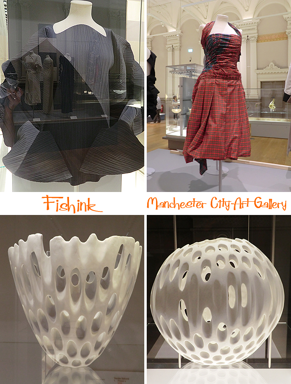

Intricate and stylish at the same time.

More clever folding and constructions.

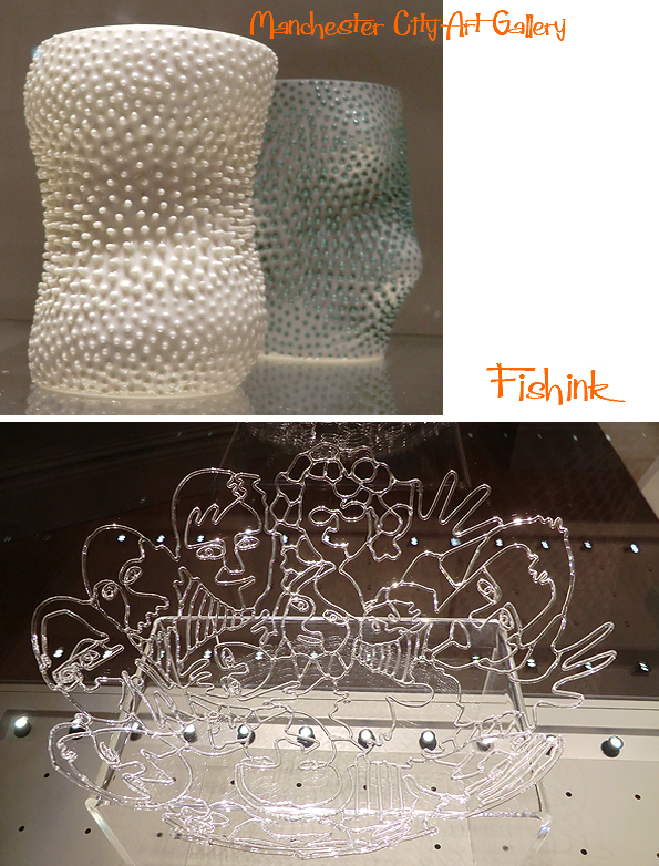
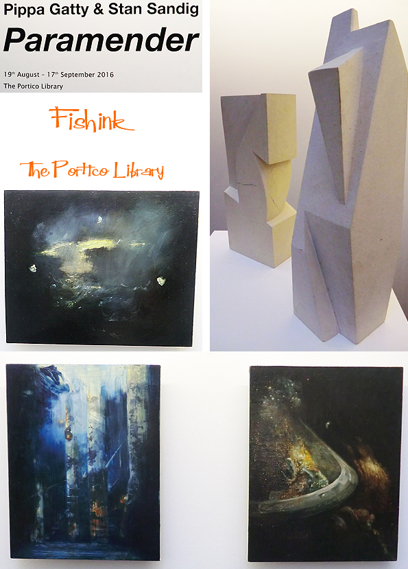
Further along the road from the Art Gallery is the hidden away Portico Gallery, with a collaborative exhibition between and artist and a sculptor. Even though it’s only a small space and tiny exhibition, the pieces did make an impression and created some intrigue by making you question their meaning, purpose and point of origin.
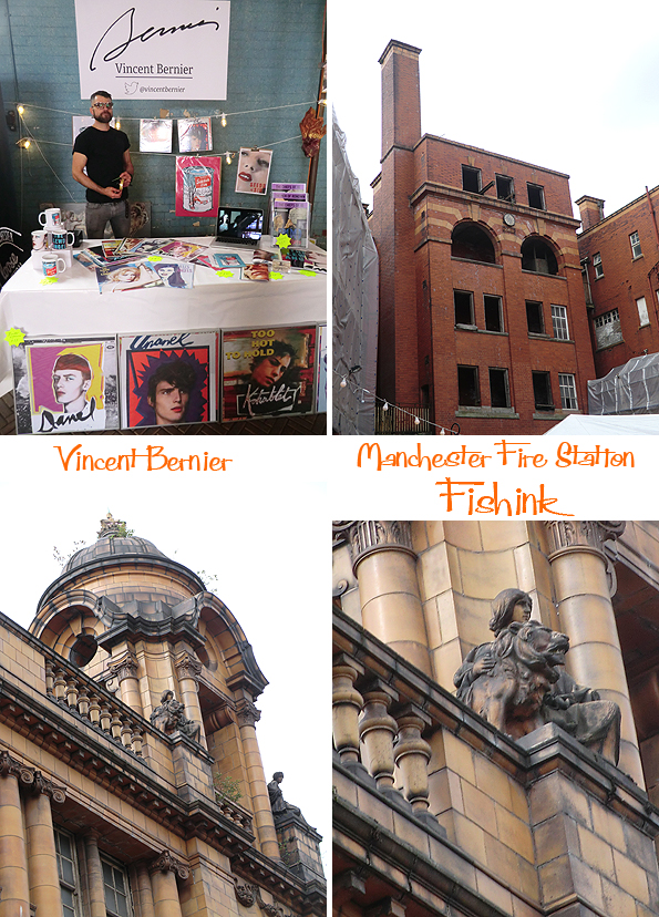
Finally on the Sunday there was a craft fair being held at the old Fire Station on London Road. A great opportunity to see, yet more art and also view the insides of this great space before it’s converted into a hotel and restaurant.

Whole communities used to live on site, in the dwelling spaces under where the billboards are in this photo below. Back in the days when the fire engines were just water carts, and the horse power to get to the fire, wasn’t an engine at all, but simply a horse ! What a wonderful space.

Some very interesting, quality designers and makers there.

Flying paper birds and pop art.
I just had to capture Joe& Co’s stand, as it looked fantastic against the peeling, painted blue of the engine shelter.

Something for everyone, food and live music too.


Good old Manchester, always plenty of new things to see, I forget how lucky I am to have it all on my doorstep. I must make an effort to go there more often : )
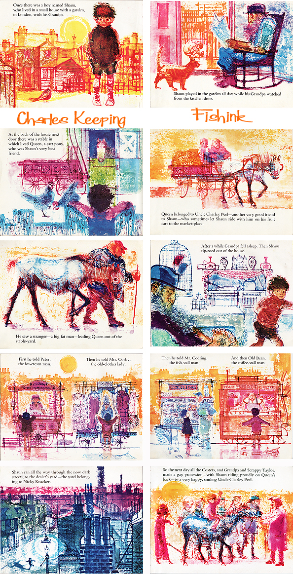
Charles Keeping Illustrating paintbox picture books
Charles Keeping (1924-1988) an illustrator and lithographer, produced dynamic and emotive images. Born in Lambeth, East London, his secure and happy upbringing had an unusually important effect in shaping both the man and the artist. Entering a working class family, there was no obvious route for Charles to get into art school. He spent his childhood in a house that overlooked an active stable yard, and became a frequent and accurate observer of horses and carts. He attended the Frank Bryant School for Boys, in Kennington, leaving at the age of 14 to become apprentice to a printer.


He joined the Royal Navy Army at the age of 18, and fought in the Second World War, serving as a wireless operator. He received a head wound which he became convinced would make him become a Jekyll and Hyde figure, but after being institutionalised, he recovered. Determined to pursue his love of drawing, he applied several times to study art at the Regent Street Polytechnic, but was unable to get a grant. He kept on applying, supporting himself by reading gas meters, and continuing drawing in the evenings. It was at the Regent Street Polytechnic (1946-52), where he met the designer and illustrator Renate Meyer, whom he later married. His books explore amazing roads into colour and texture, whilst dealing with solitary, often lonely figures in their tiny worlds.
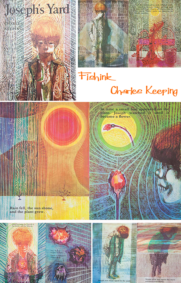

He took various jobs, including cartoonist on the Daily Herald, before starting work as a book illustrator. In 1956, he was commissioned by the Oxford University Press to illustrate stories for children written by Rosemary Sutcliffe, and with the encouragement of the doyenne of children’s book editors, Mabel George of OUP, was launched on a career which for three decades made him one of the best known and more prolific illustrators (1960-1980s). He made brilliant use of colour and the new printing techniques, using a mixture of gouache, tempera, watercolour and inks. He was an early enthusiast for Plasticowell, the grained plastic sheets designed by the printers, Cowells of Ipswich, for lithographic illustrations.
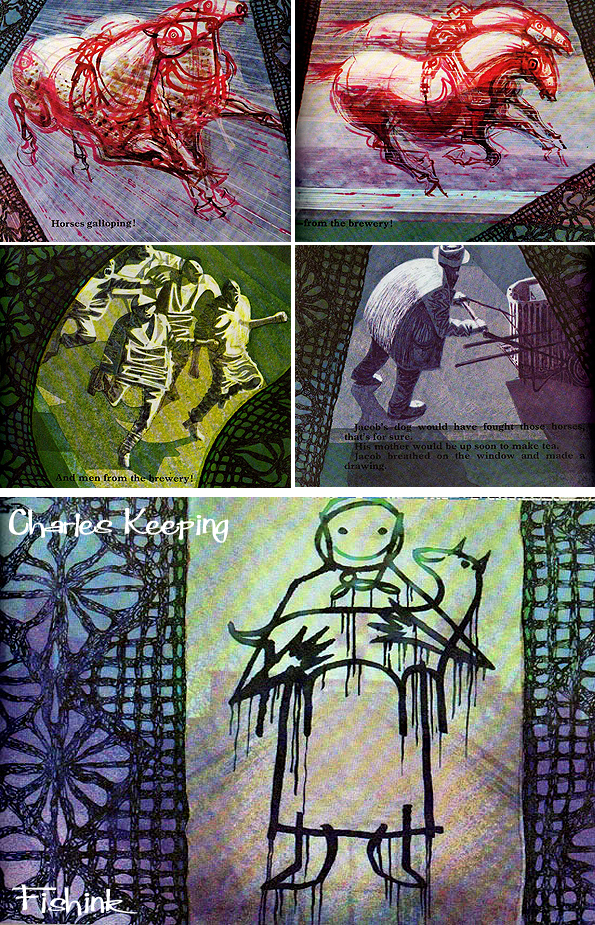
Charles Keeping was always concerned with the lot of the working horse: having been born in Lambeth, he was surrounded by them. He wrote two picture books, Black Dolly and Sean and the Carthorse about ill-treated working horses, and one Richard, about a working police horse whose treatment is always fair. Illustrating Black Beauty must have been something of a dream commission: he dedicated his version “to all those concerned with the care and welfare of horses and ponies.”


Keeping won the Kate Greenaway award for Charley, Charlotte and the Golden Canary (1967), and again for The Highwayman (1981); he was a prize-winner in the Francis Williams Award for Tinker, Tailor (1968), and for Kevin Crossley-Holland’s The Wildman (1976); and he won the Emil Award in 1987 for Jack the Treacle Eater. He became particularly well known for his work on historical novels for children, especially tales by Rosemary Sutcliff, which often depicted Vikings, men in battle or war situations. Or similarly for Leon Garfield books about ghosts, creatures from the dark and other sinister characters.

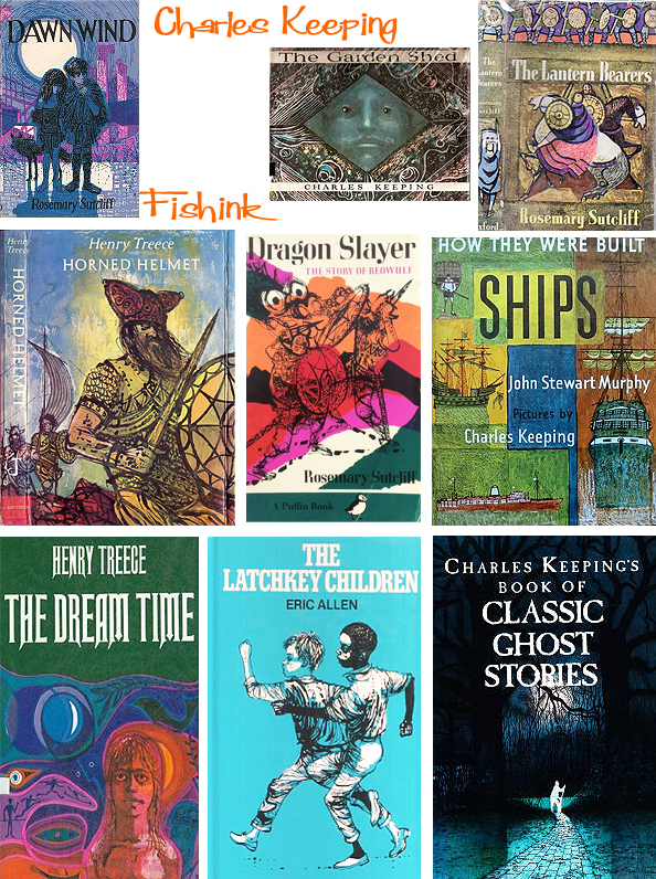
His commitment to the immense project to illustrate the complete Dickens for the Folio Society was total, and he completed it just before his death on 16 May 1988. He became the first illustrator to complete a full edition of Dickens illustrated by a single artist. His wife Renate, also an artist, set up a website called The Keeping Gallery so that both of their work can be treasured.

Have you ever seen such colour in books before ?

Thanks to Matt for sending in these scans after seeing this post.

Amazing use of rich shading and textures. Wonderful work Mr Keeping.
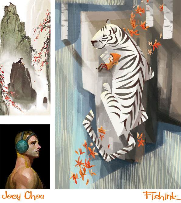
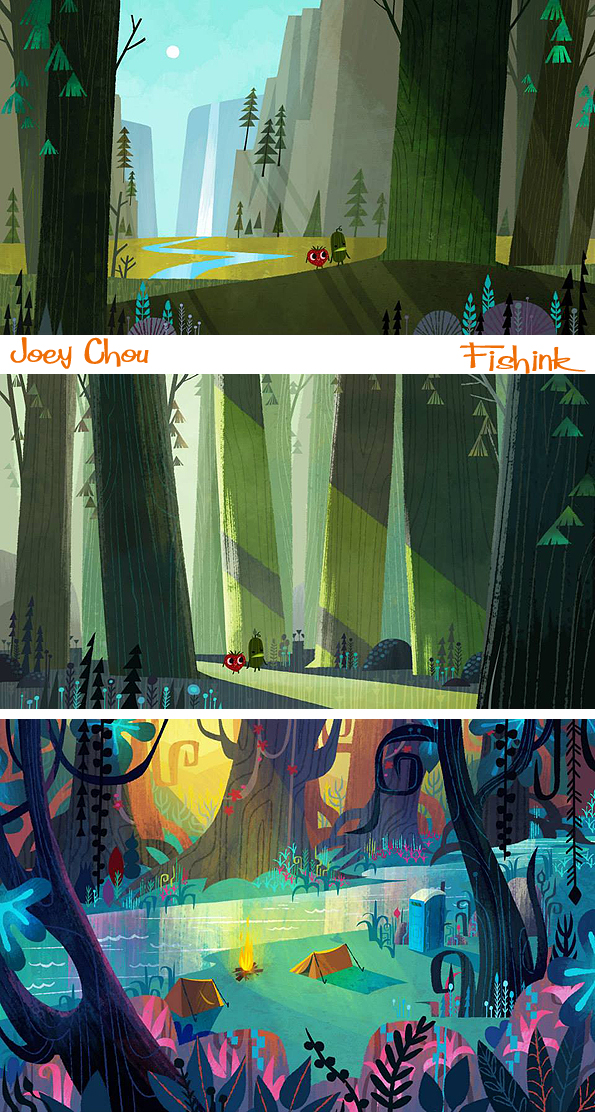
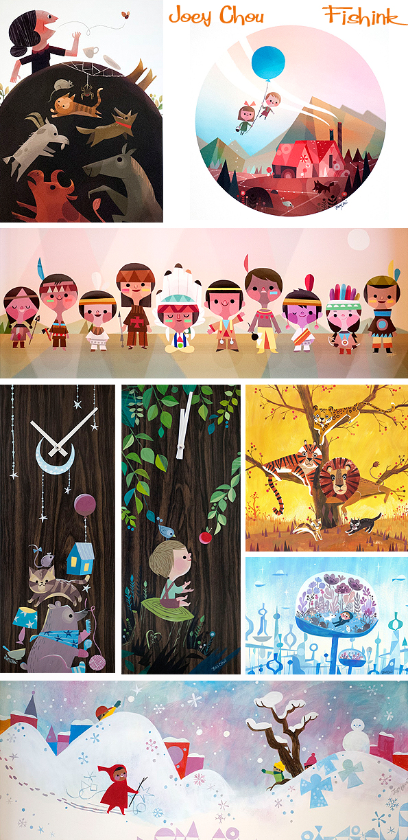
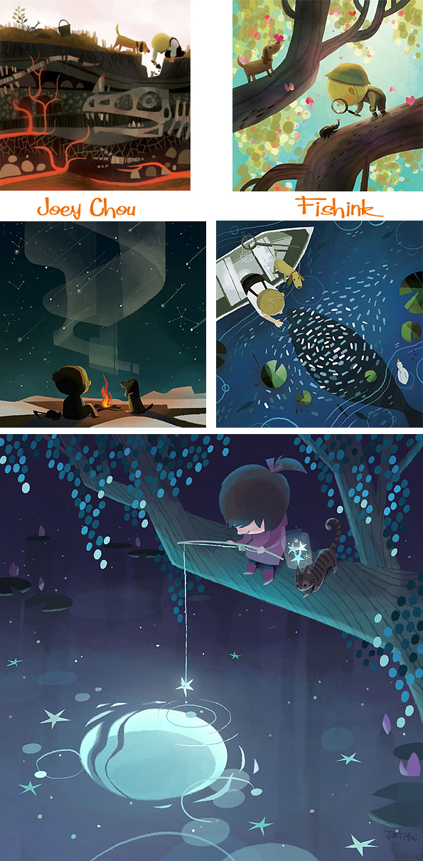
Joey Chou Mid century inspired Artist and Illustrator

This has been one of my most popular posts, I thought you might like to see it again.
Joey Chou is an alumni and graduate of the Art Centre College of Design in Pasadena, CA. Joey was born in Taiwan and moved with his parents and sister to the U.S. when he was 15. He is strongly influenced by the work of Disney artist Mary Blair, comic books and 1950’s and 60’s geometry, as am I ! He has a wonderful vision for creating scenes and settings.
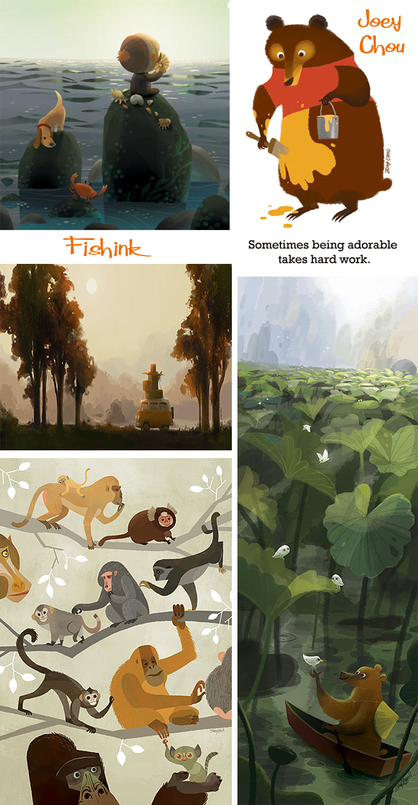
His art reflects influences by prominent and obscure artists as well as influences by the Southern California lifestyle and culture.
When not painting or sketching, Joey enjoys independent films, surfing, video games, and travelling.
He was the artist chosen to illustrate one of the latest ‘It’s A Small World Book’ which much have been a real privilege since Mary Blair was involved in the creation and decoration of the original set at Disney World.


For me his work is colourful, bold, fresh and happy, everything that works for children’s illustrations.

There’s an element of exploration and adventure at times.

A few familiar images from some Disney (and other) classics. How many can you spot ?


I really admire his painted work too. He is often involved in small gallery events where his work is on sale. Framed or painted onto plates and also crafted into clocks.
Young adventurers.
Travels with a clockwork VW.

Lovely brush strokes here.

Glitz, glamour and fame too… he’s got it all ! : )
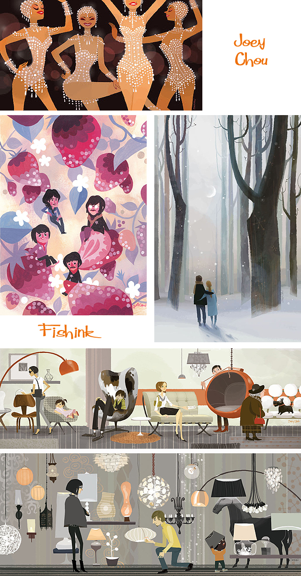
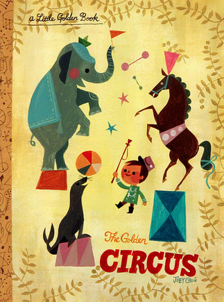
You can find some original work to purchase over at Q Pop Shop. Also it was interesting to discover that Joey has just taken part in an exhibition with a theme of ‘Little Golden Tales’ this was his entry. Fabulous !
Joey is now working for Sony Pictures Imageworks. If you enjoyed this post you’ll probably also like these posts on J.P Miller , Flora Chang and Neiko Ng. I will run a newer post about Joey and his work in the next few months.
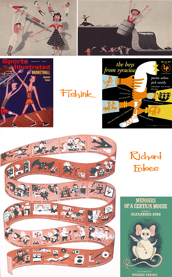
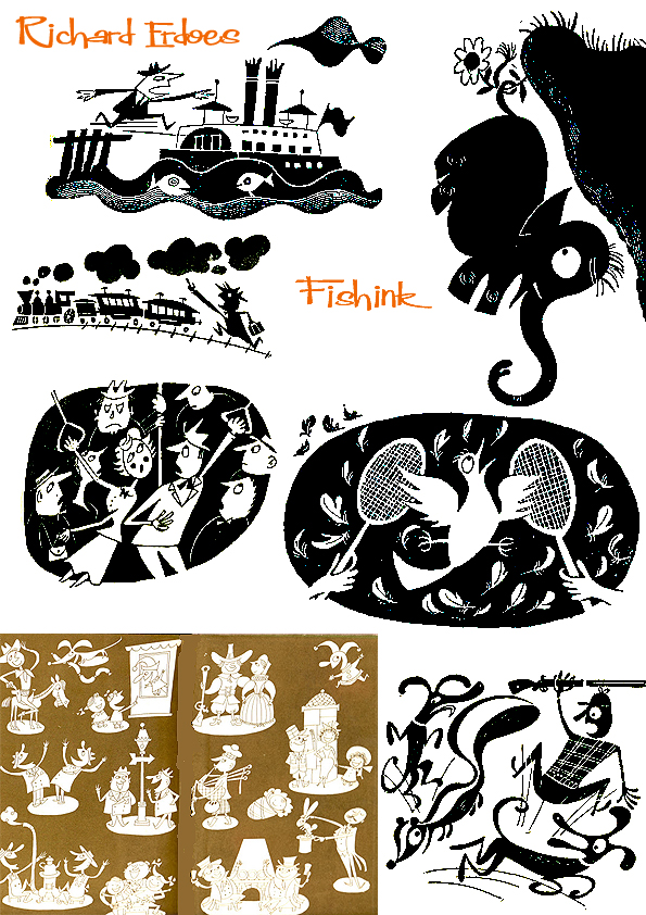
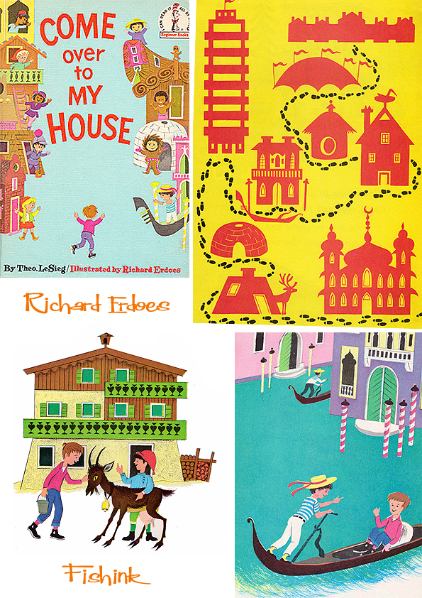
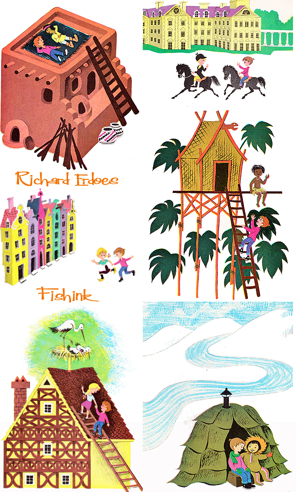
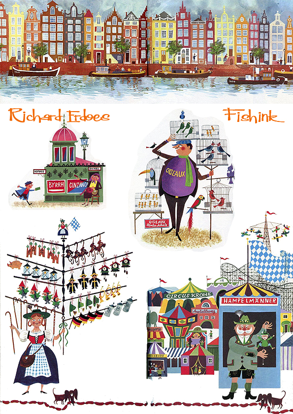
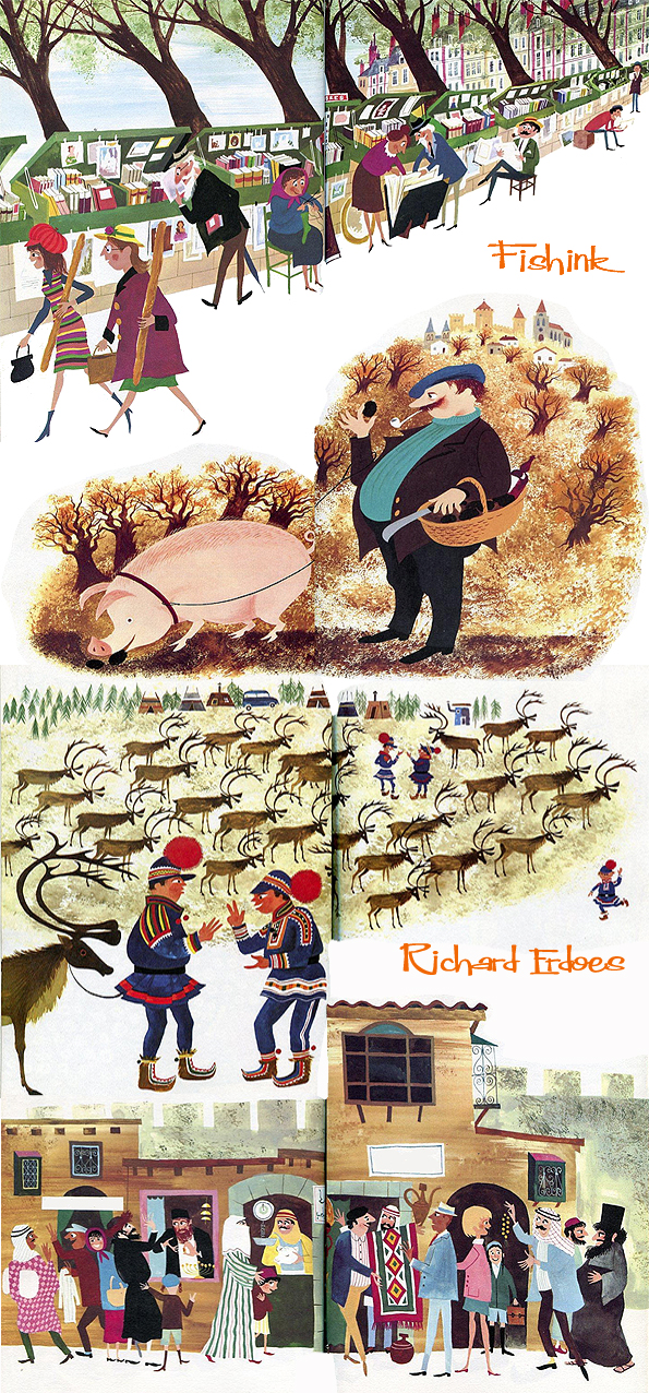
Richard Erdoes Illustrating his way around the world.
I’ve decided from time to time to republish an old post which has either been very popular, or I feel somehow got lost in the archives. Here is the first of those… enjoy.
Richard Erdoes was born in Vienna, Austria in 1912. His father, Richárd Erdős Sr, was a Jewish Hungarian opera singer who had died a few weeks earlier in Frankfurt. After his birth, his mother lived with her sister, the Viennese actress Leopoldine (“Poldi”) Sangora and Erdoes grew up traveling with them from one engagement to another in Germany and Austria. He was involved in a small underground paper where he published anti-Hitler political cartoons which attracted the attention of the Nazi Regime. He fled Germany with a price on his head. He fled to Paris and London, eventually ending up in the United States where he continued his early illustration career contributing to Life magazine, and creating three Joke books in the early 1950’s.
I’m certain his style of drawing has influenced many a modern day illustrator.


He got a taste for travelling a expressing his findings in an early book. ‘Come over to My House’ is a 1966 children’s book, illustrated by Richard Erdoes. The name “Theo. LeSieg” was a pen name of Theodor Geisel, who is more commonly known by another more familiar pen name, Dr. Seuss. The illustrations portray the various styles of homes that kids from around the world live in along with Seuss’s recognizable prose. Throughout the book they also cover what kids eat, how they sleep (Japanese wooden pillows), play (sledding on pine needles), and even clean-up afterwards (Polynesian hot spring).
An assignment for Life Magazine in 1967 took Erdoes to the Pine Ridge Indian Reservation for the first time, and marked the beginning of the work for which he would be best known. Erdoes was fascinated by Native American culture, outraged at the conditions on the reservation and deeply moved by the struggle for civil rights that was raging at the time. He wrote histories, collections of Native American stories and myths, and developed profound editor/collaborator creative partnerships with such voices of the Native American Renaissance as Leonard and Mary Crow Dog and John Fire Lame Deer.
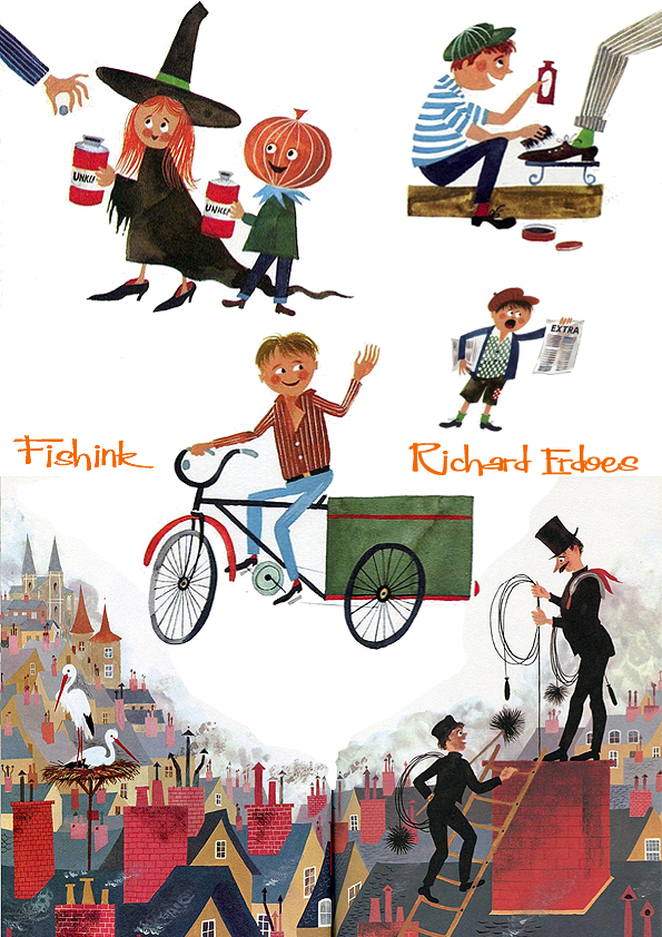
However, between 1967 and 1971, Richard had completed three amazing books concentrating on Policemen, Peddlers and Vendors and finally Musicians from around the world. It is these illustrations (with a very similar flair to those of another fav illustrator of mine Miroslav Sasek) that I wish to show you. First come the Policemen.
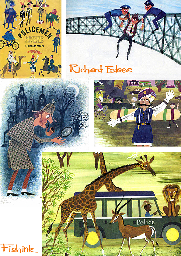

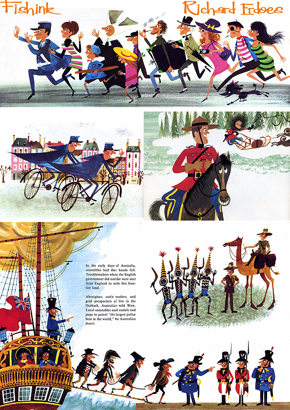

This NY street scene is fabulous, such hustle and bustle ! Next it’s the turn of the Peddlers and Vendors.


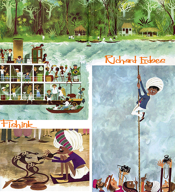


And finally the Musicians.


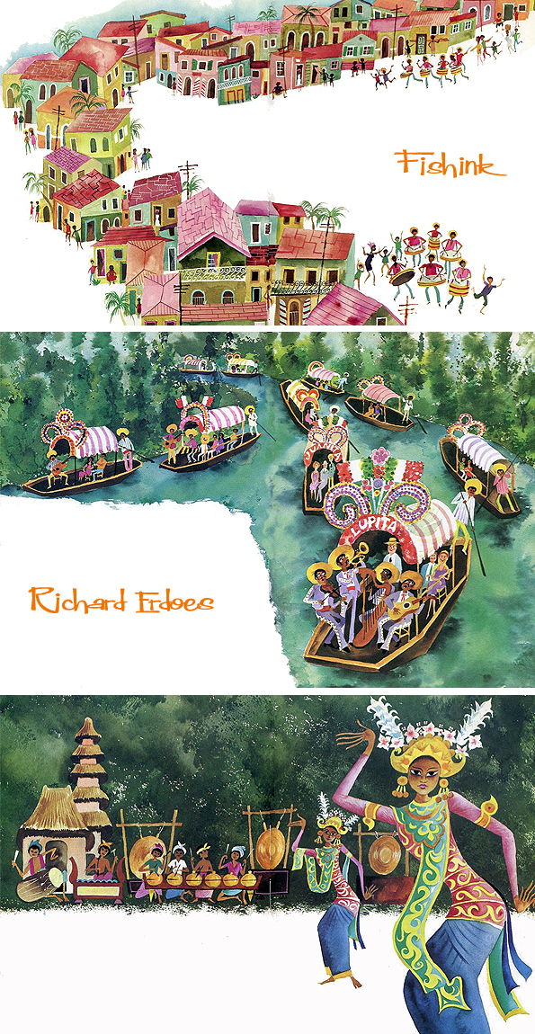
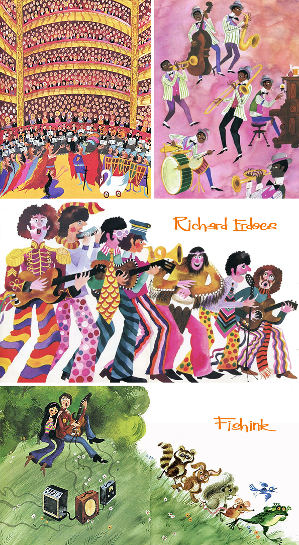
I love how he manages to characterise each countries appearance, customs and idiosyncrasies so perfectly.
As well as being a photographer, illustrating books for children, Erdoes was known for a long list of books about Native Americans including, Lame Deer: Seeker of Visions, American Indian Trickster Tales, Lakota Woman and more. Richard remarked that his father first came to Pine Ridge in 1967 for a sun dance. He said, “He always had an interest in other cultures. As a young man, before having to flee the Nazis in Europe, he traveled on foot to Yugoslavia. He was interested in how other people lived. He loved to travel on western trips and visited Pueblos and Indian reservations.” It seems that Richard was highly influenced by his father’s beliefs even though he never met him.
Richard died at his home in Santa Fe, NM in 2008 aged 96. A huge vote of thanks to the tireless work by Ariel S. Winter who’s flickr sets always inspire and inform us all.
Roger Duvoisin No introductions necessary
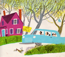
Roger Duvoisin makes quite a number of regular appearances on Fishink Blog. You can see more of my posts about him, by typing his name into the search box on the right hand side of my blog. He was such a prolific artist, that every time I seem to think about him, there’s more illustrations to view online, that I’d not seen previously. Here’s a few more book covers…

His animals have such a friendly nature to them.

His books have been translated into many, many languages and they work because his illustrations are easy to understand, wherever you may live.
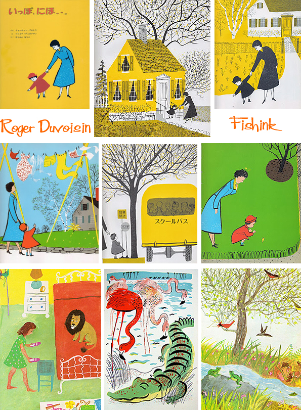
Great colour schemes.
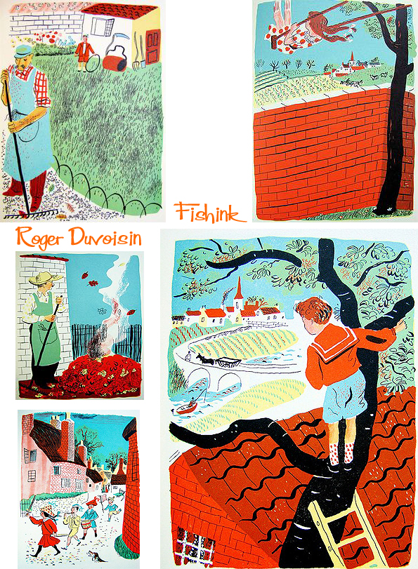
In case you’ve ever wondered what Daddies do all day…. I hope there was a Mummies book too !

Here’s the man himself hard at work, he must have had a busy and hopefully fulfilling career.

Always a breath of fresh air to see Roger’s work. To me they will never feel 60+ years old !
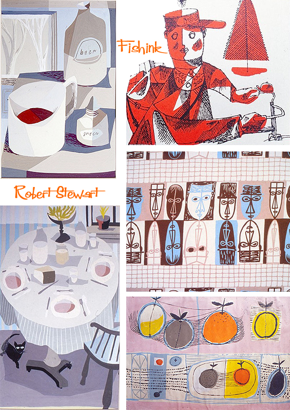
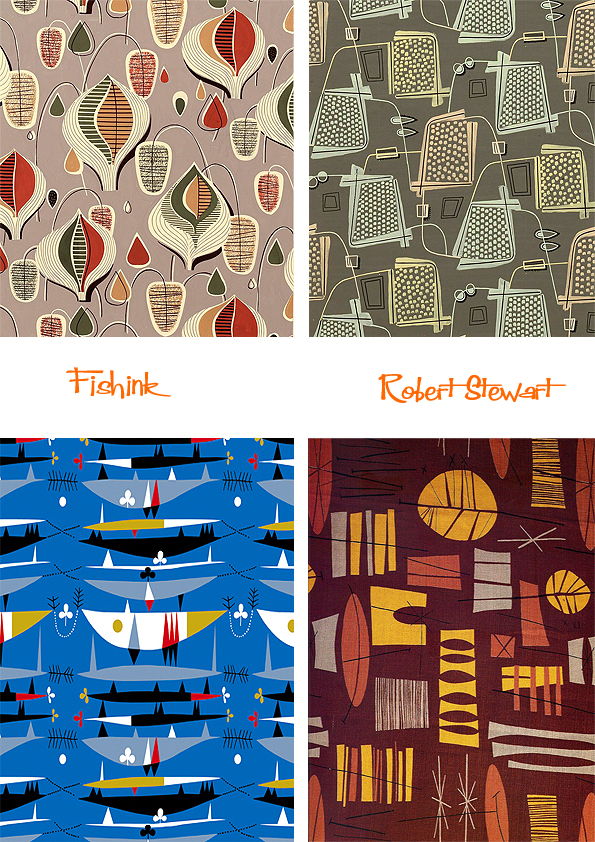
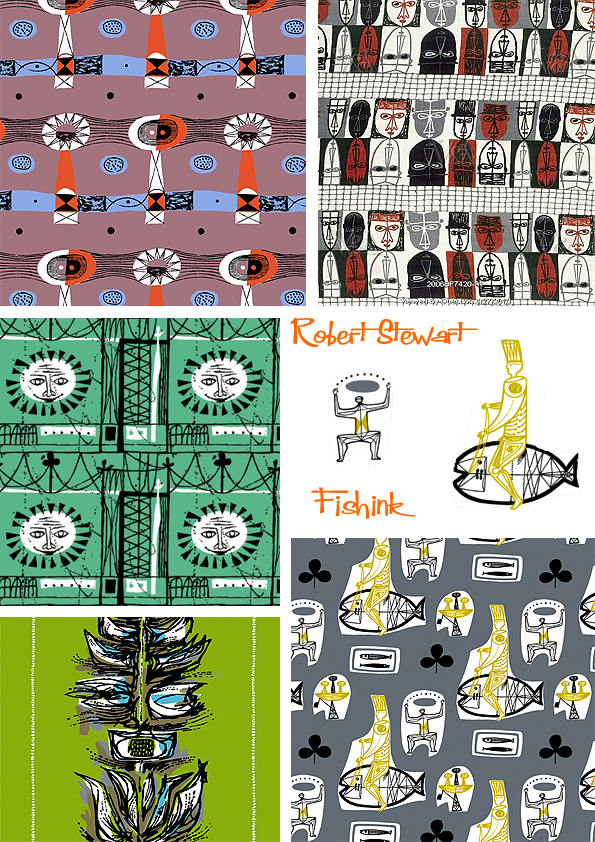
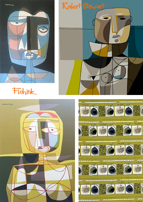
Robert Stewart mid century textiles revisited.
Robert Stewart was another amazing, mid century designer, and a contemporary of Lucienne Day (one of the few designers she admired!)
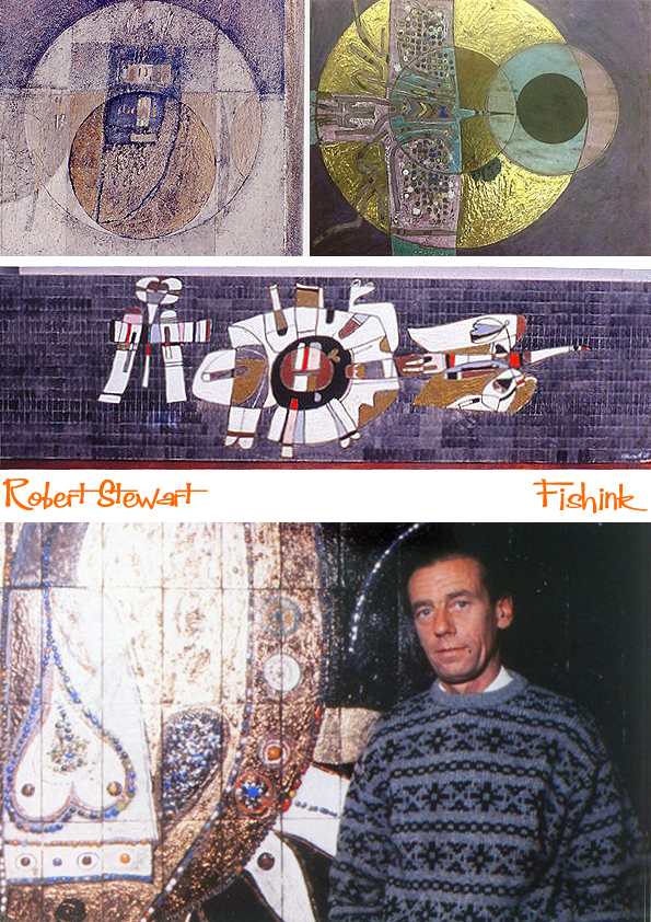
A prolific worker, Stewart produced paintings, tapestries, graphics, ceramics and murals. Some examples here.

Sun motifs seem to appear quite often in his work.
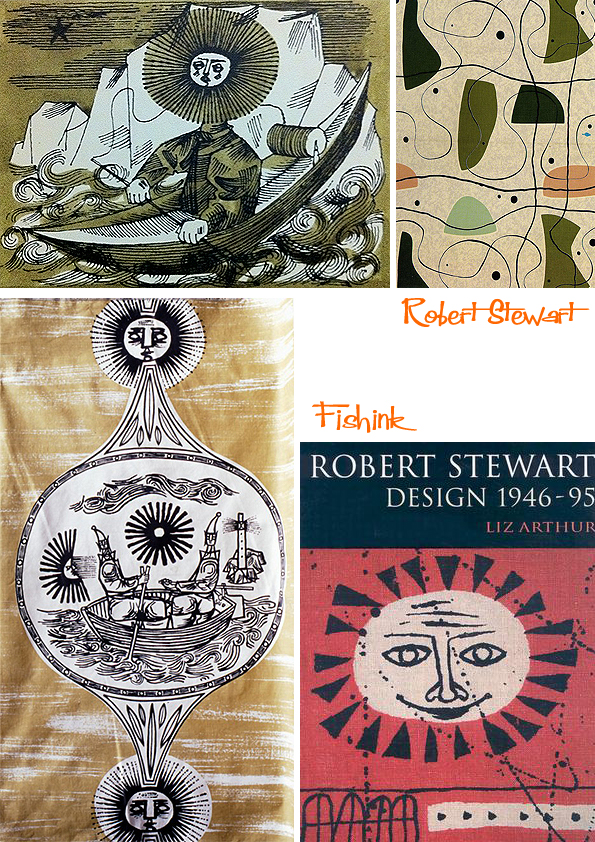
Robert also taught for 35 years, from 1949, at Glasgow School of Art, rising to Head of the Design School and then Deputy Director of GSA. By all accounts he was, by nature, anti-establishment and he revolutionised the printed textile course. In a 1964 external audit report he was described as “the best teacher of printed textiles in the country”.
It is his textile designs that have been the most influential, in particular those produced by Liberty, Pringle and Donald Brothers in the 1950’s.
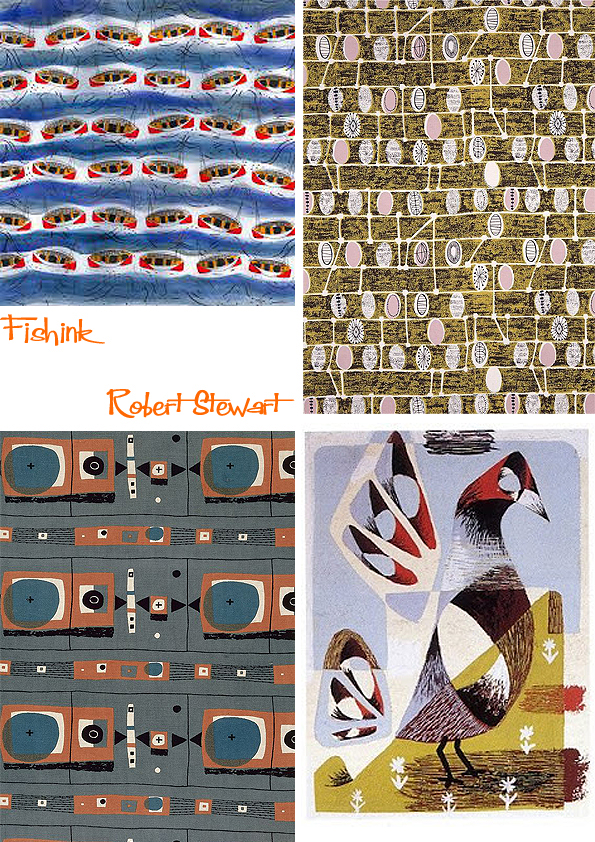
Some of Robert’s beautiful designs are being produced today by Loome Fabrics.
Don’t these designs just shout out fun and friendly messages : )
Textile company Living Union talks here about how they also managed to bring Robert Stewart’s textiles and paintings to a contemporary audience. They certainly look amazing.
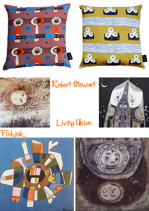
Limited edition canvasses too.
Thanks to the Glasgow School of Art for some help with the images in this post.
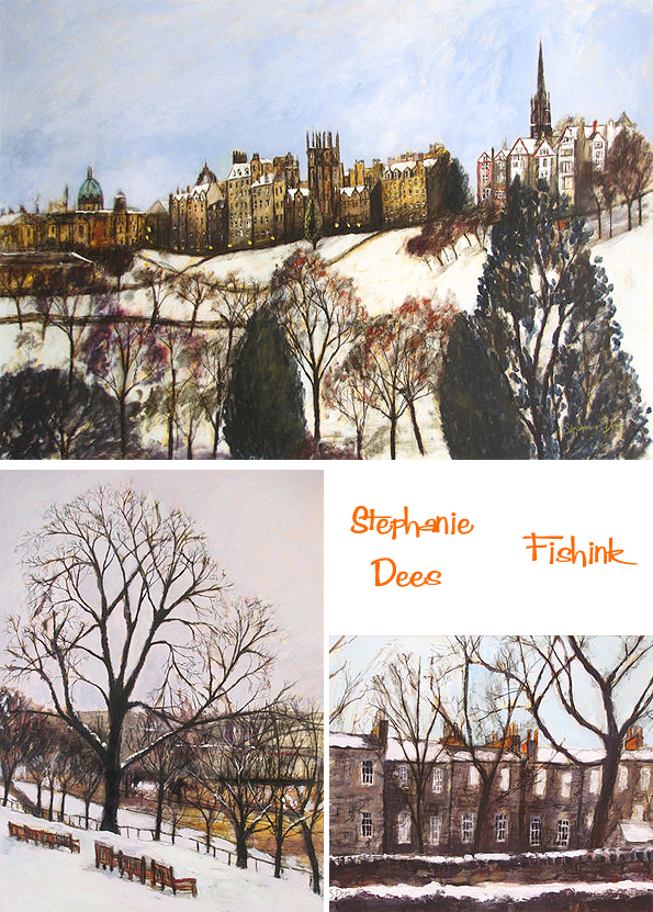
Stephanie Dees Painting the city seasons
Born in Northumberland in 1974 Stephanie Dees attended Edinburgh College of Art, obtaining a MFA Degree in Painting in 1998. Stephanie works in many different media including acrylic, watercolour, pencil, oil bar and oil pastel.

She is a regular exhibitor at Society and Commercial Gallery group exhibitions throughout the UK and has been showing with the Scottish Gallery since 1997. Her works feature in Private and Public Collections worldwide. I love her keen observational skills and her capture of the light and mood of each space that she captures on canvas.
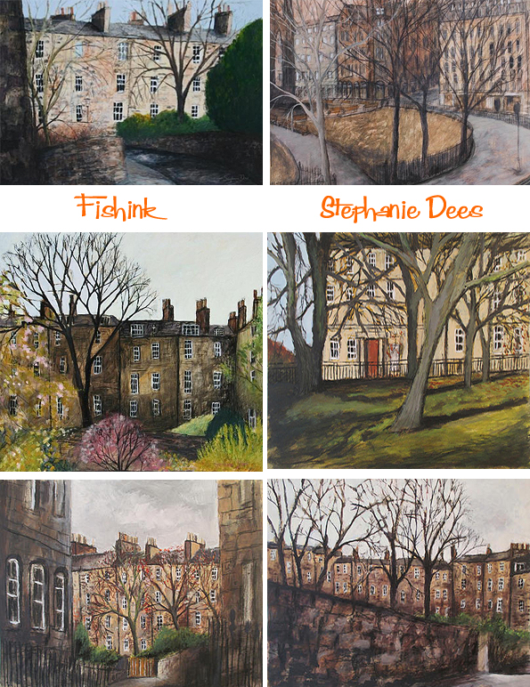
Edinburgh ‘sings’ out from these paintings.


From Scotland, to Falmouth…
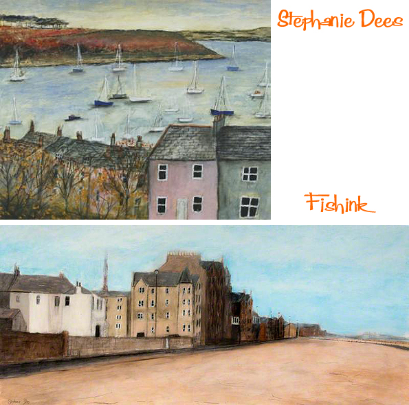

and from Paris to Italy, each painting tells a story of her travels.

Summer through to Winter even the season’s are explored in Stephanie’s detailed work. I love the grey skies contrasted with the sandy buildings here. Wonderful work, evoking great memories of times spent in Edinburgh.

Scale and layout working hand in hand to depict each scene so well. Mmmm nearly time for a Scottish trip I think : )
You can be sure of Shell

As a child my earliest associated memory of going for petrol, was always the free gift you would get for filling up at that service station. Different companies tried to outdo one another with the presents they would bestow on you for your custom. As an early artist, I particularly remember one company giving away felt tip pens. Each colour had a name and so you were encouraged to try and get the set. I always found it so exciting, going to choose the colour (or colours, depending how much fuel you had bought) after my dad had filled the car. It was a clever way to get loyalty and repeat custom and was possibly one of my first exposures of the power of advertising and consumerism !
Shell used postcards as an early form of advertising, beginning in the early 1900s. Postcards were a quick and easy way of sending messages before telephones became a popular commodity and postal deliveries could arrive several times a day. The popularity of postcards helped Shell increase their profile in Britain, reaching everyone including the non-motorists.
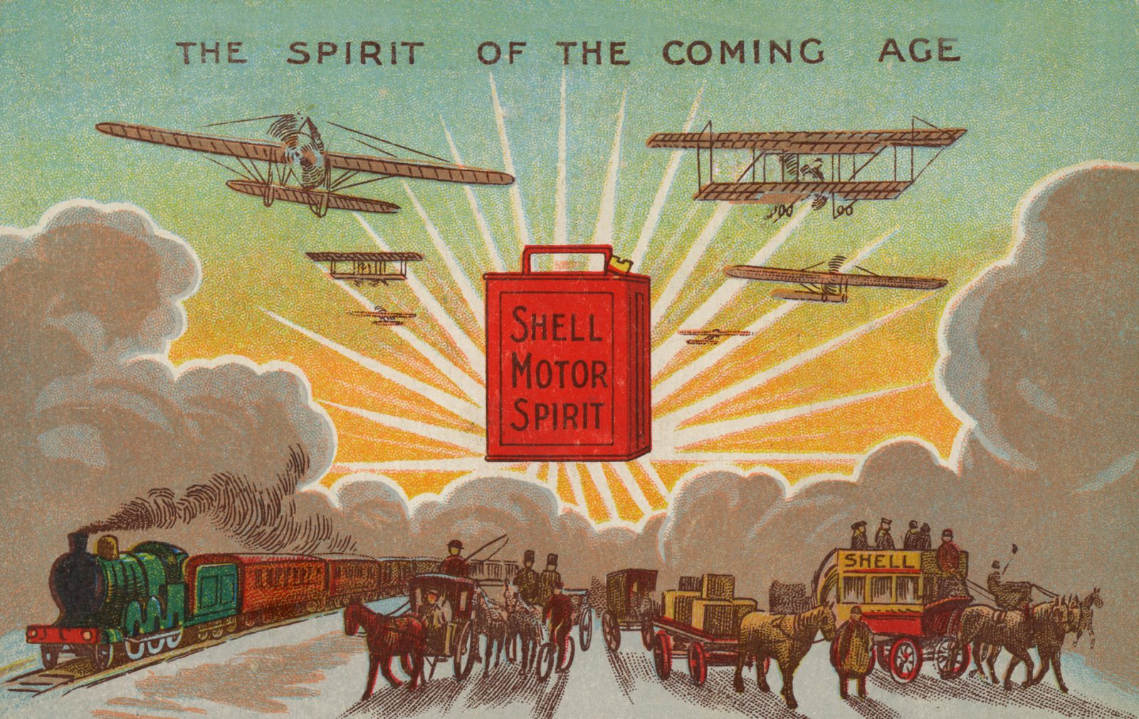
The first Shell advertising poster was created in 1920. They were displayed on the side of lorries carrying fuel to customers all over the country. These adverts (or ‘Lorry Bills’ as they became known), were designed in reaction to the public outcry against roadside hoardings in the countryside.

Foreign posters too and a whole range of topics and themes, not just centered around the more obvious choices of cars and transport.

Of course there were still many classic posters produced using the more obvious themes too.
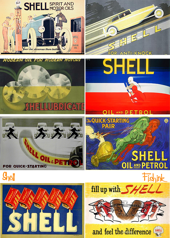
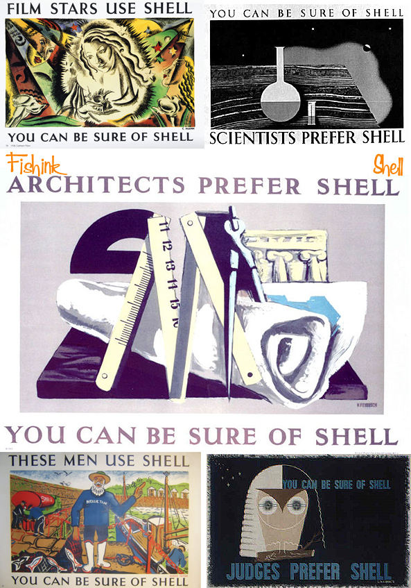
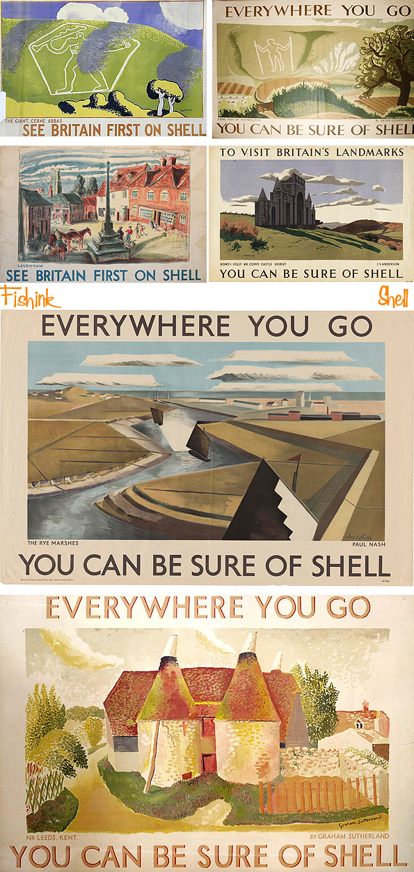
But unusually Britain’s landmarks and a campaign showing the different types of people who use Shell, became very popular.

I’m sure you’re relieved to know that Judges, Architects, Scientists and even Film Stars all use Shell.
We’re told it’s even a ‘friend to the Farmer’, giving it that ‘good for the environment angle’.

The most innovative designs were created around 1932, when Jack Beddington became responsible for the company’s advertising. Under his direction, artists were commissioned who weren’t necessarily associated with commercial art. These artists went on to become famous names in British contemporary art. Among them were people like Paul Nash, Graham Sutherland, Vanessa Bell, Ben Nicholson and John Piper.
There are over 7,000 posters in the Shell Art Collection, reflecting the charm and character of a nostalgic age of motoring.
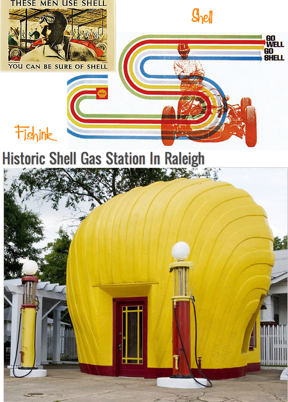
Just imagine filling up here… : )
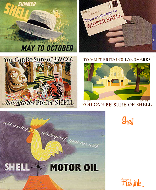
The poster (below) depicting the family all ready for their holidays, is definitely my favourite.

Which one is yours ? You can find out more about the Shell Posters by visiting the National Motor Museum website.
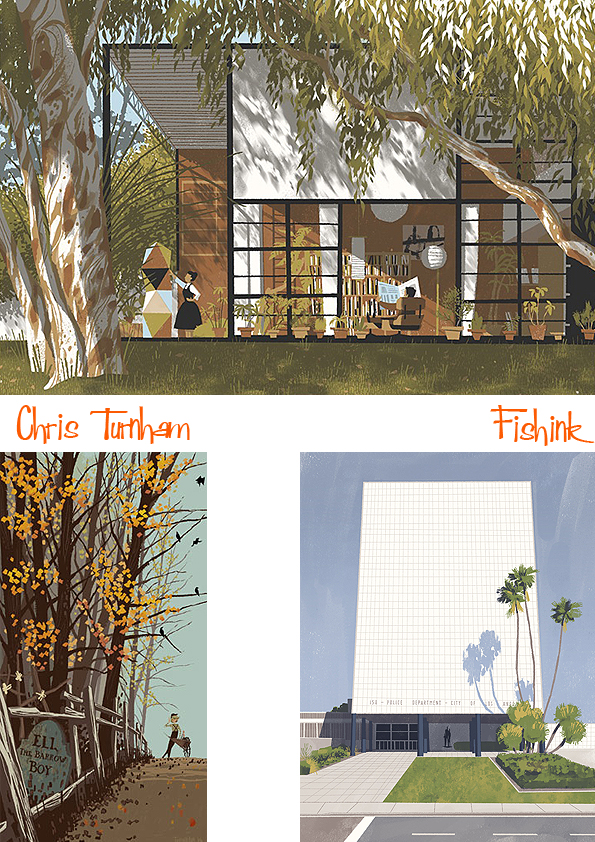
Chris Turnham Illustration
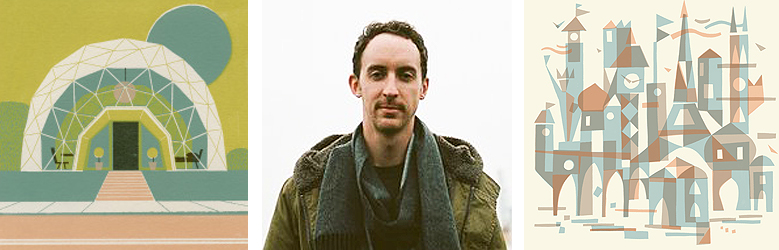 Photo by Dan Cole.
Chris Turnham lives and works in Los Angeles. He has worked in both feature and television animation and has contributed illustrations to publications and children’s books.

Of course his style appeals very much to my eye and love of the mid century life.

This could be fresh out of a book from 50+ years ago…. fabulous.

Interesting to see some floral and botanical studies too.
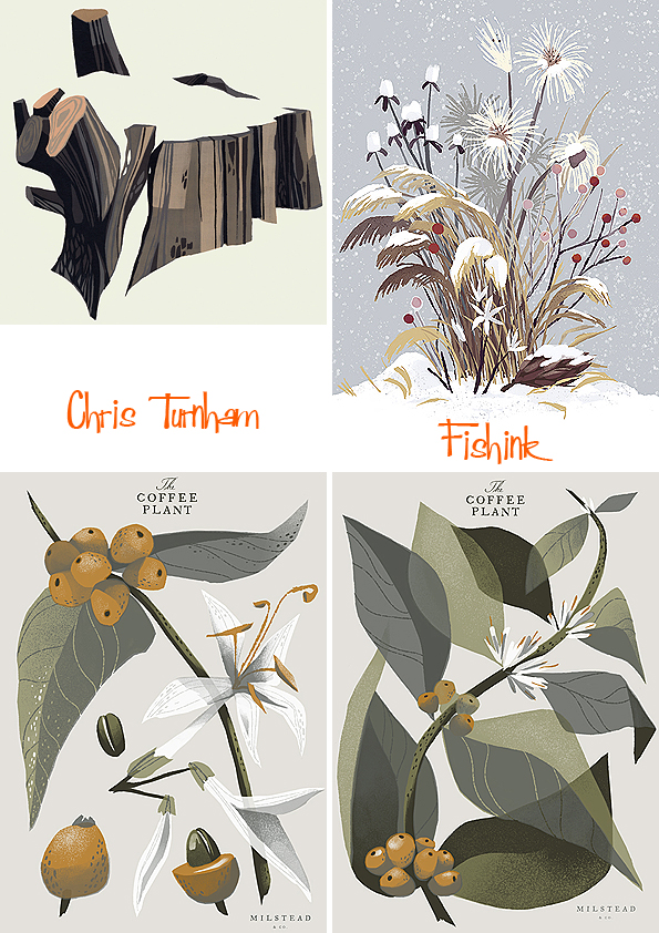
Illustrations of intrepid explorers….

and places Chris has also explored.

But my absolute favourites are his his beautiful architectural pieces… was this the bridge used in the film Grease, I wonder ?


Many of these illustrations are commissions.
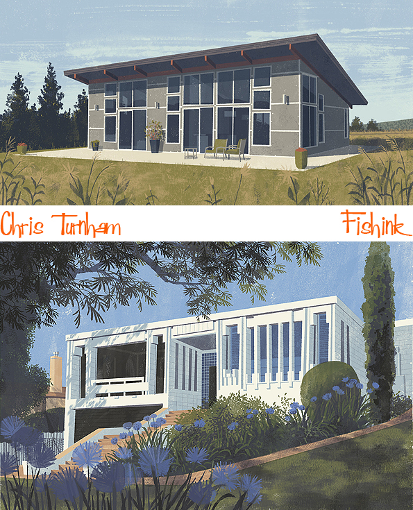
Or just plain jaw-droppingly wonderful ! Lol

I love Chris’s use of the sun in these sleepy suburban dwellings.
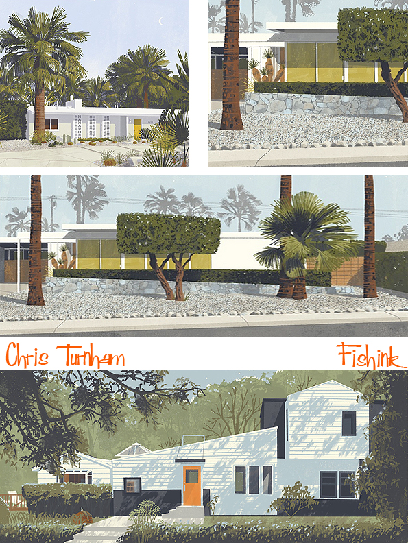
He has even covered the Eames House, below. Stunning work Chris.
Fishink Thanks
Today is all about Thank you’s. I want to start with the wonderful Jo and Sophie who together were running this year’s Sale Arts Trail. The event ran as smoothly as ever and it was a joy to take part for the second year. Here’s a taster of how the crowds appeared (after the heavens had stopped opening) on the Saturday.

My second vote of thanks goes to Claire over at Minikin ‘Paint A Pot’ Emporium. She’s such a hard working, warm-hearted and generally lovely soul that I knew we’d have a fun weekend and a chance for a catch up too. Thanks for letting me take over half of your shop.. and the work will be up for a few more days this week, so pop in if you missed it at the weekend. I was so pleased how it all looked. I also do take on commissions so if you wanted something specific for your home, or another variation of a piece that sold, please drop me a line craig@fishink.co.uk

Lastly I wanted to say thank you to everyone who supported my artwork through either sales, praise or just dropping by to say hello and support the trail. It really does all help. Thanks to Jenny who reads my blog for stopping by to meet me and numerous other people who’s names I didn’t manage to gather but who helped the weekend speed past by just being friendly and being there.
Lastly thanks to ‘him upstairs’ for the cascading rain most of Saturday and the dark stormy clouds and wind on Sunday. I decided… why fight what you can’t change.. embrace it instead! : ) Happy new week one and all.


