Fishink Walks around Settle, Yorkshire. Part 1
Whilst the weather has been at it’s warmest for a long time recently, (I still daren’t call it summer), this has been, for a small fraction of time, my eye level view.
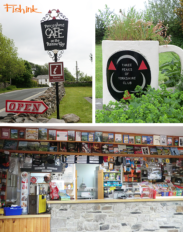
I decided to take a few days away from the Mac and head off for a long weekend over in Yorkshire, camping and walking around the Settle area. Starting at this great Pen-y-ghent Cafe in Horton-in-Ribblesdale. Very helpful and friendly staff and a good starting place if you’re doing the Three Peaks Challenge because you can clock-in there and leave some details incase you should get lost.
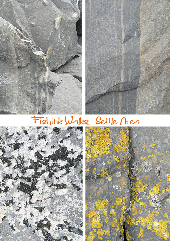
We headed off to set up the tent at a lovely quiet campsite not so far from there and after an hour we were off on our first walk, exploring the landscape and surrounding hills. We passed by this slate quarry, what a huge site, the picture doesn’t do the scale of it justice at all.

There were a lovely array of lines and lichens on the stone and slates.
The views were picturesque and the weather, luckily, was just the right temperature for walking. I loved seeing the criss-crossing dry stone walls which are famous particularly in this area. Strong, sturdy and made either or slate or boulders of gritstone. They must have taken years and years to build.

It was very relaxing wandering down the country lanes and through forests and fields, just absorbing the wonderful views.

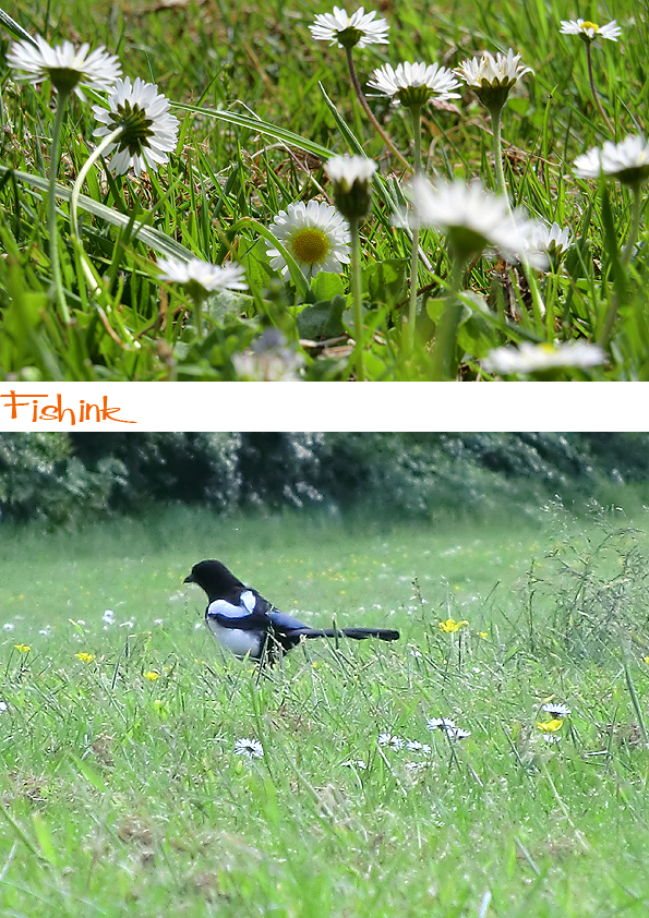
The fields were awash with buttercups, clover, daisies and a whole host of other flowering wild plants, which helped to add colour and sparkle to the already beautiful landscape.

Even the lanes were pretty and filled with plants and birdsong all the time too.

A little higher and we were soon on the tops. The landscape changed into limestone pavements and a harsher looking terrain. Still inspiring.

This was one of the enormous views and this little fellow was happily chirping at us from just a few meters away.

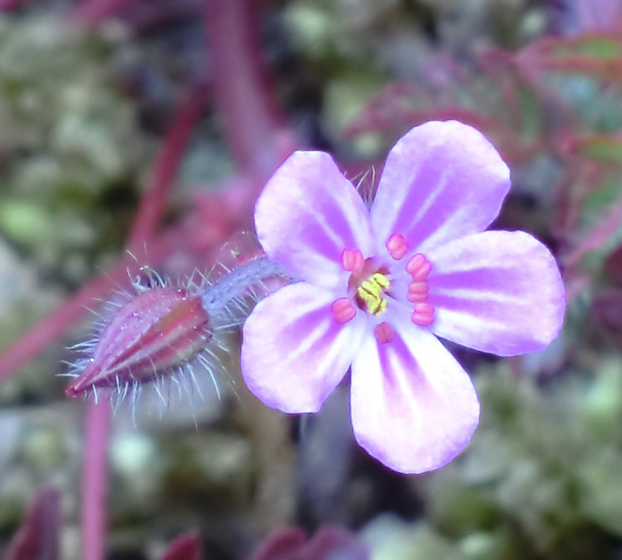
Purple orchids and bluebells could be found scattered across the hillsides.
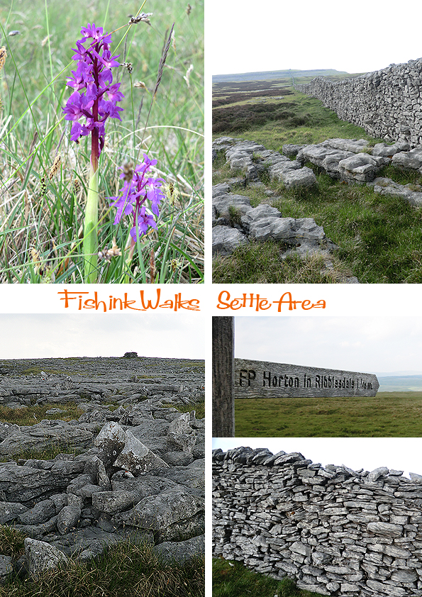
This sign made me smile as I felt like the place where I stood, no longer existed.

The station at Horton-in-Ribblesdale is small but very pretty. Someone takes a lot of time planting and maintaining the flora on either side of the platforms. It looked glorious.

We stopped off at The Crown Hotel for some well earned and rather tasty hot food, before walking back to the campsite. We noticed the calcium deposits in one of the small rivers, it looked like a milky coffee ! Lovely scenery. Part Two to come.

Fishink Stained Glass Project 4

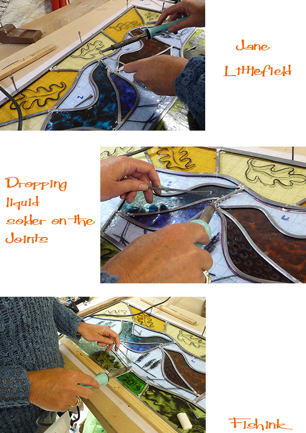
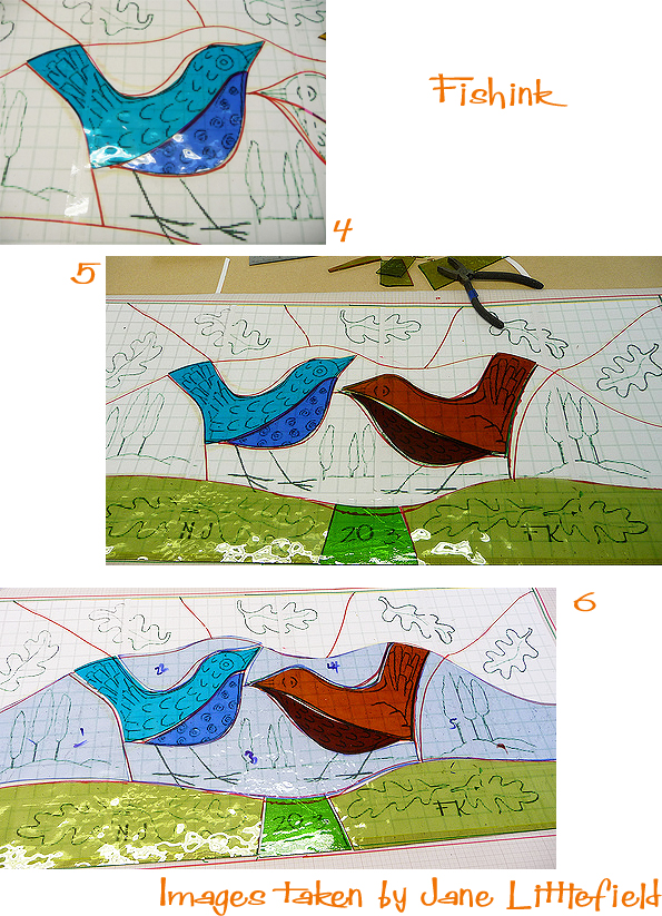
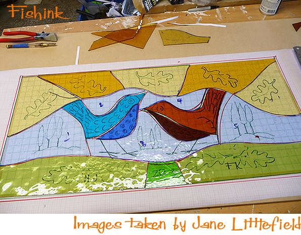
My latest on the stained glass news is that it all survived the firing process and then Jane set to work making it into the final framed piece. Very kindly Jane has not only taken some great images and allowed us to view them but has explained the process as she has gone along. What a generous artist !
Jane constructed a right angle with wooden batons and then created the lead frame, building it up from the base upwards. The pins keep the glass pieces in place whilst the lead is placed and cut to fit.

The joints are then cleaned using a wire brush, which helps the solder (liquid metal) obtain a dust and dirt free area to adhere to. A Tallow Candle acts as a flux which aids the lead to reach a molten state. Using a soldering iron, Jane then carefully positions the molten solder onto the joints, helping to form a structure and to aid in the sealing of the panel.

More soldering and note that the pins help to keep the frames structure whilst the glass pieces and lead are being sealed into place.
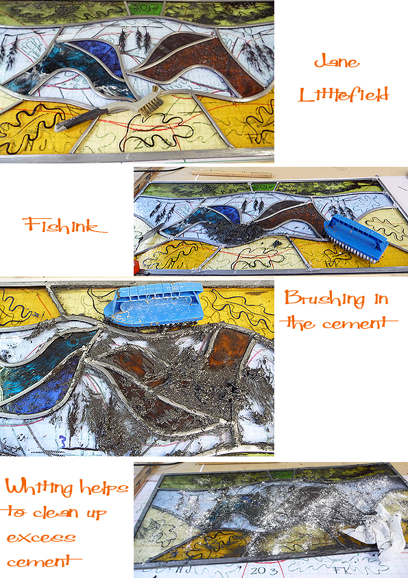
The panel is then flipped over and soldered on the back. After that stage Stained Glass Cement is brushed over the entire panel (both sides), especially under all the lead and gaps. This weatherproofs it and makes it sturdy. Once hardened, the excess cement needs to be cleaned off, Whiting is used to do this.
After giving the panel a good clean, and leaving the cement to dry off, the final stage is to give it a good polish. This Black Grate polish blackens the lead and also cleans the glass. Bringing the colours up to look fresh an sparkly.

Here’s Jane in her studio after all her hard work making my design into a finished piece. It looks amazing, I’m so pleased with how it’s turned out and I can’t wait to see it in front of me and get around to setting it into it’s final resting place. Thanks again Jane for your continued help and support. For kindly explaining your process and for giving us such fab images to see this, in all it’s ‘step-by-step’ glory. Catch up with Jane on her blog and see the whole photo story of the making of this panel here or in the previous blog posts on the Fishink Blog.

Just to mention for those of you in or around the Manchester area in the next few weeks that the BA (Hons) Illustration degree show is available to view at Manchester School of Art from the 15th til the 19th of June. Textiles, Fashion, Photography and more are on at the same time, more info here.
Mid Century Illustrations made into repeat patterns

I’ve been working on some repeats based on the work of some of the illustrators from the 1950’s and 60’s that I really like. These are not designs I’ve drawn to sell or use but just to create and see what they look like. For me, it is also a way of keeping the illustrators’ work fresh and to give it a new lease of life.
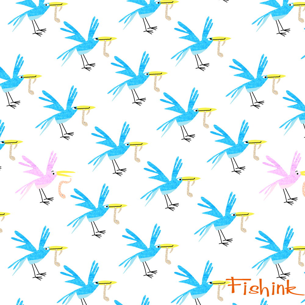
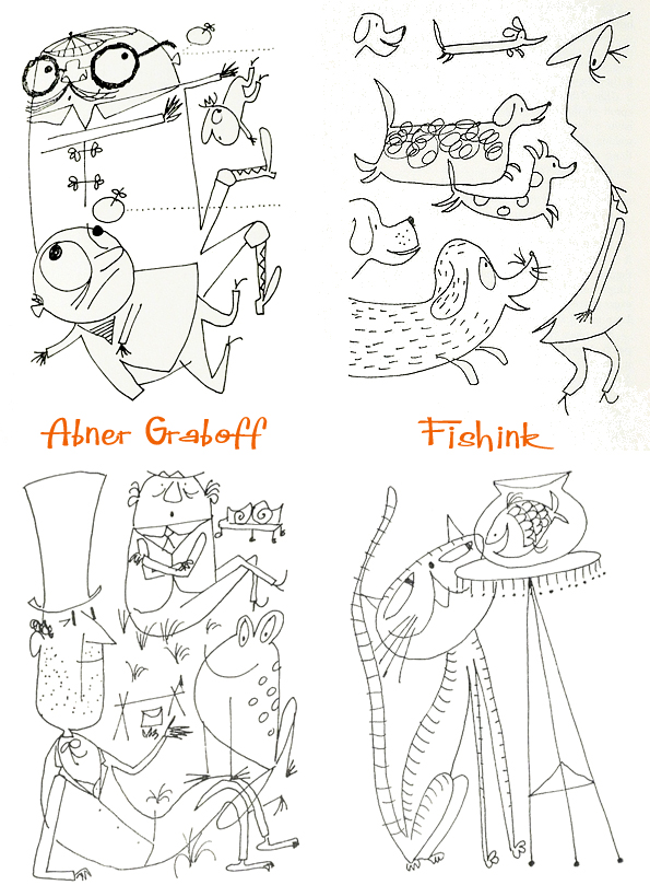
First to be shown are my offerings to Abner Graboff’. You can find more info about Abner here and here. These energetic joggers seem quite happy.

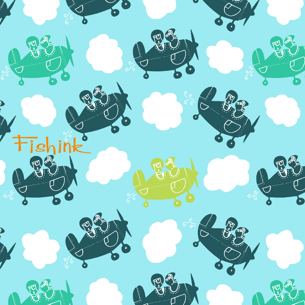
I really liked the feel of this aeronautical one too.
A couple for Bernice Myers. Blogs about Bernice are here and here.
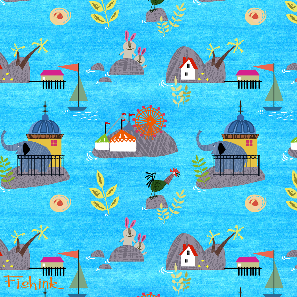
I created this one from lots of separate drawings and put them all together on their own floating island fairgrounds.
And three Mary Blair contributions. More about Mary here.


What do you think ? More to come.
Fishink Stained Glass Project 3
Monday was a beautiful day… not only for the glorious sunshine. I awoke crazily early at 5.30am and the sun was already ‘cracking the flags’, as we say up north ! It was glass painting day !
I knew that the journey over to Jane Littlefields’ Studio in Derbyshire would take me over an hour, so I decided to set off early (7.15) and hopefully beat the traffic on their monday morning rally.
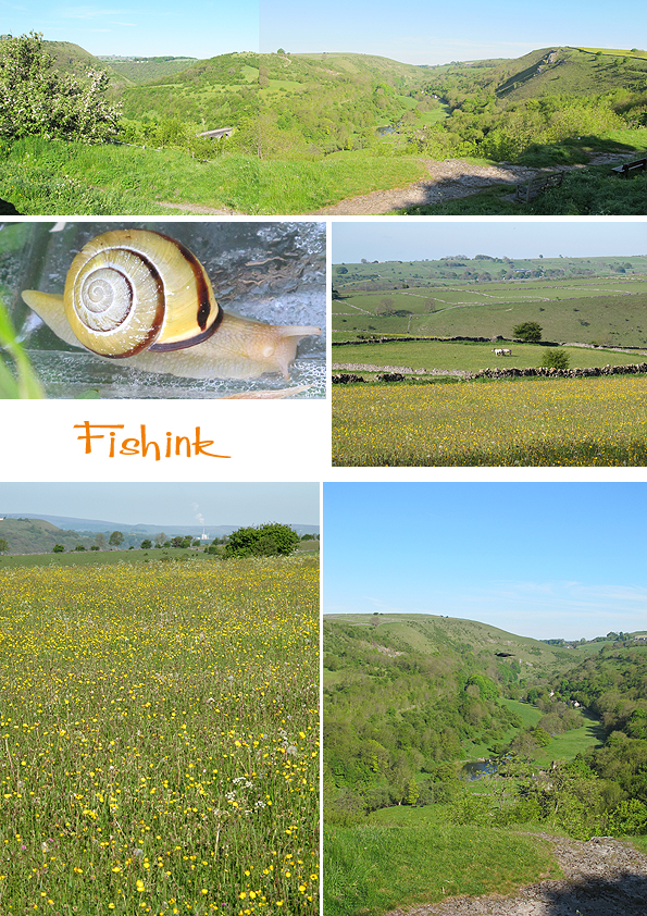
I stopped to take these pictures on the way, pure, sunlit, English countryside at it’s best.
Fortunately Jane was already walking her dog when I arrived at 8.30 so it wasn’t too unsociable an hour. She kindly made me a cup of tea and we sat down in her sunny garden amongst the buddas and green men to finally catch up. We ‘met’ through my blog but hadn’t actually had the chance to chat face-to-face until today. It was like meeting a long lost friend. Funnily we’d already discovered that we had both trained at Ravensbourne College of Art and Design at the same time, but on different courses and our paths hadn’t previously crossed until today.
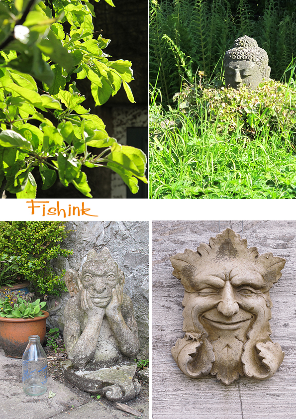
Jane’s garden is soo lovely, calm, serene and full of birds and wildlife that I could have easily just sat in the sun all day and chattered, but I was also keen to start working on the stained glass panel too so we set off into the studio to start the days task.

Jane explained a variety of techniques that I could try in order to create different marks and patterns. She had a wonderful selection of brushes, sticks, sponges, rollers etc that I could use to experiment with, and discover which styles I preferred. I worked on a lightbox and after carefully mixing the glass powder with the tiniest amount of gum arabic and water I was ready to roll.
I took each piece of the glass panel and initially cleaned it to get rid of any film or grease that may prevent the paint from making contact with it. Then I started painting my design, using the paper copy of the design beneath the glass to give me a guide to the scale and positioning of each element. It was a long process and took me all day, from 9 til 5 to finish, with only a little break for some hand cooked lunch from Jane, yum, well a boy’s got to eat ! lol.

I found the process very relaxing even though I did have to really concentrate in order to not peal the paint away in the fine line and more delicate areas. On the bird above for example, I initially painted a wash over the glass piece. Then I used an old comb to create some of the cross hatching marks, by combing the paint on the glass this way and that way and eventually building up a pattern of marks to add texture to the bird’s feathers. I lastly used a sharpened stick to create the finer feather marks on the beak and eye and the loops and swirls on it’s chest. For the trees I used a sponge to build up the shape and then scratched back into the edges to add more texture and then finally dusted the glass with a dry badger brush, which softened the edges and again added more definition and depth to the marks I’d already created. I really like this sunny picture of Jane we took in her garden.

The glass would now get fired in a kiln in order to melt the glass powder and seal it to the piece beneath. Next the pieces would be slotted into some lead ‘H’ shaped lead and soldered at each seam, front and back to give it stability and support. Finally the whole piece would have some black cement rubbed into the gaps between the lead and glass, to make it watertight and solid. It would then need to be thoroughly cleaned to get all excess cement from the glass areas and let the final design shine out. It will be a few weeks before I get to see the panel in it’s final stage but I will post some images of it when I do. I stopped here to eat my tea at 7.30 on the way home again. A creatively, inspiring day and all thanks to my generous and talented hostess Jane Litlefield. I would strongly recommend anyone to take one of Jane’s stained glass classes or you can book her to teach a group of you too and make your own. Find out more here.
I want to once again say a special thank you to Jane for her help and suggestion to make this project possible in the first place.

I didn’t actually make these designs in glass, but playing on the computer with the photos of the work I’d created during the day, made me wonder what they might look like as repeat patterns.

I got home to discover that Julie Gibbons over in Australia has written a lovely post about my work on her blog Tractor Girl. You can read it here. Thanks for such a chirpy post Julie.
Fishink Stained Glass Project 2
I am working with the wonderful Jane Littlefield on the stained glass panel I designed a week or so ago, you can see the early ideas here. Jane has been working hard, cutting out the design in preparation for the painting stage, and she kindly sent me some images to show you it’s progress… and today (cue fanfare), I’m off to derbyshire to meet Jane in person and do the illustration / painting work.

I’m so impressed at Janes’ careful cutting of the glass, what a skilled job that is. I liked seeing the tools of the trade in the images too. Thanks to Jane in the meantime for the lovely stage-by-stage pictures showing the panels’ progress and fingers crossed it all goes well. I’ll show you the results soon. Keep watching this space.
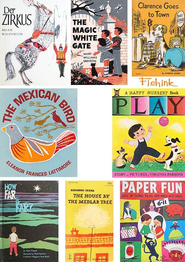
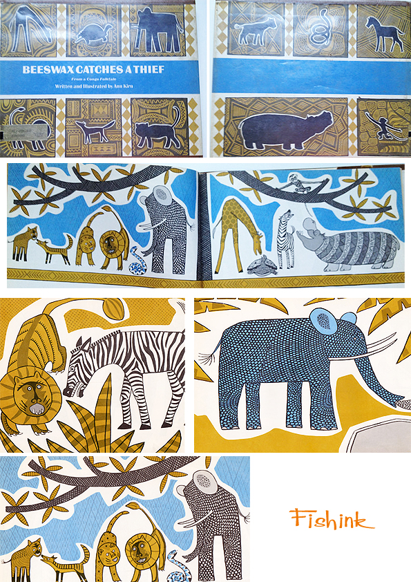
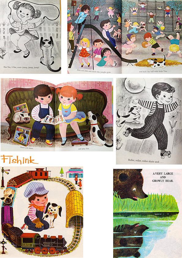
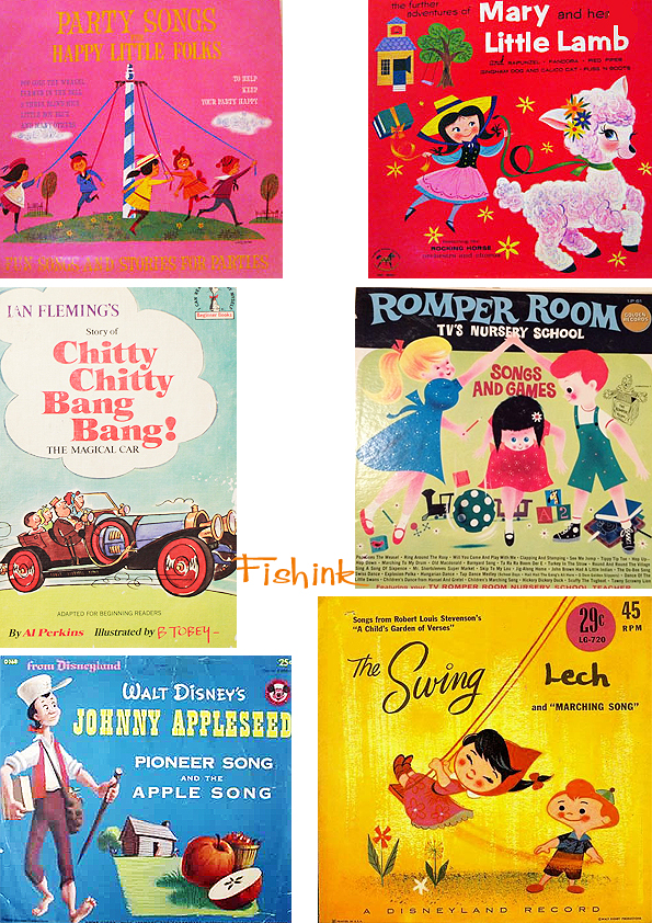
Children’s Vintage Books
More offerings from the World Wide Web wanderings around Vintage Book sites. The things I do for you guys lol

An african offering.
These lovely pencil illustrations in The Runaway Giant.

A few in a Mary Blair style.
I also thought I will create a post featuring Children’s Record Covers as there are also some amazing illustrations here too… here’s a taster. Watch this space !

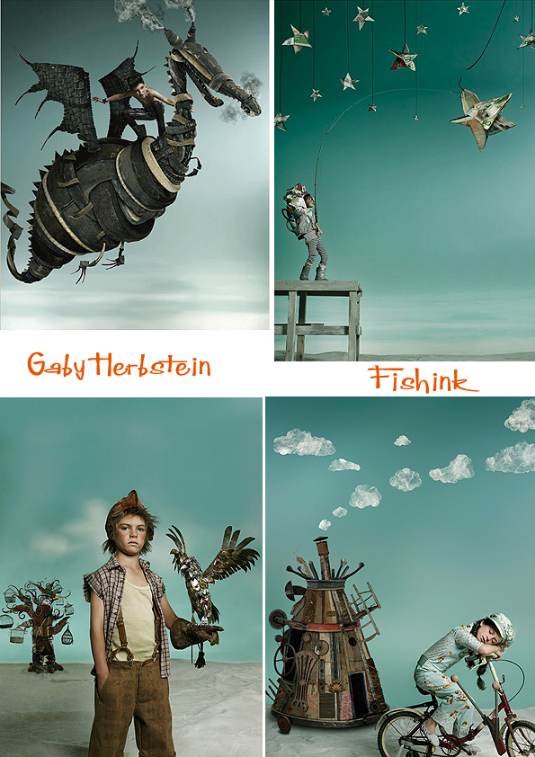
Gaby Herbstein was born in Argentina in May, 1969, and currently lives there with her husband and two daughters. She is a photographer with a natural flair for being both creatively lavish and theatrical in her approach to photographing a subject.
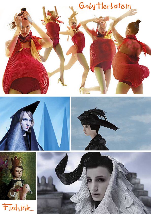
She generates most of her production at her studio in Buenos Aires, along with a supporting team of artists and professionals for her projects. For the last twenty years she has worked in advertising photography focused on fashion and beauty, and her own artistic endeavors.

Her transgressive vision turned her into a coveted artist to create brand image for firms such as L’Oreal, Procter & Gamble, Dove, Sedal, Lux, Telcel, Sony, FTV (among others) and several fashion companies from Argentina and Latin America.

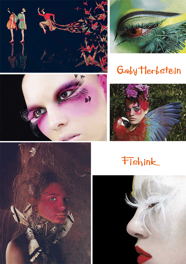
Until 2008 she has been featured in fifteen solo shows, at Art Basel, Art Miami, Chelsea Gallery, Broward Center of Performing Arts, MALBA, Centro Cultural Recoleta, Museo Metropolitano, Palais de Glace, Centro Cultural Borges. She manages to create some dark and strikingly different imagery.
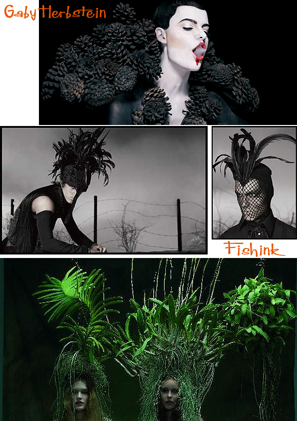

Her personal ventures in the last thirteen years concentrate on issues she cares about – HIV prevention, ecology, assessment of Argentinean aboriginal culture, Argentinean women unrecognized by History, among others – that she shapes in calendars on behalf of different charities. I love this series concentrating on the themes of dreams and childs’ play, what an amazing film this could make.
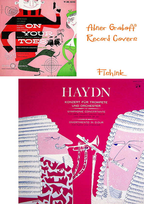
Abner Graboff Continued

I keep coming across illustrations by Abner Graboff that I’ve not seen before. He was such a talented and quirky illustrator that his work just makes me beam. Just look at ‘Blueberry the Bloodhound’ for starters, how can you keep your mouth from smiling !

Or Please Don’t Feed Horace…. I love the doctor in his pinstripe green suit !
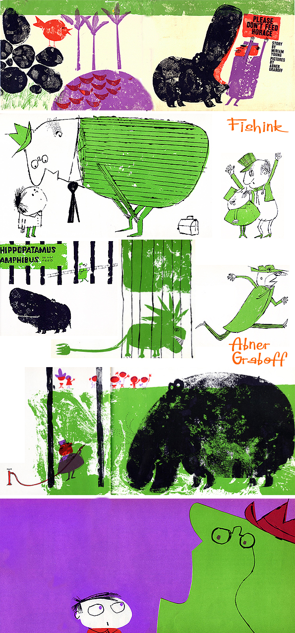
Some sketchy illustrations
Old Macdonald Had A Farm. Illustrated (1969)

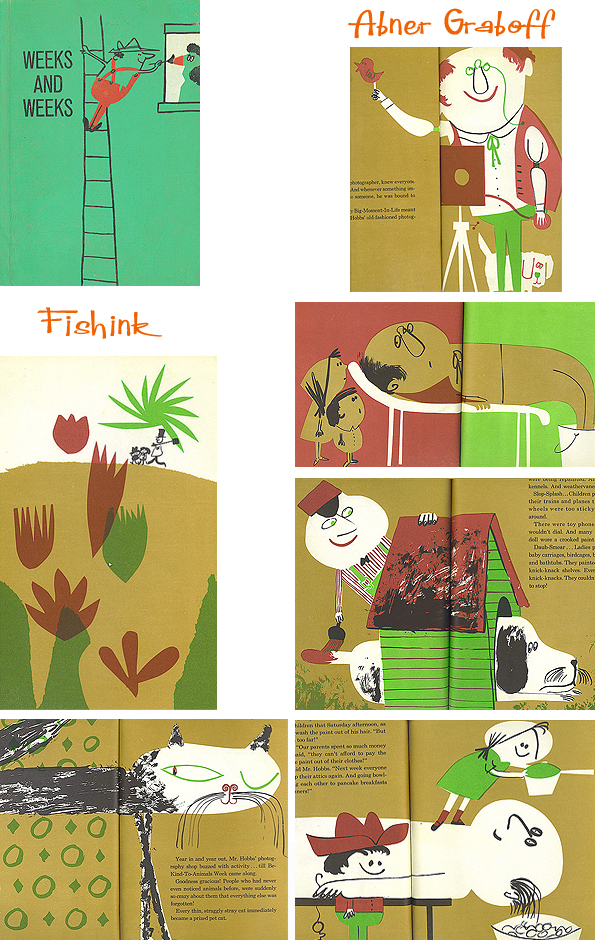
Weeks and Weeks by Mable Watts. (1962)
The Sun Looks Down, by Miriam Schlein (1954)

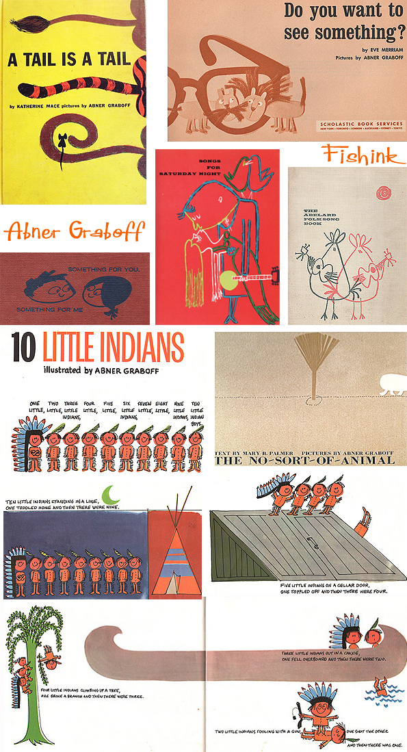
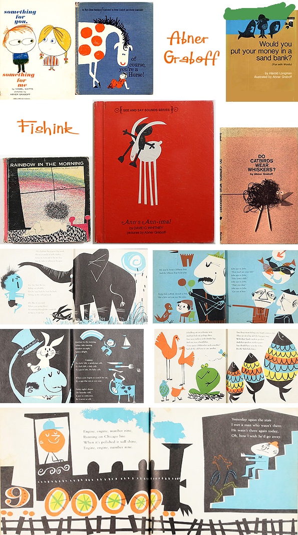


You can find more about Abner from an earlier posting here. Many thanks again to the wonderful Ward Jenkins at Wardomatic for his posts about Abner and for writing up the conversations he had with his son Jon Graboff all about his father’s life history. Thanks also to Stickers and Stuff, henrietta hanks, Aqua Velvet, Book Cover Lover site for their images and constant reminders of his fabulous work.
Fishink Stained Glass Project

You may remember the post on a the talented glass artist and follower of this blog Jane Littlefield.
You may also recall me saying that I was wanting to make a stained glass panel for my home. Well, Jane has very kindly offered to artistically ‘hand-hold’ me through the process and make this dream of mine actually happen. I can’t wait !
To give you a little background on the idea, this is where the panel will go, a selection of the beautiful colours we have to work with (I wanted something with an autumnal theme) and a visual of the final design I’ve developed.
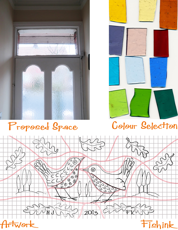
Jane suggested drawing the design out to scale and putting it on a grid to help keep it straight and balanced. The pink lines denote where the cuts in the glass will appear. The actual size will be 80.5 cms in width and 37.4 cms in height, so it’s a fair size. When the weather is good, the sun does stream through the front door and into the hallway, so I’m eagerly anticipating how the colours from the glass will add to the warmth in the space. The walls are presently a dusky cream colour above the dado rail, with more of an orangey-umber hue beneath, so I’m hoping that they should allow the glass colours to enrich the hallway too.

I’ve been working on colourway ideas and last night, (with a little help from my friends) decided on the final idea for what colours will go where.

I guess that the selections are a little literal in terms of the sky being blue and the earth green, but I preferred that as I think you can focus more on the design, rather than wonder why the grass is purple and the sky is orange and green lol. I’ll be off to meet Jane at her studio in about a weeks time so watch this space for more developments. How exciting ! You can catch up with what Jane is up to on her blog here.
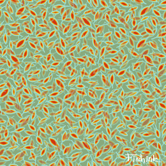
Fishink Textile Designs
I was just playing around with some simple shapes and repeats last week so I thought I’d share some of them with you.
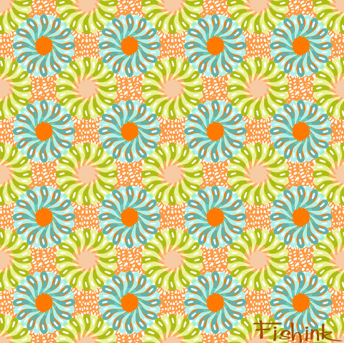


I like the cool summery vibes of this one and looking at the weather outside this might be quite appropriate !
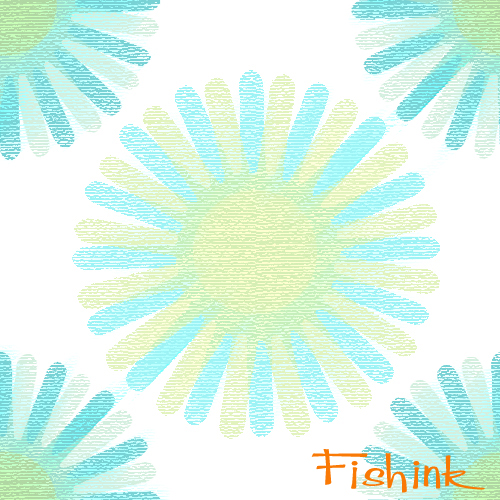

An idea for bedding or curtains too

Here’s how the design would look in repeat.

With a visual so you can see what they might look like. Any thoughts ?

This reminded me of swirling autumnal leaves in the wind or swimming japanese goldfish in a muddy pond lol

And by special request from Sarah, another colour way. I aim to please lol.