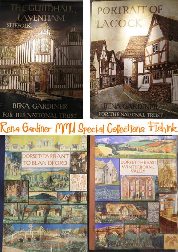
Rena Gardiner at MMU Special Collections
Just a quick reminder that if you are in the Manchester area next Sunday then come and have a look around the Sale
https://saleartstrail.com/christmas-bazaar-2016/exhibitors-christmas-bazaar-2016/

Look forward to seeing you there. For the regular followers you may recall that I’ve spoken on Fishink Blog about
before, also here
Rena Gardiner A lifetime spent Illustrating the English Landscape
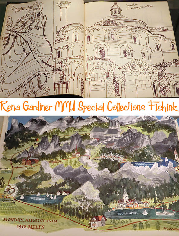
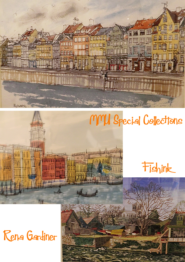
For those of you who managed to get to see the (now ended) exhibition at the MMU Library, Special Collections Gallery that ran for just over two months, you’ll know what a joy it was to see some of Rena’s work, ‘up close and personal’. I was lucky to find the time to pop into Manchester last wet Wednesday, especially to see it, and was very thankful that I had. Sadly it’s very difficult to get decent images with everything being behind glass, but I hope you can see just how beautiful Rena’s illustrations, water colours, lithographs and lino-cuts really are.

Rena Gardiner found a way to reconcile a one-woman industry with mass production without compromising her artistic integrity. She adopted elements of commercial printing but bent them to her purpose, crafting everything herself. She treated a commercial press like a hand press and produced books and prints that were in every sense handmade.
Her work exemplifies the printing process known as autolithography, where the artist draws directly onto the lithographic stone or plate with no intervention of another hand or photography. Rena’s particular contribution to the art was the way she used the commercial press as a creative tool to develop and explore her images and not simply as a means to produce an existing image. It was most unusual for an artist to take on every aspect of organisation and production.

The highlight of the exhibition for me was seeing Rena’s sketchbook and this wonderful collection of holiday paintings.

I would have loved to have seen more inside this sketchpad (above).
Rena’s passion for history, buildings and the landscape emerged early on in her work, and she would pursue these themes for the rest of her life. After completing her studies at Kingston Art School and gaining her teacher’s diploma, her first post was in Leamington Spa. In 1954 she moved to Wareham in Dorset to teach at the Bournemouth School for Girls. She fell in love with the country, which became her home for the rest of her life.
She saw herself as an artist expressing herself primarily through the medium of printmaking. She experimented with book illustration and the craft of making books, and also began to travel abroad where she was influenced by the vibrant colour and architecture of Venice and Rome. This early period saw the maturing of her skill and talent for drawing, painting and printmaking and, in particular, her very personal approach to lithography.

Such attention to detail and a keen eye for the accuracy of what she is drawing too.
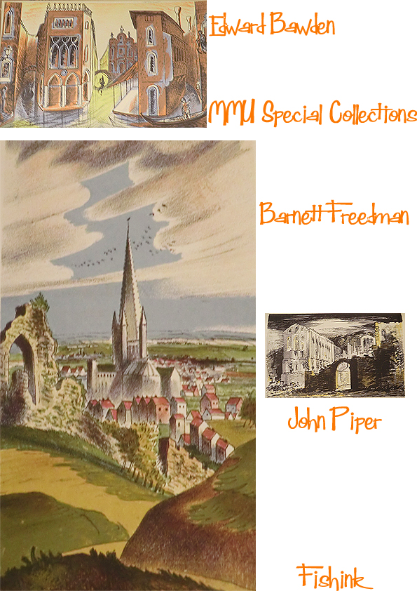
It was the generation of artists who had been establishing their reputation before the War that inspired Rena. Eric Ravilious, Edward Bawden, John Piper, and Barnett Freedman, all of whom made lithographs. Rena visited exhibitions organised by the Recording Britain Scheme initiated by Sir Kenneth Clark as an extension of the Official War Artists Scheme. This featured such artists as Kenneth Rountree, Thomas Hennell, Rowland Hilder, Enid Marx and Barbara Jones. Rena was an avid reader of John Betjeman’s and John Piper’s Shell Guides as well. However she also admired the work of topographical artists of the past such as Thomas Girtin, John Sell Cotman and Thomas Shotter Boys, and the technique of the great lithographers such as Honore Daumier.
Rena was also familiar with the Puffin Picture Books published by Penguin and edited by Noel Carrington, and recognised the influence they had on her own work. Full of brightly coloured and freely drawn illustrations which relied on autolithography for their vitality and economy, they introduced Rena to another group of artists such as Clarke Hutton, Hilary Stebbing, Kathleen Hale and in particular S.R. Badmin.
In 1965, Rena moved into a cottage at Tarrant Monkton, near Blandford Forum, where there was sufficient space to install a commercial printing press. Her book production began to flourish. She established her relationships with the National Trust, Salisbury Cathedral and other clients and by 1970, she was making enough money from the books to give up teaching and concentrate on book production.
She still found time to produce paintings, pastels and drawings of England and abroad. The paintings from France show her particular interest in Romanesque architecture and sculpture. During this period she produced many of her most successful books and mastered her illustrative technique, exemplified by three large-format books on Dorset and the books about Cornwall, starting with Cotehele in 1973.

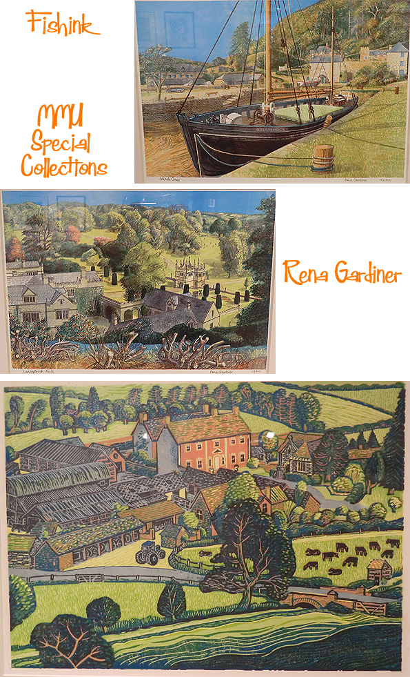
By the time she was in her sixties, Rena found the pressure of book production an increasing burden, and her last new book was produced in 1996. She still worked on reprints and editions of existing books, but wanted to slow down. Rena returned to the art of printmaking and revived her interest in lino cutting. Her subject was her beloved Dorset and she took the opportunity to travel abroad and make prints of Italy and France. In the late 1990’s she spent time in the beautiful surroundings of Cotehele in Corwall and produced a collection of 35 linocuts.


So pleased I finally got to see this exhibition before it ended. Hope those of you who didn’t get there, enjoyed it through my images too.

Thanks to Martin Andrews for some of the information used in this post.
Fishink in Autumn
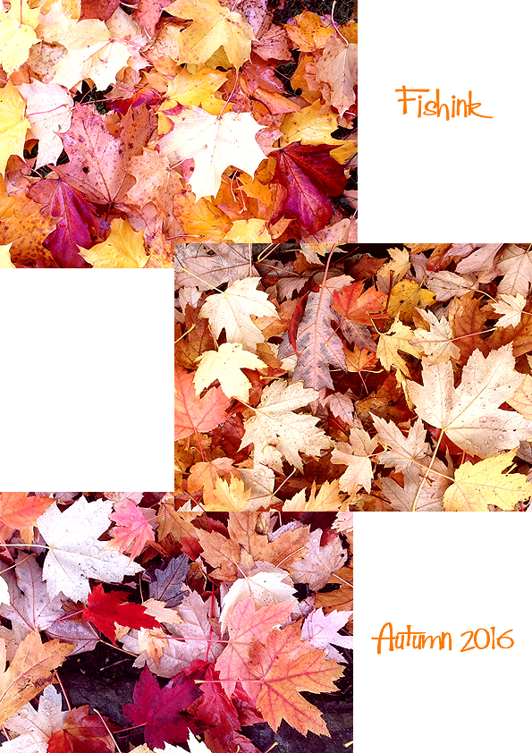
Once again I’ve fallen in love… with Autumn ! The colours have been tremendous lately and if you take a few moments out of your busy day to notice these things, they will surely make you smile too.
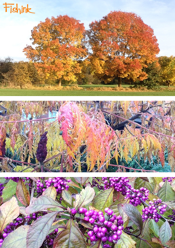
These ‘beauty berries’ (Callicarpa bodinieri Profusion) looked almost unreal in someone’s local garden, and the carpet of leaves are still wonderfully scrunchie and colourful too.
Even Boo (my lurcher), seems to be admiring the views (or is she looking for squirrels?).
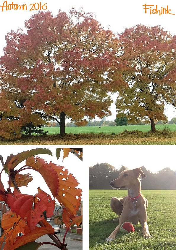
BOO.. are you paying attention ? ….. or just doing your best to blend in with your environment… you autumnal dog!
Talk about Where’s Wally ? …. we often play ‘Spot the Boo’ !
Did I mention that she’s also got her own instagram account called adognamed_boo , so you can now follow her exploits too. Oh for goodness sake !
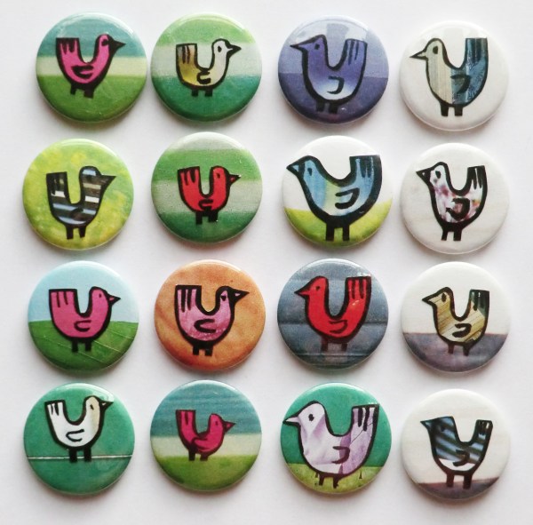
Also in a couple of weeks time I’m taking part in an exciting and not so bizarre Bazaar in Sale, Manchester.

I’ve not been to The Claremont Centre before so it will be great to have a look around and display work with the 40 other exhibitors who will be present on the day…. exciting times. Do pop the date in your diary / tablet /phone and call in, call your friends, spread the word, it’s even free entry !
I’ll have a selection of the following goodies with me on the day.. hope to see you there.


More work on my website here.
Fishink in Edinburgh Part 2
Hi everyone, I’m back here with part 2 of my recent trip to Edinburgh and begin with a morning spent enjoying the Botanics.
The Royal Botanic Garden Edinburgh was established in 1670 and during the 20th century acquired three other Regional Gardens – the mountainous Benmore in Argyll; Dawyck in the wooded hills of the Scottish Borders and Logan on the Gulf Stream-warmed southern peninsula of Dumfries & Galloway. Together they represent one of the world’s largest living collections of plants.
I would highly recommend a visit here, if you have an interest in plants or just like large spacious garden areas and it’s free to enter and wander in most areas.

Plants always fascinate me. I’m completely enthralled by their variety, complexity, shape and colour. I’m never disappointed by what I find inside the green houses.

The shapes often inspire designs, here’s a couple of quick ones I made using the images above.

Inside one of the glasshouses there was a glass exhibition based on the subject of cell structures.
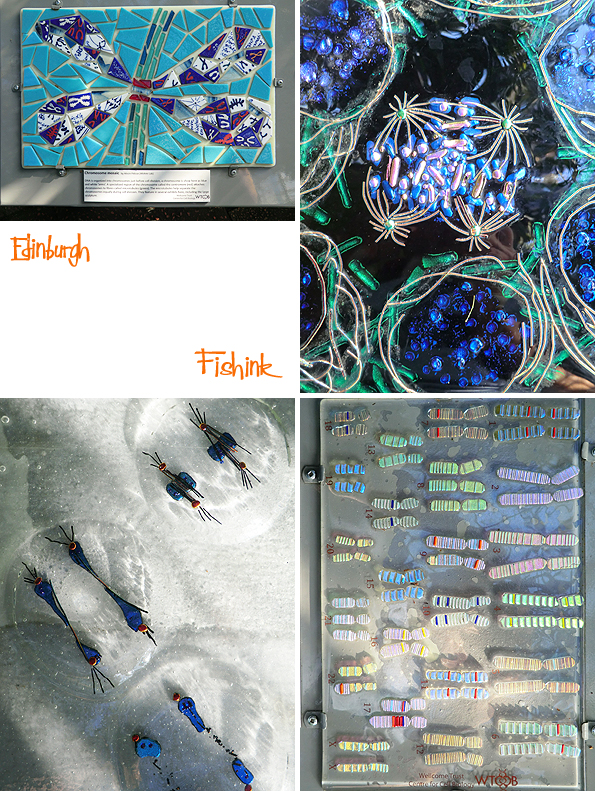
How fab to gaze through the jumbled layers of leaves and see shadows and shapes, all over the place.

Great contrasts in tone and shape don’t you think.
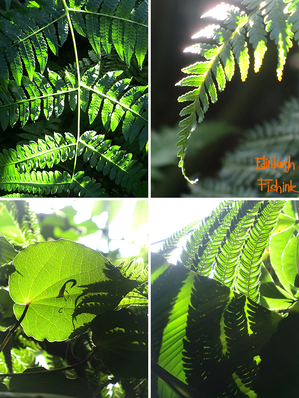
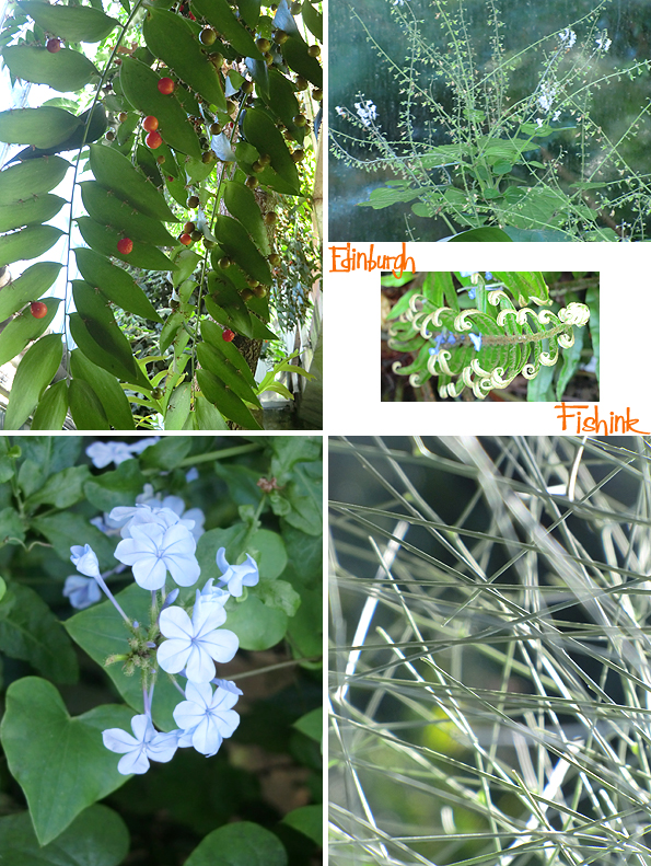
Berries, fronds, flowers and frenzy.
There is even a small Aquarium, with a rather lonely looking Red Mexican Tarantula. Small aquariums always remind me of being a child , when I used to visit the one in Liverpool Museum. I thought it rather curious that all those creatures lived in a room at the museum, also it was probably the first time I had ever seen live seahorse, one of my favourite tanks to visit.

The Botanic Cottage originally stood at the entrance to a long lost incarnation of the Botanics, across the city on Leith Walk. It was built in 1764-5, and designed by the renowned architects John Adam and James Craig. Not only was it the home of the principal gardener, it was also the main entrance to the Garden, and contained a classroom where every medical student was taught botany during the height of the Scottish Enlightenment. After the Garden moved to Inverleith in the early 1820’s, the cottage became a private home, then later offices and a van rental shop. Over the years the street level was raised in front of it, the lime render on its exterior was lost, and by the mid-2000s it had been abandoned and set on fire. Fortunately, a community campaign, working with the Botanics, saved the cottage. It was moved stone by stone across Edinburgh, and rebuilt in our Demonstration Garden, where schools, students and community groups have plots. It was rebuilt with all of the stones and timbers going back in the correct places, and finished so that it looks as good as it did 250 years ago.
I was very impressed as it’s a beautiful building…. both outside and in.

The gardens around it are filled with all manner of flowers and vegetables. As wonderful to photograph as they are to walk around.

Again being lucky with the sunny weather in October was a huge help.

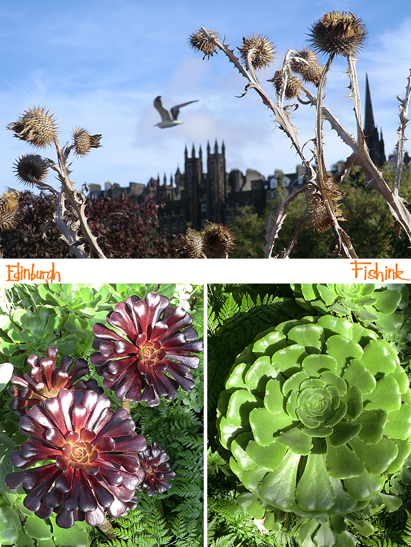
I was surprised just how much late colour was still around.


This poppy flower really caught my designers eye.

I think it makes a lovely repeat pattern !

Inside the Botanic Cottage was an exhibition of some of the many varieties of apple with a Scottish association. Colour, shape, smell and tastes all to compare.

Here’s a small sample of the work currently in the exhibiton at Inverleith House, (apologies, I didn’t capture the artists details).
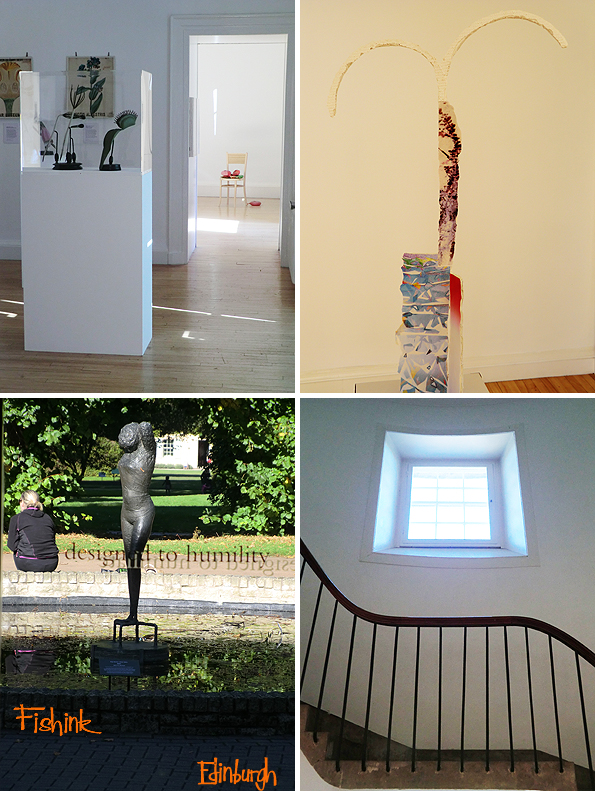
I did think these were quite fun.

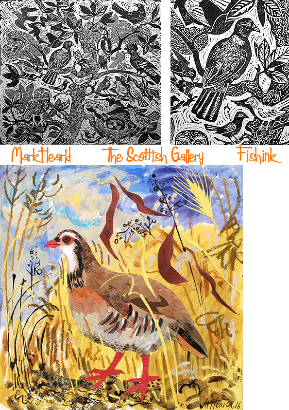
A quick mention that the Mark Hearld solo exhibition was on last month over at the Scottish Gallery. Sadly not whilst I was there.
Some great illustrations as usual.


I hope you enjoyed visiting Edinburgh with me : ) Where have you been inspired by lately ?
Save
Fishink in Edinburgh Part 1
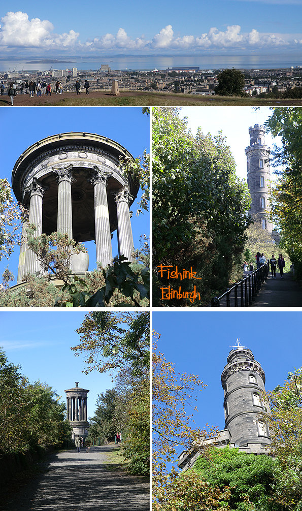
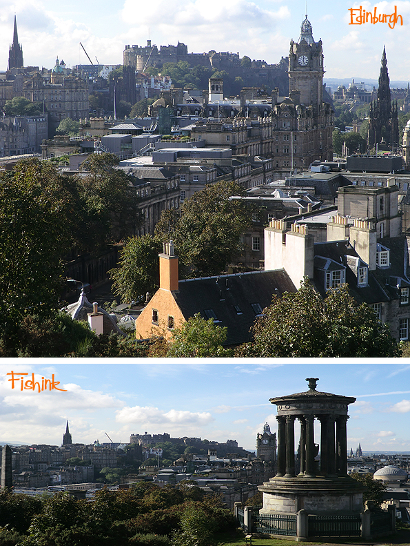
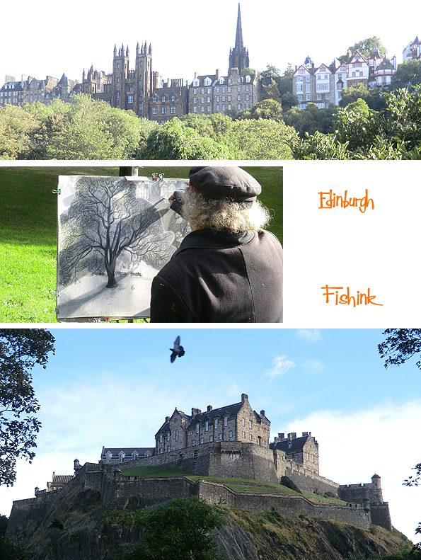
A couple of weeks ago I had the opportunity to spend a long weekend in Edinburgh, I didn’t need to think twice as to whether to go or not. It’s a beautiful city, and I was lucky to see it in such amazing light too. Here we are, standing high on Calton Hill, with views out over the Firth of Forth, Scottish Parliament and Arthur’s Seat. What views!
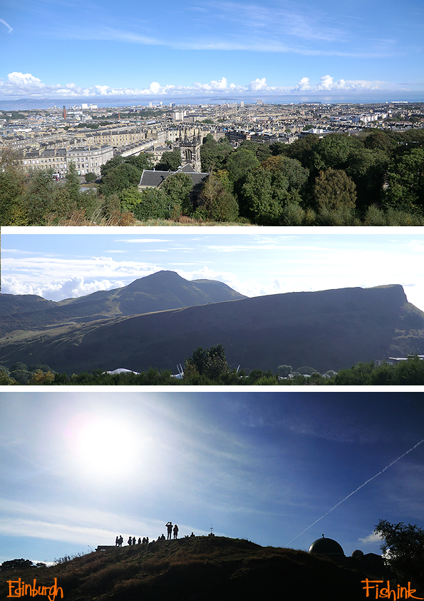
As you can see it’s popular with the tourists, who clamber all over the National Monument of Scotland.
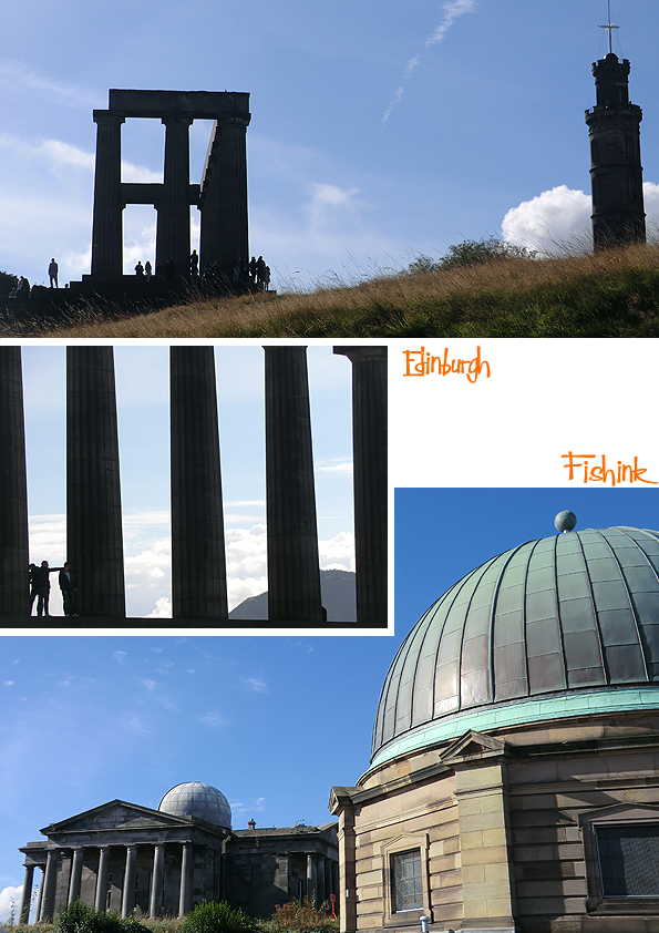
In 1724 the Town Council of Edinburgh purchased Calton Hill, making it one of Britain’s first public parks. The monuments and buildings date from the 1760’s to the 1820’s and relate to a period known as the ‘Scottish Enlightenment’, a time of great artistic, literary and scientific advances.
One of the leading figures of the Enlightenment was the philosopher David Hume, who was responsible for lobbying the Town Council to build ‘public walks or roads for the health and amusement of the inhabitants’ on Calton Hill. You can still stroll along Hume Walk, there, named in his honour.
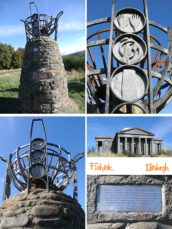
Wonderful for views over the city and up to Edinburgh Castle too.
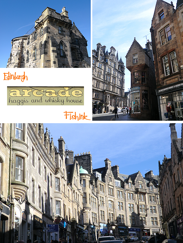
There is some beautiful architecture around the city, often with quirky details.
The Fruitmarket Gallery had an exhibition on by Mexican artist Damián Ortega, with a couple of interesting clay hangings.
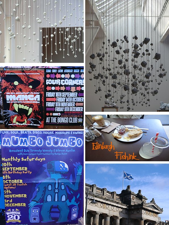
Over the road in the City Art Centre, I noticed a great mural in their cafe.
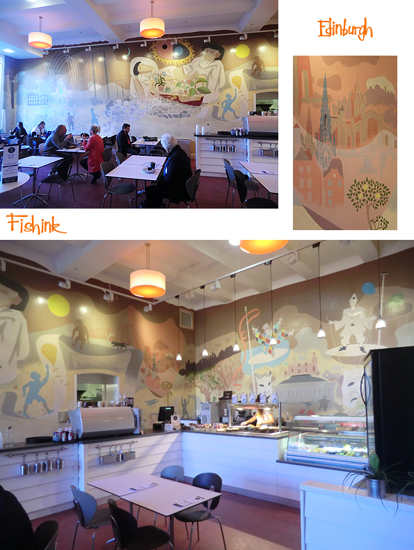
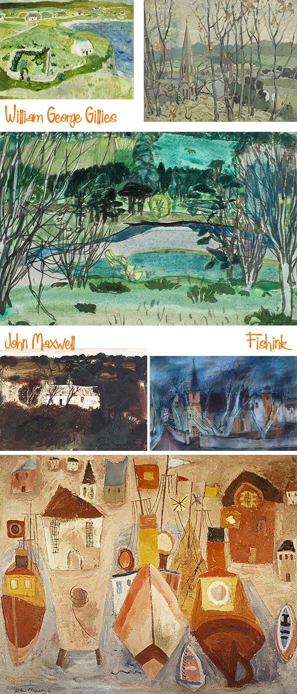
The current exhibition, featuring the work of William George Gillies and John Maxwell, sadly finished on October 23rd.
I couldn’t believe how wonderful the weather was for the start of October. Even saw this artist (reliably informed it is Michael McVeigh) drawing outside in the Princes Street Gardens.
Next week I’ll show you part 2 of my trip with more images from the Botanical Gardens.
Fishink at the Great Northern Contemporary Craft Fair Part 2

Hi everyone, following on from last monday’s post and part 1 of this years GNCCF review. Here is part 2 !
We start with some hand-built clay work based on natural forms by ceramic artist Anne Haworth. Looking like a great find from the seashore, but created by casting dozens of Romanesca Cauliflower florets and molding them onto a larger pot form. Anne must have great patience and also a keen eye for symmetry.

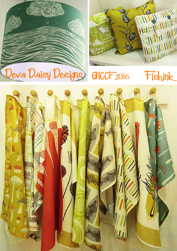
Deva Daisy Designs is a pure treasure trove of 1950’s love. The designs are all created by Deva Booth, mixing Scandinavian inspired themes with a cool, calm retro palette. Hand printed here in Manchester, snap up a tea towel today.
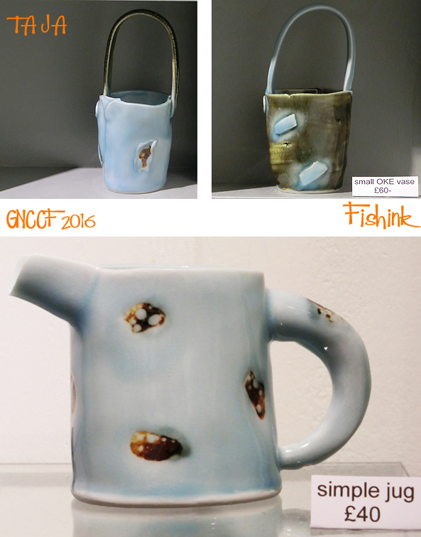
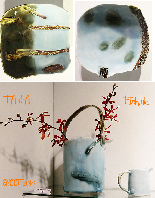
When it comes to the essence of ‘cool’ , the first of my ‘best in show’ awards must go to Devon based company TAJA. This Japanese ceramist was inspired by tiles he had seen at a Japanese airport, then applied for help from the Arts Council and spent months of experimenting to create this delicate blue glaze. I love it’s pool like qualities and I’m sure there a fish swimming around on that bottom pot ! No wonder I like them lol
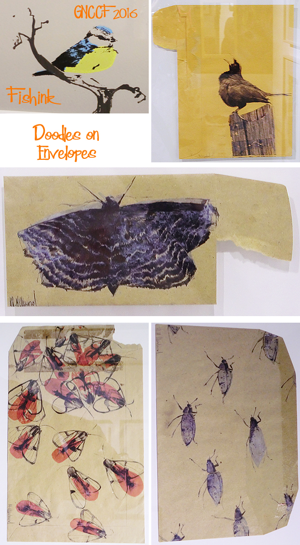
Some lovely illustration work from artist Mandy Cleveland. Her hand drawn, individual style appears on used old brown envelopes. Such a beautiful way to capture a fleeting moment.
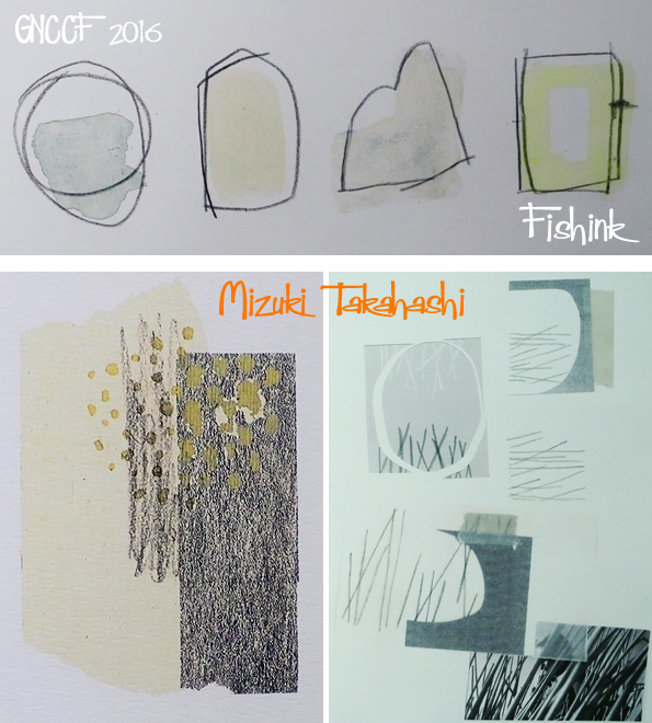
My second ‘best in show’ award goes to the serene work by another Japanese artist, Mizuki Takahashi. (For some reason I can’t get her website to link but it’s http://www.mizukitakahashi.co.uk ). I was enthralled by her mark making and the chaos and calm that flowed through her jewellery and drawings.

Chatting to Mizuki, she told me that she also had a love of 1950’s, I thought her art would work well in a contemporary children’s book, anyone else think so too ?
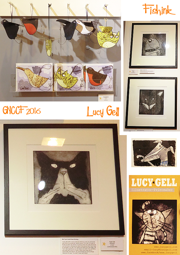
For sheer fun and amusement, I also loved the work of Printmaker and Illustrator Lucy Gell. Again with a lurcher like Boo (my faithful friend) I can’t help but wonder why I like these so much lol.

Also a lovely range of 3-d bird cards too!
Talented jeweller Jo Lavelle was showing some ‘clusterful’ new work. Silver made sublime.

Nature inspired jewellery from another talented designer Cathy Newell Price. Cathy’s work often tells a story of a seaside walk or the changing seasons. It’s no surprise that her degree was in Plant Science ! Beautiful tiny sculptured pieces, that my photos can’t possibly do real justice to.

More amusing animal forms from leather bag designer and creative director Lee Mattocks. In the future, Lee was telling me that parts for his range of bags will be available to order separately online, so that if a piece wears out or you want a different colour, you can replace it and make your personal bag bespoke to you alone… how exciting.
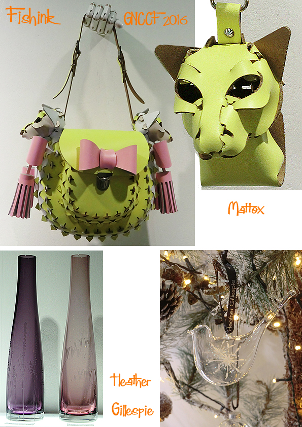
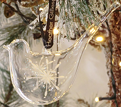
Heather Gillespie was showing a delicate range of hand engraved glass tea ware.

I particularly liked her bird shaped christmas decorations.

More birds and vases from Ela Niznik. Her range of handmade, unglazed porcelain objects of sentiment, featured images and motifs inspired from mementos of the past. A clever accident that this bird found an eye using a window on a Victorian book engraving. Lovely cut out ferns and flowers using old sheet music too.
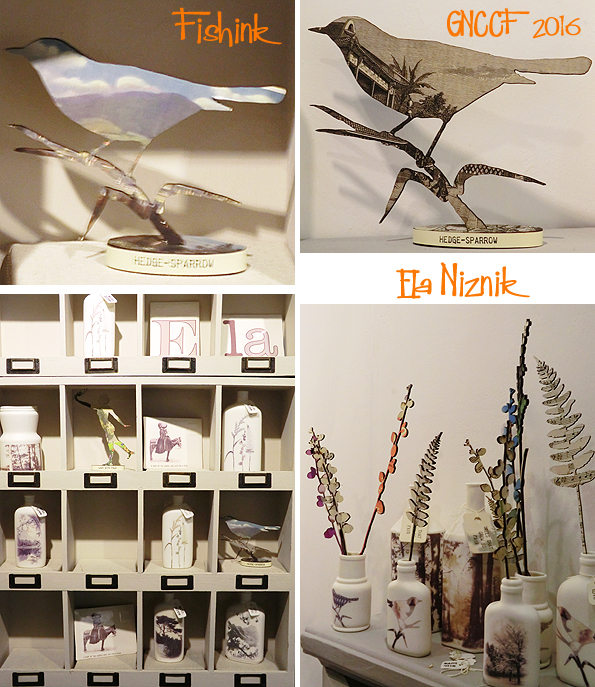
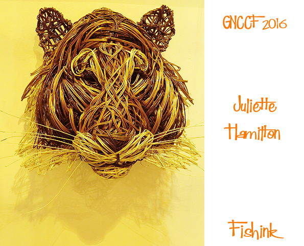
This majestic tiger from willow weaver Juliette (http://juliettehamiltondesign.com/).
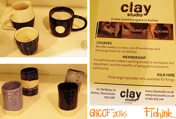
Also if you’re looking to start some ceramics for yourself in the Manchester area, check out ‘ Clay Studio‘ in Hulme. They do all kinds of courses and workshops with friendly and very experienced staff. Tell Robert I sent you : )
Fishink at the Great Northern Contemporary Craft Fair 2016 Part 1
Wow has it been a year already since the last Great Northern Contemporary Craft Fair , I don’t know where the time goes, but I do know where the beautiful designers hang out… read on to discover for yourselves : )
As usual I try to cover the new designers I come across with work that catches my eye for one reason or another. One such person was ceramist Jasmine Simpson with a new range of lions, dogs and birds.
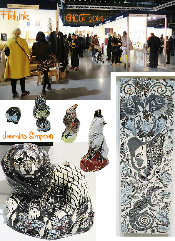
I loved her curled up watercoloured fox (below) and her anxious lions and slightly starey looking dogs, best of all.

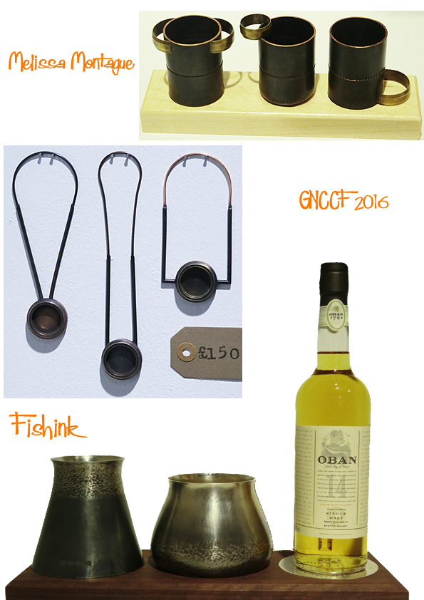
Melissa Montague had an interesting range of metallic objects, some functional, some decorative.
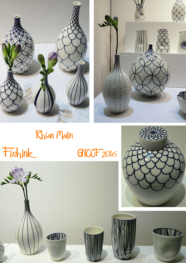
I watched Rhian Malin patiently draw out the design in pencil onto her pot, before creating these intricate designs with blue glaze, all with such a steady hand. Simplistic, stylish and sophisticated. The stand looked great.
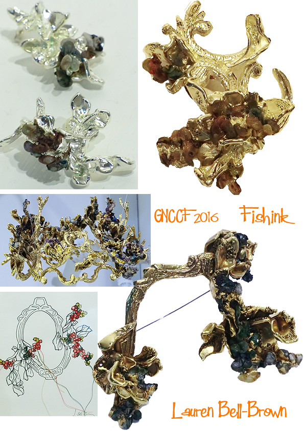
More ornate and beautifully stylish jewellery from fresh graduate Lauren Bell Brown. Based on the fairy tale of Sleeping Beauty, many pieces hold a combination of the dark and light sides of the tale. Hidden hearts and skulls, lie within the pieces and of course the crowns and mirrors remind us who is the fairest jewellery designer of them all ! ; )
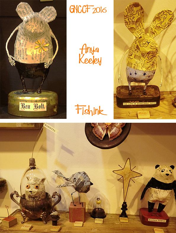
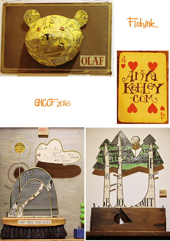
I have previously included work by the talented mixed media, papier-mache artist Anya Keeley but I find I’m always drawn to her stand to see what’s new and more importantly ‘Who’ is new! This year Olaf caught my eye and made me smile… so thanks to Anya and Olaf for that.
I spotted a few linear pieces from jeweller Holly Higgins. Inspired from research on pattern and line drawings Holly’s work has moved into silver 3-d form.

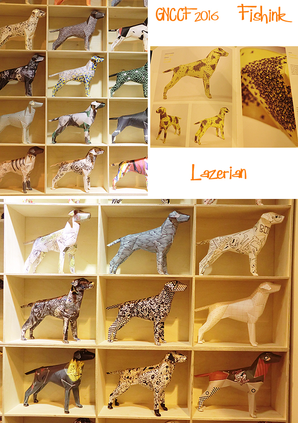
Finally in this post was fanatical paper dog maker Liam Hopkins trading as Lazerian. Liam has created a limited edition range of this fine looking hound in many differently designed ‘coats’ . They looked amazing all together.
More to come in next monday’s post. Tell me which work you like the best and why. Watch this space.
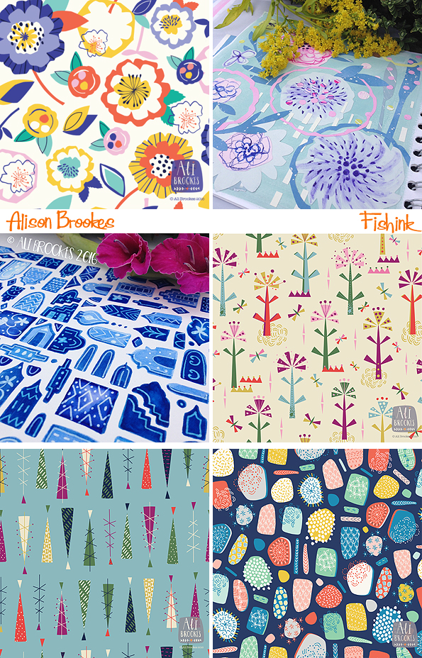
Alison Brookes Talented textile designer
I’m delighted to give my blog space over to a talented designer for this week’s post. I met our guest artist, Alison Brookes many years ago when recruiting freelance designers to work for different sectors of the textile/ interiors and gift-ware markets. I have always been impressed by her professionalism, organisational skills and of course her beautiful textile design work. We recently rediscovered one another through social media, and it’s been great catching up on the time in between. So without further ado.. Ali please take it away!
Hello! I’m Ali, and I’m a Surface Pattern Designer from Northamptonshire, England.
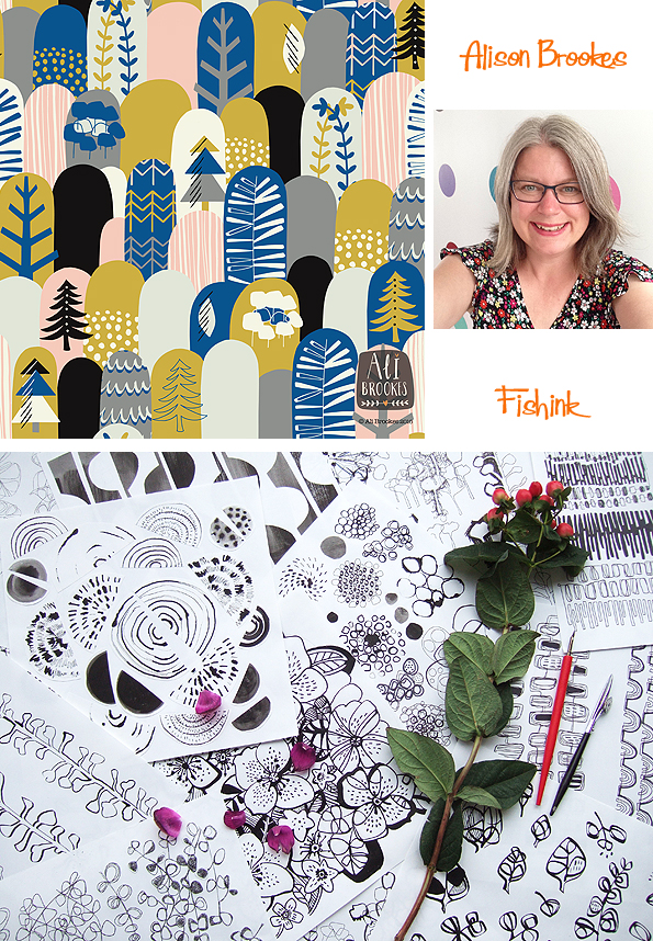
I’m a curious person with the habits of a magpie, and I like nothing more than a colourful image. I loved drawing as a child, but I probably loved fabric more. There is something about patterned fabric that sets my heart a flutter. So it wasn’t a surprise to my family that I followed my heart and studied for a degree in Textile Design at Derby University in the mid to late 90s.
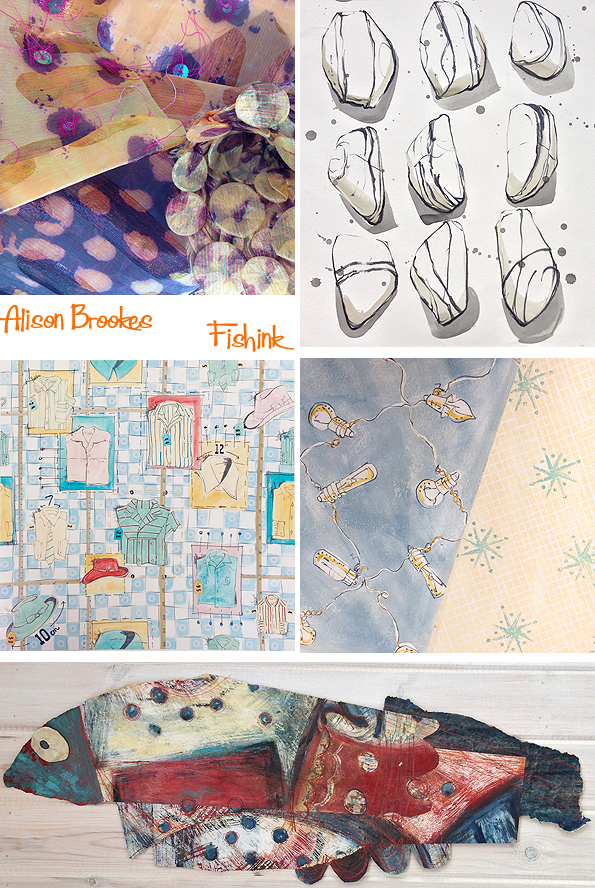
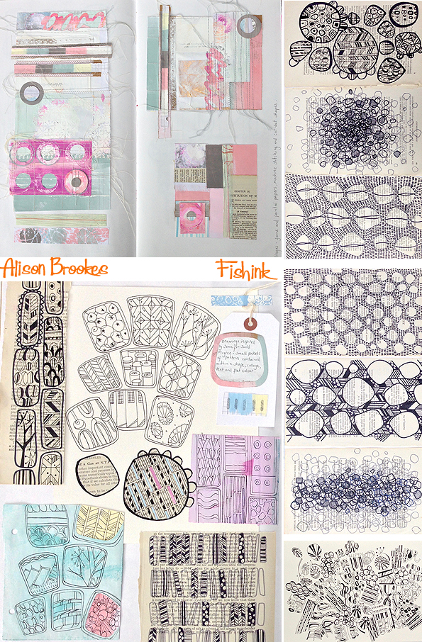
I loved the freedom that my degree offered and the time to develop into a designer. It allowed me to experiment, take risks and think about things in a different way. This approach is probably why when I left university I had developed a range of styles. I love combining various media and techniques: collage, machine embroidery and painting.
The design influences forged at university have stayed with me throughout my design career. I have collected new ones along the way, but I’m still a big fan of 50’s design, particularly anything by Lucienne Day. I still admire Paul Klee, Rothko and Tricia Guild for their use of colour. Also, I was fascinated by how Annora Spence and Mary Fedden painted and how they composed their images. Today, I love how social media sites like Pinterest have opened up instant avenues of inspiration and the discovery of new designers and artists that would have taken years to find otherwise.
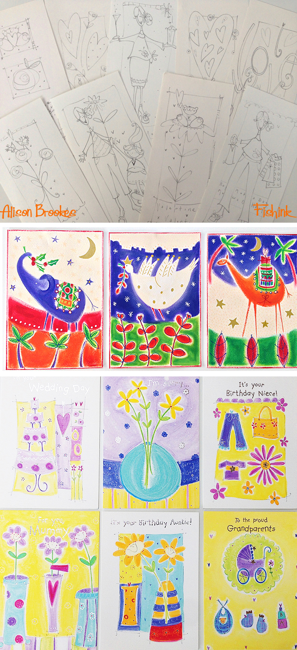
After university, I started working at a local college, teaching visual studies to interior design students. At the same time, I got my first freelancing gig through Craig. He was working for a company that had started up a freelance division, and through him, I sold my work to the stationery industry, notably Paper Rose, and interior companies. One memorable project was designing a child’s duvet cover that had to be hand-painted to 100% size. (It was big!)
My next job was working in a studio at a company that produced transfers for the glass and ceramic industries. Here I worked with some of the industries oldest and greatest companies such as Royal Worcester and Denby. I learnt a lot about screen-printing, which has influenced my design process today. I also gained an appreciation of ceramics and their role in history.
The next phase of my life was being a full time mother to my three children, and my design career was put on hold. However, I never stopped looking for inspiration, and I took up knitting to fulfill the creative gap left by leaving my career – I knitted a lot of socks when my kids were small, and my children have an appreciation for a good yarn shop! I found that knitting could be put down at a moments notice to attend to the myriad needs of numerous small children, whereas drawing cannot.
However, it was during this time that I found an unexpected path that has led me to where I’m today. I never thought I could return to my design career and fit it into family life. Teaching was something I had always considered, and I started working at a Montessori nursery school where my son attended. Soon I had taken over the responsibility of the creative areas in the nursery. I love how young children are spontaneous, and nothing is a problem when it comes to creativity. Then came a stint at a local secondary school in their art faculty, which morphed into an artist-in-residency position. There is something intoxicating about the smell of an art room, and I knew as I started working with these teenagers that I still wanted to design. I loved helping and teaching the students, but I didn’t want to become a full-time teacher, I wanted to be at the end where the kids were: creating.
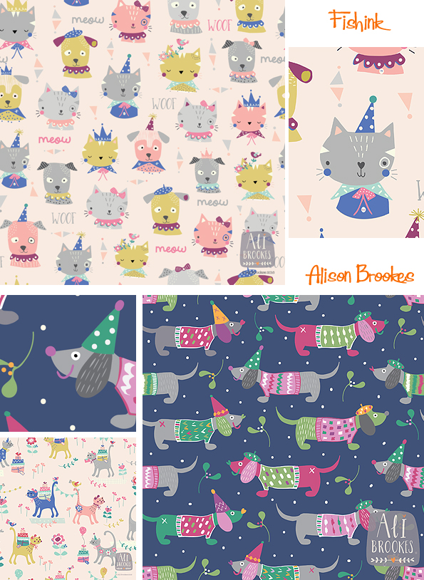
The industry that I had left was now unrecognizable from the one I had previously known. Even the job title had changed! Was I a textile designer or a surface pattern designer? I opted for the latter. In the age of digital design, my patterns could be reproduced on any surface, not just fabric. In the relatively short time, I had been absent the world had changed. Computers, the Internet, social media, and selling sites such as Esty had made their appearance. I had little computer experience and zero social media know-how, and what was a Wacom tablet for heaven’s sake. I didn’t even have a Facebook account until February of this year – I know, I joined the party late!
I embraced these changes and used the Internet to search for an answer to how I was going to update my skills. I joined Skillshare and did a few online courses such as Jessica Swift’s Pattern Camp and one of Rachael Taylor’s The Art and Business of Surface Pattern Design courses, found my ‘tribe’ on Facebook, and started showing my work on Instagram. I still begin a project by drawing, but I love using the computer to put everything together into a pattern. I like the speedy nature a computer gives to changing layouts and colour choices – the possibilities are endless. I love designing in repeat. It’s like doing a complicated puzzle, and I relish the challenge of trying to fit everything together in a pleasing and harmonious way.
One of my favourite parts of the design process is the initial brainstorming of ideas, and I have folders stuffed full of ideas for future projects, which I update regularly. I draw every day and squirrel everything away in sketchbooks and envelopes, including any mistakes, as I never know when they might come in handy. I often find the unexpected in the mundane. At the moment, I have a fascination with the rear brake lights of cars. I’ve not quite reached the design stage yet, as gleaning the images are quite tricky when you’re driving. My children have got used to me shouting, “Quick! Pass me my phone,” when we are sitting in traffic. Or, “Take a picture of that car in front!”
So what’s next? My new website will be online shortly, and I will be approaching agents with the intention of establishing new working relationships. Continuing to discover the complexities of Illustrator and Photoshop every day and building up collections of patterns is an ongoing process, and at some point, I will be working on some one-off collage pieces. Oh, and I’m moving from working at the kitchen table and into my studio, aka the garden shed, because everybody has got fed up with finding bits of paper in their dinner !
Many thanks to Ali for agreeing to treat us all to a viewing of her wonderful work (readers I’m sure you’ll agree ). Please leave her your thoughts below and I want to wish her the best of luck for the design path that lies ahead. Do keep us posted Ali.
You can check out more of Ali’s beautiful work on her Facebook Page or over on Instagram and don’t forget to follow her too.
Esso. Put a Tiger in your tank !

For those of you who saw and liked my post about oil company Shell …
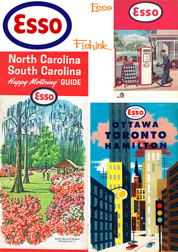
Here’s a little about one of their competitors … Esso. The company began in 1880 in London, Ontario, when 16 refiners created the Imperial Oil Company. In 1898 Standard Oil of New Jersey (now Exxon Mobil Corporation) acquired a majority interest in Imperial. In the 1900’s, Standard Oil of New Jersey started marketing its products under the brand name ‘Esso’, which is the phonetic pronunciation of the initials ‘S’ and ‘O’ in Standard Oil. Application for the Esso trademark was filed in 1923 and the Esso oval was introduced in the 1930’s as a sign of quality and a symbol of service. Since then, the Esso name and oval have been used continuously in Canada and over 50 other countries.

In 1936, Esso sponsored the first national radio broadcast of an National Hockey League (NHL) game. In 1940, Esso sponsored overseas transmissions of hockey games for Canadians serving in WWII. By 1950, three million Canadians were listening to Esso hockey broadcasts each week. In 1952, Esso expanded its sponsorship to include television broadcasts.
As usual with these successful brands, alongside the campaigns… comes wonderful illustration, visuals and ideas.
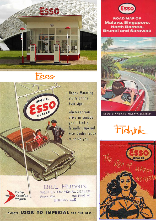
As early as the 1930’s, ‘motoring’ was becoming ever more popular. In 1935, Imperial produced free road maps for customers and also gave out free colouring books to keep kids entertained on road trips. Today, thousands of Esso customers use the online Fuel Finder to help them on their journeys.
The tiger first appeared as a mascot for the Esso brand in Norway around the turn of the 20th century. He surfaced again in the 1950’s, when Esso started using it to represent quality and power. Thanks to the now famous advertising phrase, “Put a tiger in your tank”, the Esso tiger became extremely popular in Canada in the 1960’s and was featured in numerous ads, jingles, and TV commercials. After a 27-year hiatus, the Esso tiger once again earned his stripes in the 1990’s.


Whilst some of us Brits link the tiger with Kellogs and their Frosties advertising.

I’m not certain (time-wise) where the friendly oil drop came from but it’s another winner in my eyes.

As a company with such a close association with the tiger, Imperial, together with our parent company, Exxon Mobil Corporation, was instrumental in establishing the Save The Tiger Fund in 1995. Today, Exxon Mobil Corporation contributes $1 million a year to help conserve Asia’s remaining wild tigers.
Another trip down memory lane for some, and a totally new experience for others, let me know which it was for you.
Bernice Myers Talented mid-century Illustrator of children’s books

I’d like to refresh your eyes with a little from an old favourite Bernice Myers. Also…
Anyone familiar with the children’s books illustrated by the mid century artist Bernice Myers like The Four Musicians, Bunny Button etc , may not have seen her science based ‘ All Around ‘ series of books. This is her more usual style.

I discovered her other style whilst browsing on Flickr and started collecting the range of books she illustrated with the text supplied by Tillie S Pine and Joseph Levine. Here’s a few of the titles I have already. I love their simple style and colourful, humourous characters. Most of the books feature two colours and black to show off the fun images.

I’ve taken some images from each of the books for your to marvel at. Starting with Friction All Around.


Electricity All Around.

Air All Around.

Sounds and Magnets All Around.


Heat All Around.

Gravity All Around.


Water All Around.


Light All Around.


A superb collection of quirky and informative illustrations, that I’m sure would captivate children and adults alike even today.
I did get in touch with Bernice who told me that she was flattered to be featured on my blog. How great is that !! She also mentioned that the work you see above, helped her to pass a test for a Ford Foundation Scholarship, where she learnt enough to go for a specially created college degree. Some 60 books later and she’s still working !
Superb work Bernice, I still have a couple of books in the series to go for the set but I’m getting there.
What’s new Pussycat ?
There’s quite a few ‘must see’ exhibitions already on, or coming up in the next few weeks. Whether I’ll get to many is another matter. as I’m frantically busy doing a new course at a local university for the next few weekends, but if anyone else does make it to any of the following, be sure to give me a rundown : )
Let’s start with something that has been on since early July and that’s the John Moores Painting Prize 2016 which is on in Liverpool at the beautiful Walker Art Gallery, 9th July until 27th November. Thanks to my good friend Gill, who took some photos when she went recently, so we could share a flavour of it.

Does anyone else think of Hockney when they see these reclining figures ?
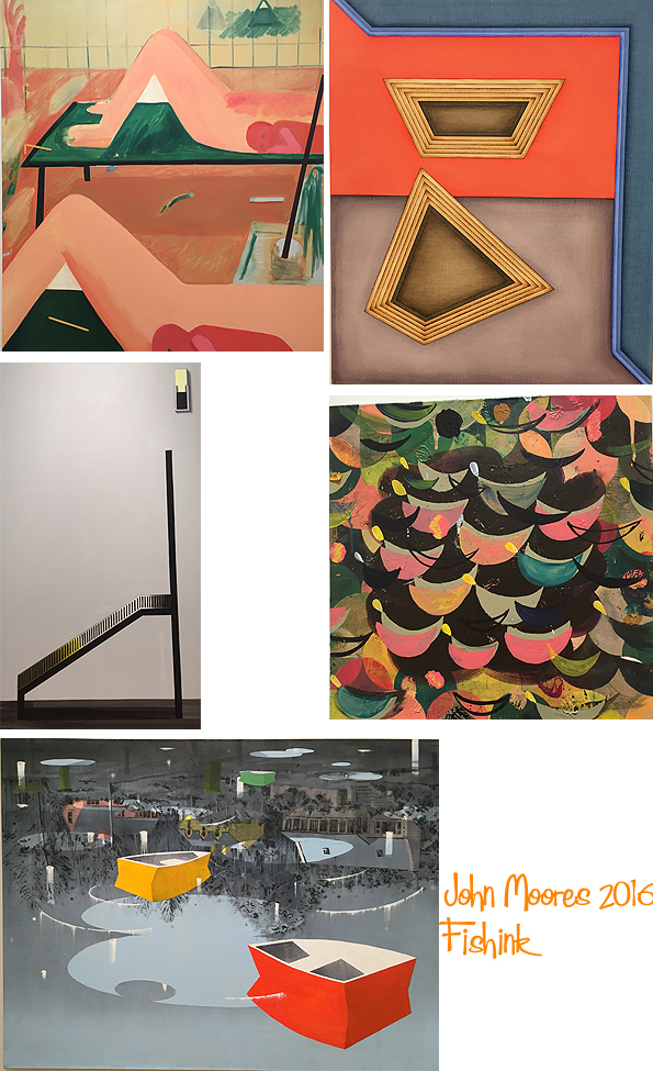
I love the floating boats here.
Hopping further north to Edinburgh, to the Scottish Gallery‘s Exhibition of Michael McVeigh’s whimsical work. Perhaps my northern friends will be popping into that one. Eh Rick, Carys, Mel, Eileen and Jess ?

I’m thinking Grandma Moses, Alfred Wallis and a tiny smattering of Chagall here : )


A great range of work here, from drawings, to etchings and paintings.
Next we move closer to home and what I’m hoping will be a beautiful collection of the work of
Rena Gardiner A lifetime spent Illustrating the English Landscape
This is on at Manchester Metropolitan University 12th September until 18th November. Well worth a gander.

Finally for today there’s the beautiful Great Northern Contemporary Craft Fair taking place between 7th and 9th October 2016. It’s here again at the end of Quay Street, a few meters from the junction with Gartside Street, accessible from Deansgate in Manchester city centre. More amazing design work to come !
These alone from Deva Booth would be reason enough to go lol. Enjoy you lucky people. Apologies to all our overseas readers to tempt you in such a way : )


