Heaton Sparks Fire Festival
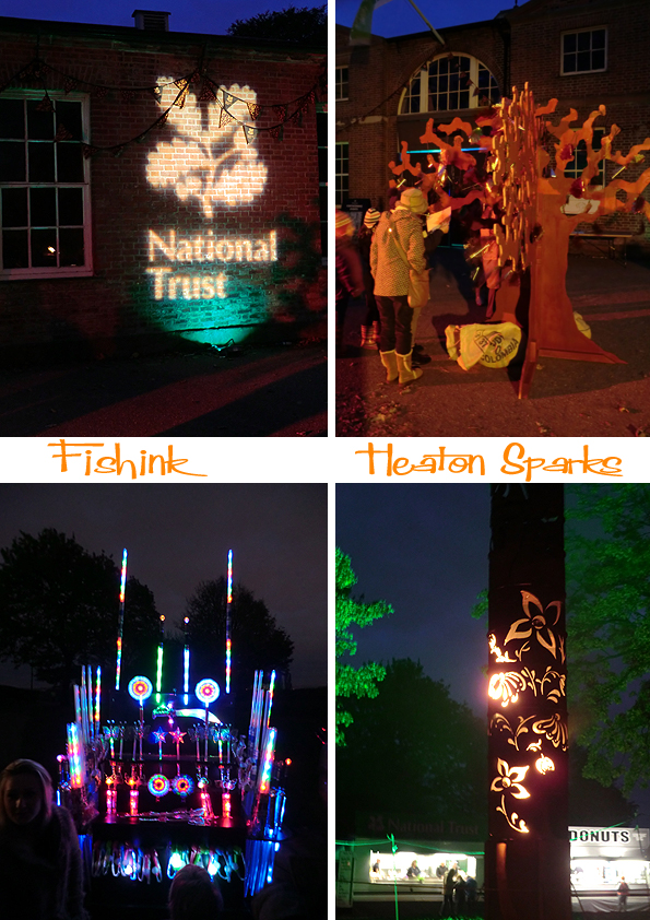
I was lucky to see a tweet about a local event outside of Manchester. It was called Heaton Sparks and had been organised by the National Trust and a creative force of artists, theatre makers, pyrotechnicians called Walk The Plank.
We were greeted by the ringmaster / Lady of the Manor who welcomed us to the event and led us through a gateway and into the garden of fiery delights.
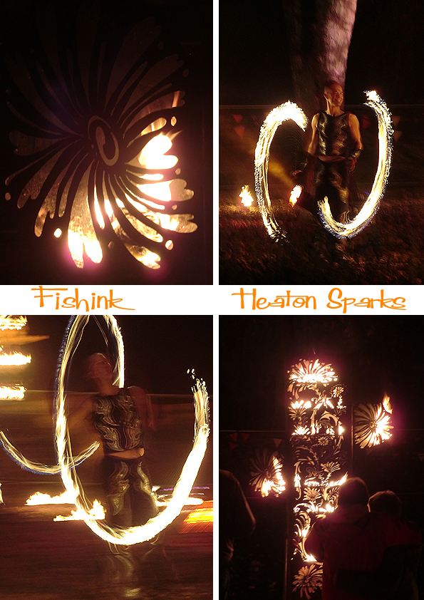
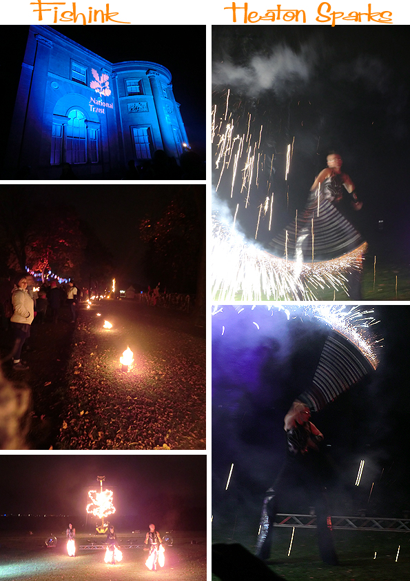
In the garden were a huge collection of large metal carved brasiers and primeval looking fire spurting plants. There was a team of five, extremely acrobatic and talented pyromaniacs, filling the air with the small of kerosene and our eyes with a myriad of fire-drawn shapes in the night air. It was quite magical.
I really liked some of these motion blurry images.
There was additional lighting, lanterns and sound effects creating a mystical and dreamlike atmosphere. It was the first time, for a long time as an adult, that I really felt a childhood sense of excitement, how rare lol
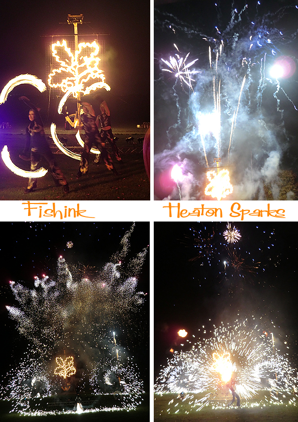
The performers went on for about an hour and then we were led (as a group of about 100 people) to a space in front of the hall at Heaton Park, and the grand finale began !
It really was quite a special evening and was sooo cold that the warm scarves, gloves and extra layers of clothing were all the more welcome (and necessary).
Thanks to everyone involved in making this an amazing event. I hope there’s a repeat performance next year. Happy 5th November everyone !
The John Moores Painting Prize and China Exhibition 2012 at the Walker Art Gallery Liverpool
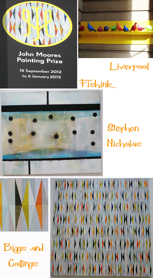
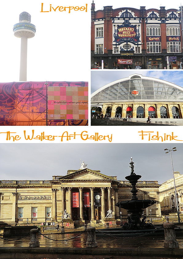
This is the second blog from my trip to liverpool this week. Predominately to see the John Moores Painting Prize and Painting Prize China Exhibition which is on now until January 6th at the Walker Art Gallery, Liverpool. As usual there was a wide range of artists work. These are some of my favourites. Sadly the pigeons outside weren’t part of the show !
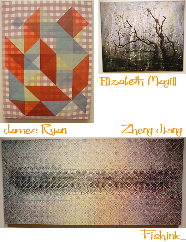
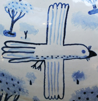
Although Sarah Pickstone’s Piece won the show, I thought there were better pieces in the running, sorry Sarah. Like Damien Meade’s haunting ‘Talcum’ and I loved the stunning colours and ‘Festival of Britain feel’ from Biggs and Collings.
Lovely texture and colour, painstakingly painted by Zheng Jiang.
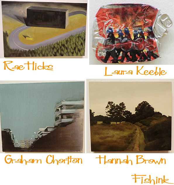
The charming realist work by Hannah Brown, the striking viewpoint of Graham Chorlton and the unusual, yet familiar, canvas from Laura Keeble all caught my eye.
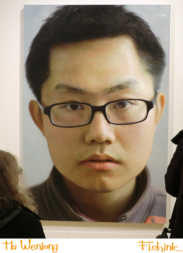
But for me this stunning photo realist portrait by Hu Wenlong, literally stole away my breath. It’s called ‘Aphasia’, (an impairment of language ability). I would have chosen this painting as my first choice and if I was judging the show from the perspective as to which piece I would gladly hang on my wall, I would have picked the Biggs and Collings. What would you have chosen ?
There’s over sixty exhibiting artists in both exhibitions more about them here.
Plenty more to see in Liverpool for a great day out. She loves You, Yeah Yeah Yeah !
Fishink in Liverpool, The Bluecoat Display Centre
I want to start this post by saying hello to all the readers from America, particularly the NY and East Coast regions that have been struck by the effects of the Hurricane. Our thoughts are with you and I hope all is well.
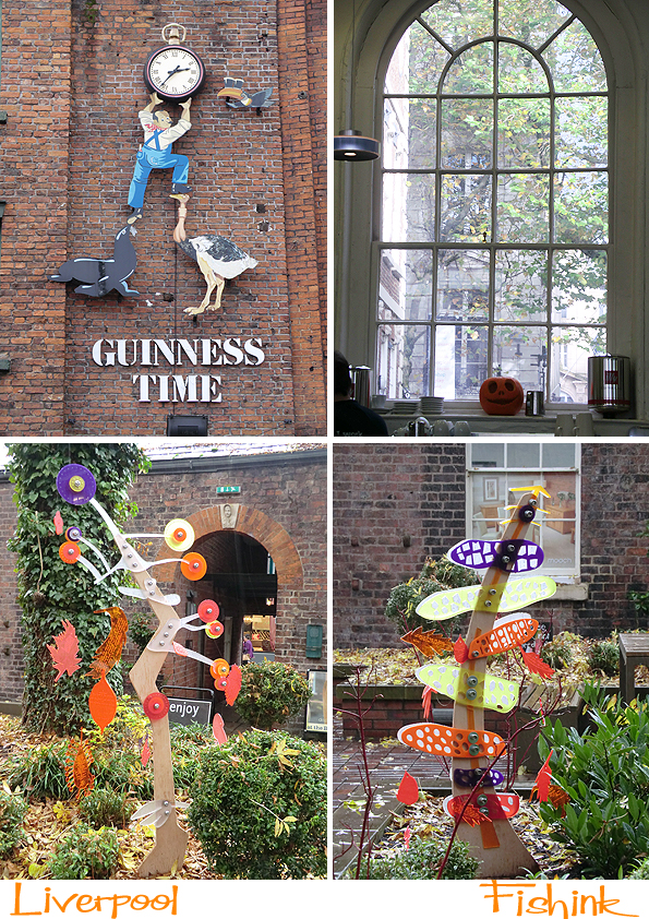
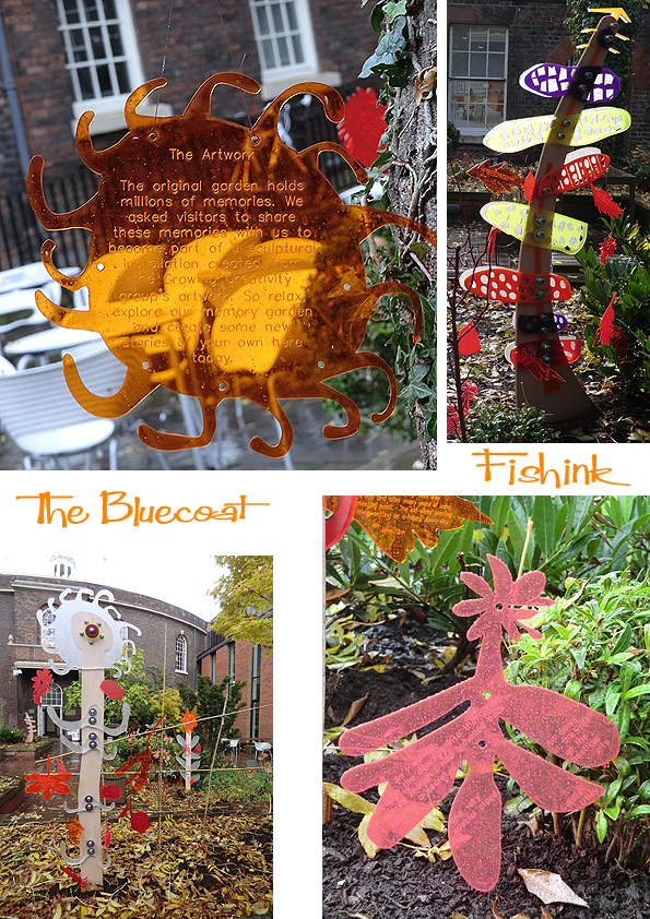
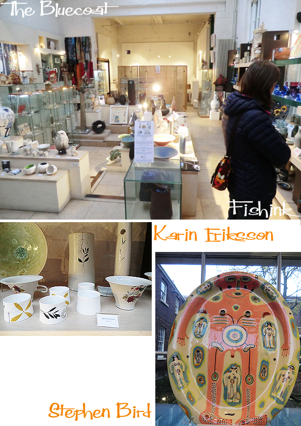
I was in Liverpool on Monday, checking out the Bluecoat Display Centre and later the John Moores Exhibition at the Walker Art Gallery. The garden at the Bluecoat, never fails to surprise or delight me.
The perspex shapes were engraved with people’s memories of the garden and space. They worked so well, catching the light and adding a twirling, kinetic movement to the foliage.
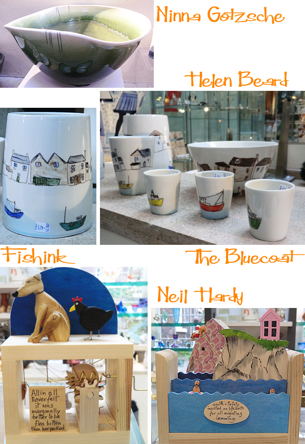
The gallery shop is always packed with goodies. Here’s a few items that were either my favourites or that simply stood out.
An insect house was tucked against one wall under a fig tree with huge rubbery leaves. Great shapes.
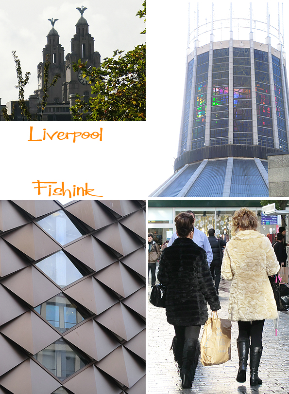
Some familiar sights for those of you who know Liverpool well. The liver Birds on the Royal Liver Buildings and the Catholic Cathedral amongst them.
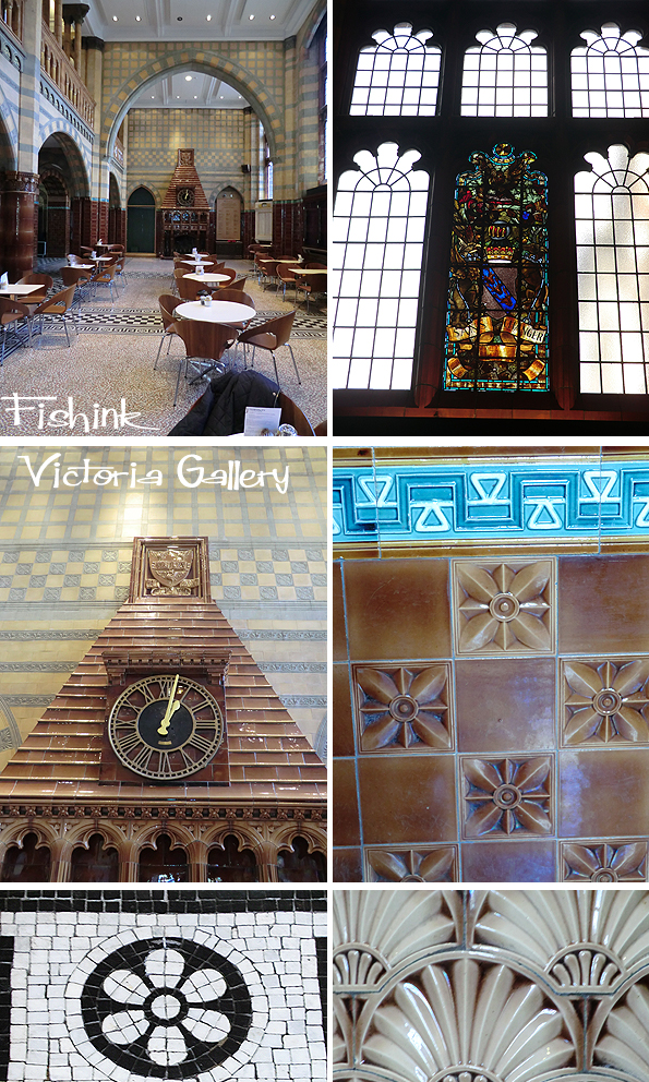
For lunch we met up with a friend at the cafe in The Victoria Gallery and Museum. Sadly the museum was closed on mondays, but it looks like a good place to head back to another time.
Come back for images and news of the entries in this years John Moores Exhibition, here on friday.
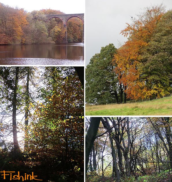
Fishink Walk, Autumn Colour
It’s a different light in the UK from my trip to Connecticut of a few years ago, somehow sharper and definitely colder but a great colour-wash just the same.
Some lovely woodland details. The autumnal starry surface to the river.
The skies have been pretty amazing lately too, colour in the day and evening.
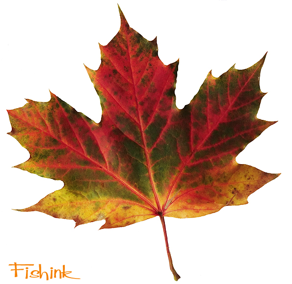
This leaf seemed to be trying to sum up the range of autumn colours all by itself !
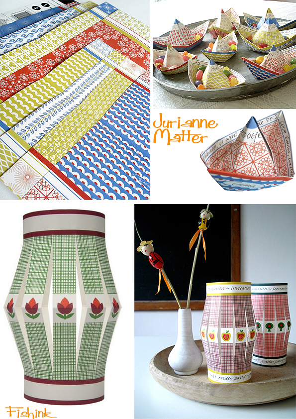
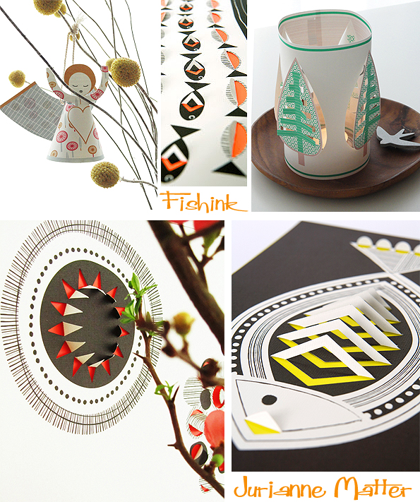
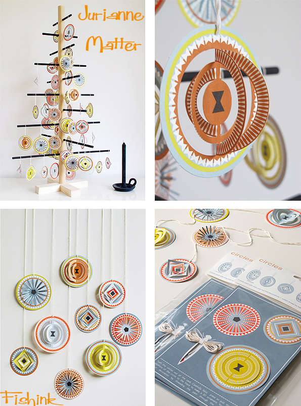
Jurianne Matter Paper Sculptures
Jurianne Matter is a creative stationery designer. With a background that involved working for IKEA as a stylist, it’s no surprise that we find her work, stylish and beautifully designed.
She says “As a little girl I was already sure that I wanted to become an Inventor of Beautiful Things. I was decorating, drawing, constructing machines, cutting paper, making music all day long… I attended one of the first Waldorf Schools in Holland, where nature, art and spirituality were important values. At home, in our large medieval house, everything was allowed as long as it was creative. Covering one of the toilets completely in golden foil paper? No problem at all. Painting furniture white, refurnishing rooms, all fine with my artistic parents!”
“And then something horrible happened. A dear friend and her mother died in the tsunami, Christmas 2004. We had been friends for over 20 years. A difficult year started. The next year, when everyone was ‘together’ in memorials in Thailand or on tv, we were in our house in the mountains in the South of France. I wanted to DO something, make a ritual that made me let go of the horror of the tsunami and just keep the beautiful memories of their lives. My sons said immediately: let’s fold boats and put them on the river! We drew the papers, wrote down beautiful memories, their names, and on the morning of the 26th of December we let them go on the beautiful, clear little river near our house. The sun was shining, and there they went, our little wishboats. We stood there silently, everyone with his own thoughts. In the two years after that– I left IKEA and worked as a stylist-journalist – I designed little paperboats in my spare time, for almost every private occasion. They sailed out to celebrate weddings, new born babies, new jobs, birthdays, anniversaries or sometimes even as treasure ships (with candies). So I started my own label and a wholesale business with my Little Wishboats. They turned out to be a huge success ! The Paper Angels followed, then the Lanterns and now Blom and Little Tree and more have been born.”
“My main sources of inspiration are my childhood, almost forgotten folkloric traditions and rituals, nature, fabric and paper design. I notice that often it is a combination of colours that somehow attracts my attention, wakes me up and inspires me. That can be in the garden, in the supermarket, in any detail of life, if you just focus. I do have a preference for northern european design, colours and shapes. I am deeply rooted in my Northern European culture. I tend to be nostalgic, so I often go back to midcentury modern times. I can feel so happy looking at simple every-day life stuff (candy-wrappers, retro ceramics, notebooks, textiles), but I also get inspired by artists like Anish Kapoor, James Turrell, Johan Sebastian Bach and the 14th century artist Giotto. In the past few years I took great leaps in my development, both artistically, businesswise and personally too. I would like more and more to focus on design and less on doing business. I love the (international) contacts, I love doing PR, but I don’t like export regulations, taxes and that kind of stuff. I would rather sit down and design! That’s what makes me breathe. All my products are made in Holland and are completely eco-friendly. The paper carries the FSC-logo, and is acid- and chlorine-free. The Vega-Fast ink is a Dutch developed printing ink based on vegetable oils. The plastic-looking bags are actually made from cornflour and are bio-degradable.”
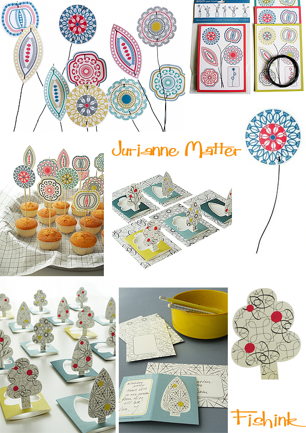
Jurianne showed her brand new ‘Circles’ range of paper goods at the ‘Maison & Objet’ trade fair in Paris in September. I bet the orders are flying out !
You can see more of Jurianne’s ideas on her blogpost here.
The Seventh Artist Book Fair at Manchester Metropolitan University and the Anthony Ratcliffe Exhibition.
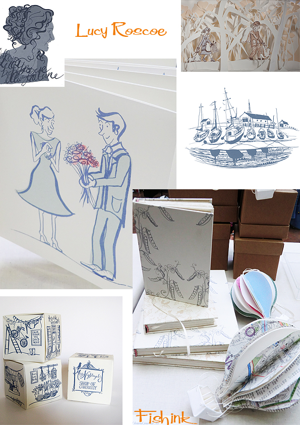
I have been to the Manchester Artist’s Book Fair for the past four years now and always looked forward to the rich diversity of work and the creative vibe that tends to emanate from the space in which it’s held. I bumped into Lucy Roscoe who I’ve blogged about previously from 2010’s Great Northern Contemporary Craft Fair .
She had some lovely new pieces, and you can see more on her blog. Lucy told me that she’s busy running her business and teaching at the Edinburgh School of Art at the same time. She always seems to be smiling and to have lots of energy.
The second person’s work to catch my eye was that of Charlotte Vallance. She graduated from Birmingham City University, in 2009 in Visual Communications and specialised in Illustration with print-making.
She loves to sketch buildings, to travel and screen print, and she’s luckily managed to combine all three in her work. I can only imagine she’s a happy girl !
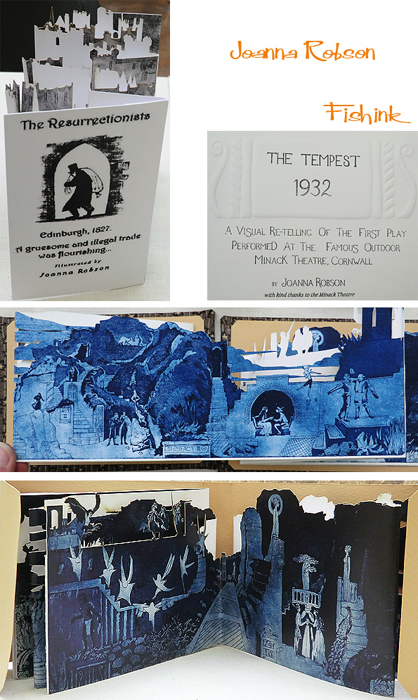
Lastly I was also inspired by the work of Joanna Robson. I didn’t get to meet her in person as her work was represented by someone else, but I loved the indigo colouring and the depth in her cut out structures.
Looking at her blog, I see she’s written a great detailed piece, with illustrations about the process of etching. You can read it here.
There were a few other beautiful pieces by other skilled artists and illustrators, but sadly, I found this year’s show to be on the whole lacking in fresh ideas, inspiring work and talented new individuals.
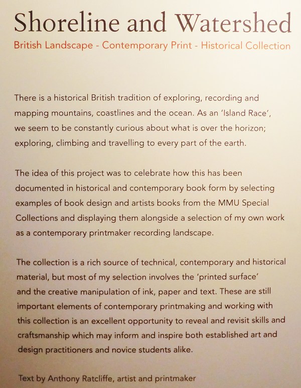
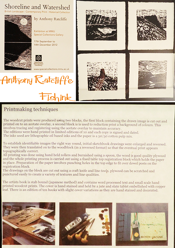
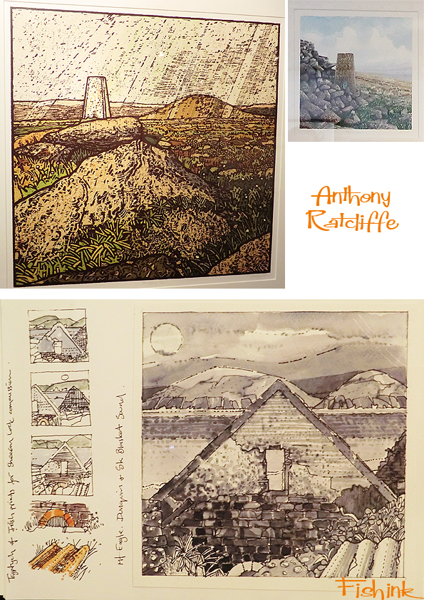
I headed over the road to the MMU Library to see the Anthony Ratcliffe exhibition. Anthony has exhibited widely in the UK and his prints can be found in many public and private collections in this country and abroad including The British Council and Houses of Parliament. He studied at Manchester Polytechnic (Foundation course) and Wolverhampton Polytechnic (BA Fine Art). He is currently a Senior Lecturer and Programme Leader for Foundation Course in Art and Design at MMU where he originally started employment as a technical printmaking assistant.
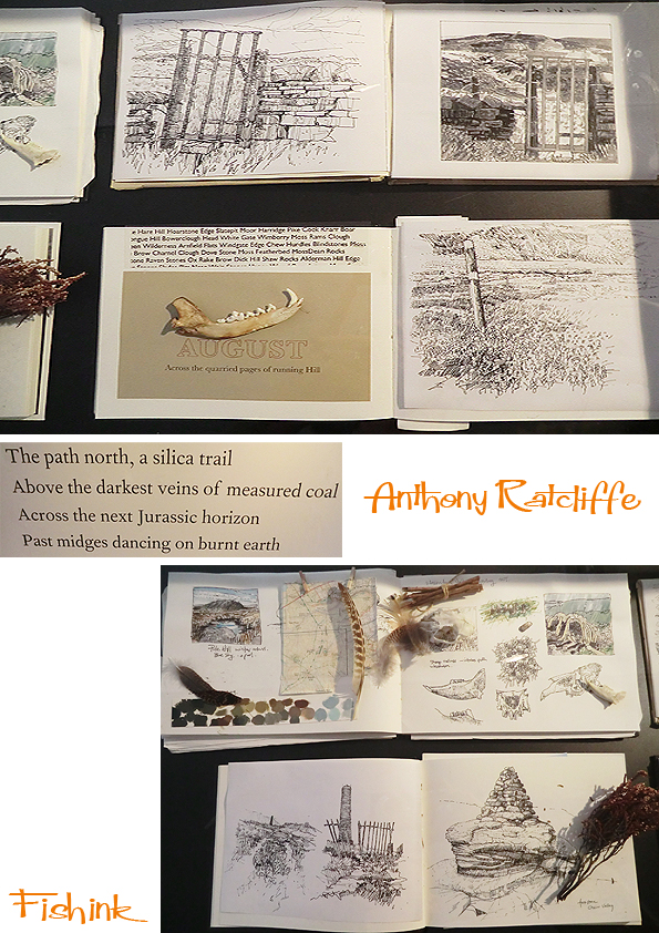
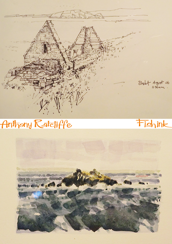
I really enjoyed this exhibition, due to the range of different items on view. Sketchbooks, paintings, wood-cuts, found objects and full size framed illustrations and prints.
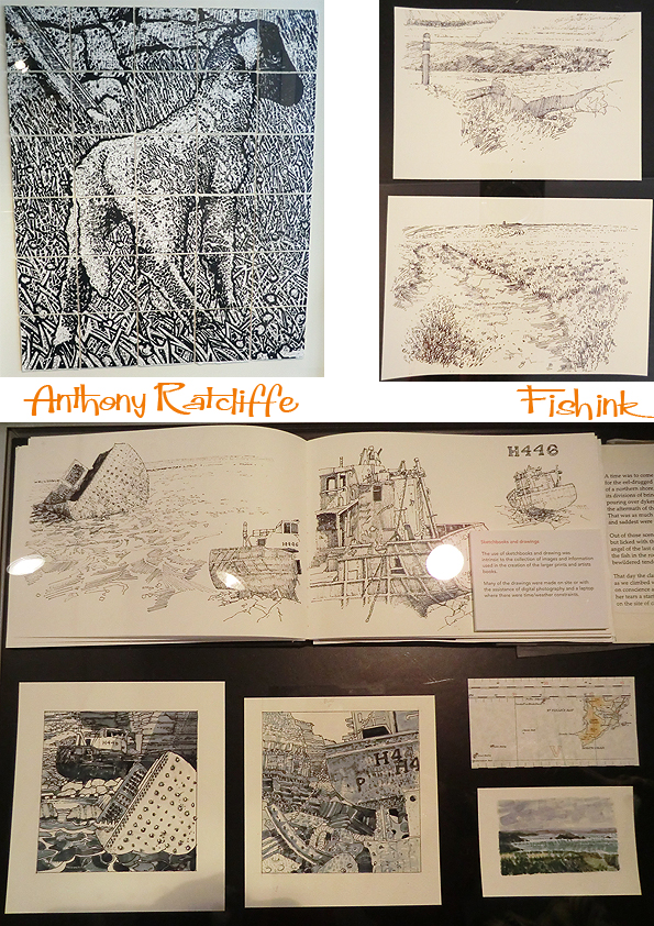
The sketchbooks were lovely. Detailed, descriptive, beautifully drawn and considered.
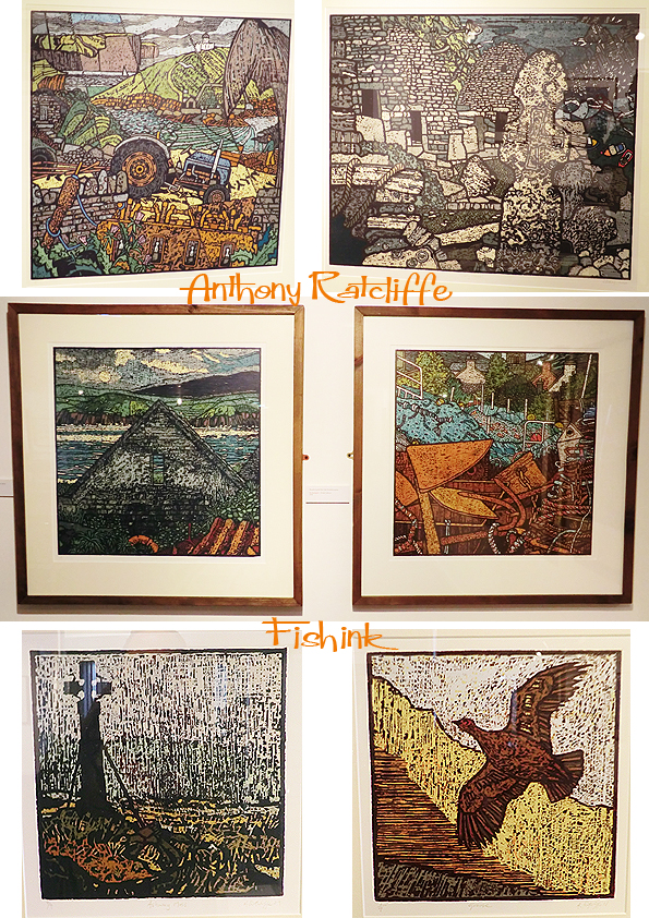
Some of Anthony’s finished, multi-layered prints.
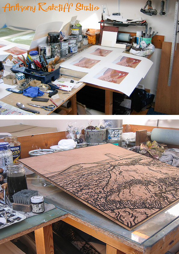
Anthony says “When I was a schoolboy in Yorkshire I could see the Pennine waterhsed above Sheffield from my bedroom window, I then moved to study art in Manchester and could identify the same hills from the other side. I now work in a studio which overlooks these slopes and making reference to their colour, shape and form is a daily visual treat.” Below are two of Anthony’s images of his studio.
Black and white images show his grainy, textural line work.
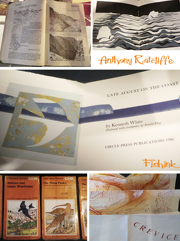
Placed alongside Anthony’s work were a collection of related items, like the drawings from Ronald King, the pen and ink illustrations from Alfred Wainwright and the ordnance survey cover illustrations and maps, showing a range of landscapes and birdlife.
A wonderfully assembled exhibition, available to visit until 14th December, don’t miss it. Details of how to get there and opening times here.
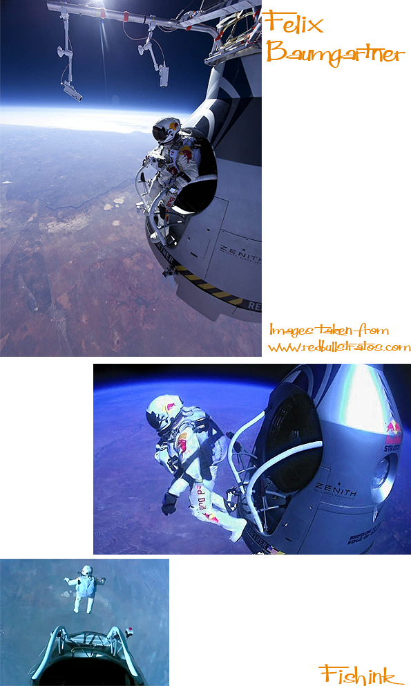
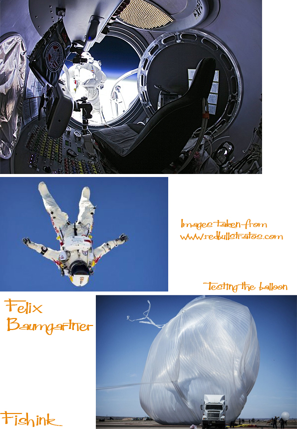
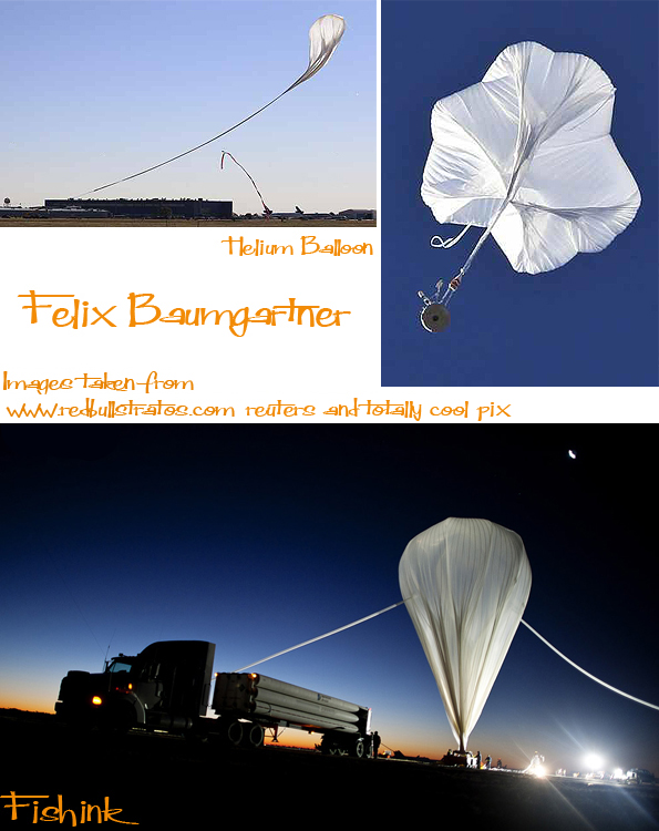
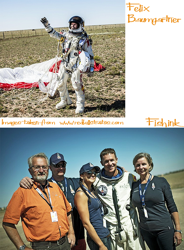
Felix Baumgartner , the man who fell to earth.
It took about three hours to ascend to the height of the jump spot, and then took him just under ten minutes to reach solid ground. At points of his journey he is believed to have hit speeds of 833 miles per hour, the fastest any human has been without the aid of an engine and broken the speed of sound.
Before launching himself Felix declared “Sometimes you have to get up really high to know how small you are.” Obviously this was a well rehearsed phrase at a poignant moment, but it did make me think.
Now I’m someone who experiences a slight nausea looking at those images you see of people’s feet on a bungy jump ‘ship’s plank’ seconds before they leap into the void beneath them ! But what struck me is that I wasn’t thinking Wow, I wish I’d done that , but rather how amazing it was that Felix had done it.
I’m celebrating that notion that we’re all unique.
Well done to the team involved and to Felix for making us appreciate that our possibilities are wider than we sometimes see them.
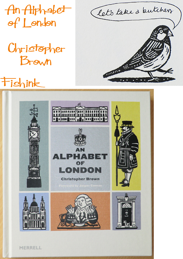
Christopher Brown’s An Alphabet Of London by Merrell Publishers and a Fishink Blog Surprise !
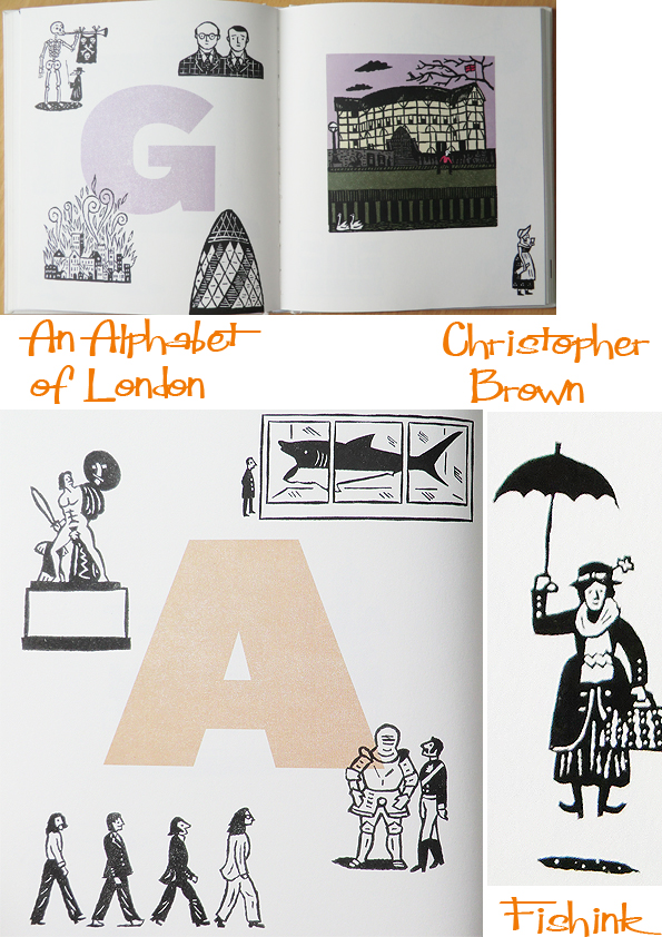
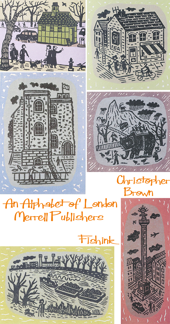
Talented Illustrator Christopher Brown was born and bred in London. He studied at London’s Royal College of Art before going on to teach there as well as Liverpool School of Art and Central St Martins. He is well known as a printmaker, and specialises in linocuts. There’s a great book called ‘An Alphabet Of London’ by Merell Publishers which celebrates his love of all things London.
Christopher begins with an amusing description of his childhood life growing up in Putney. He says ” It was at Harrods that I had my first haircut, at the age of two and a half, and I remember sitting on a rocking horse before my shearing. Harrods also had a pet department that was more akin to a small zoo; I haven’t been there for many years, but I can’t imagine that it still has the same exotic animals.” The book takes us through Christopher’s linocuts in alphabetical form. So we get to meet , on ‘G’ page, The Globe Theatre, the Gherkin, a Gin Drinker, the Great Fire of london, the Great Plague and Art treasures Gilbert and George. I smiled at the quirky additions throughout the book, like the Beatles striding across Abbey Road and Mary Poppins floating down with her umbrella. Both linocuts on their respective alphabetical pages of course !
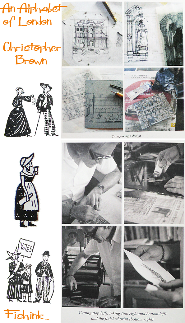
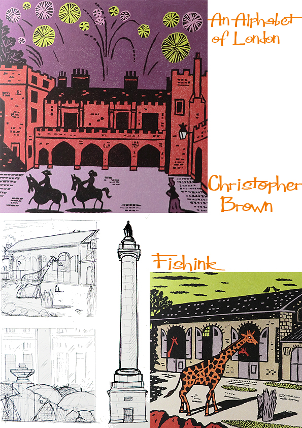
The book took over four months of solid work. With Christopher constantly travelling across London, making sketches of the buildings and sites he wanted to include in the publication. It’s fascinating in the book to see how he creates his linocuts from his initial sketches. There are some lovely details and memories alongside his collection of colourful illustrations too.
Christopher was lucky enough to assist one of the masters of the linocut Edward Bawden after studying at the R.C.A. In fact it was Bawden who encouraged Christopher to work with lino in the first place ! In a chapter entitled ‘Working In London’, Christopher describes his work, and the process involved in creating his characteristic prints.
I recently caught up with Christopher and asked him some questions.
What were the first ideas you had for lino-cuts, that you knew, just had to be included in the book ?
One would have been Flanagan and Allen (under U for Underneath the Arches), they are so London and remind me of my dear old dad who really enjoyed their song. Another would have been Victoria in her Veteran car. Again a memory of my dad who every year took me to watch the London to Brighton car run. Of course Victoria is my bit of whimsy.
From other people’s suggestions for alphabetic inclusions, which ones did you find most fun to illustrate ?
Angela Barrett suggested Johnson’s cat Hodge – I’d forgotten all about the statute of him, and David Ivie said I should include the memorial to Flight Sub Lieutenant Alexander Warneford in Brompton Cemetery (Z is for Zeppelin)
I imagine humour plays an important role in your life as it’s so apparent in you work. Was it also essential for you to include it in the book, rather than do a more formal study of London’s architectural sites and features ?
It does, the work my be humorous but it’s done with serious intent. The Alphabet stretched me, I don’t usually draw buildings but I wanted to stretch myself and I couldn’t resist putting in some narrative within the images; a gentle humour I would like to think.
Can you tell me any more about your memories of working with Edward Bawden ?
They are so many, I’m hoping to include those of my trip to Cornwall with him in the new book. But one might be when we printed the image of Saffron Walden Church together. A very large print consisting of several blocks. Too big to use the Albion so, it had to be printed by foot in his studio. The blocks were inked the paper dually laid down then we gently “danced” to transfer the ink to paper this must have appeared very strange to builders who where working on a property at the back of his house, an old man and a relatively young one jigging around together. I regret I didn’t accept his offer of one of the prints but I couldn’t have afforded to have it framed, instead he gave me two of the Aesop’s Fables.
Your next plan is for a book of linocuts of England, can you give us any sneaky views of this developing work, ideas or inclusions etc ?
It will follow a similar format to an An Alphabet of London but it’s a bigger book 192 pages so will include not only places but also subjects/themes. I keep changing my mind! However, some do appear fixed but my problem is I really feel the need to travel to see and sketch. I can’t rely on other peoples photos and however cursory my sketches might be they allow far more freedom to make interesting cuts. I don’t want it to become “theme park” England so I’m trying to make sure the modern is well represented. So far I’ve completed spreads for P is for Pottery P is for Poets and and now working on B is for Beer. Each spread with the main coloured image of a place will also have about 300 words written about the subject but I’m not describing my chosen images but recalling my memories which will be mostly from childhood. There will be 26 characters walking through the book but they will all be of “real” people in the previous book many were “types”. These are always changing though Z doesn’t give me many choices. One place I do want to include is Caerhays Castle in Cornwall I spent two very happy weeks sketching with Edward there.
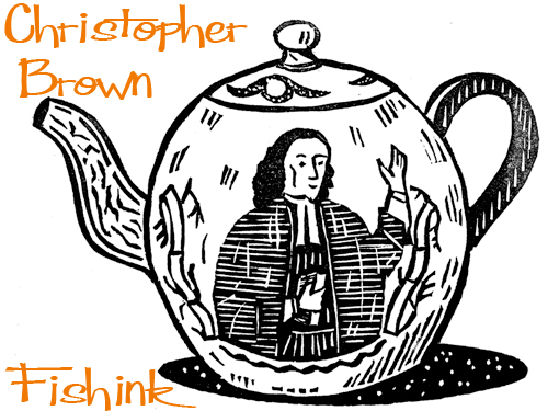
The Alphabet Of London is a lovely keepsake and would be an ideal gift for anyone wanting to recall the days of old London town or alternatively the modern day tourist. It has something for everyone. Christopher kindly sent us a sneaky preview of two of his brand new linocuts. A teapot and a scene from the Rovers Return, both will be featured in his new book about England. Many thanks for that and for taking the time to write something especially for the readers at Fishink Blog. Much appreciated.
Footnote…
I was talking to Christopher about this blog piece yesterday, and happened to mention that in growing up on the wirral, Liverpool became my ‘stomping ground’ as a teenager in the 1980’s. Lo and behold in the post today, I received this little surprise.
and if you look carefully you can make out what he’d written underneath. What a generous gift !
You can purchase many of Christopher’s earlier charming prints on the St Jude’s Website here. I can’t wait to see which bit’s of England will make the new book.
__________________________________________________________________________
__________________________________________________________________________
This was the second day I’d had a large grin on my face because on wednesday I received a tweet from an online website The Good Web Guide.
Apparently one of my artistic heroes at the moment Mark Hearld, whom you may have seen me mention on here from time to time (wink) had said that this was one of his favourite sites. His words were, ” The internet is a wonderfully rich resource, but I have to confess that I feel more at home on the bookshelves. The Fishink Blog provides a fantastic overview of illustrated material, graphic pattern-making and textiles. A great place to discover out-of-the-way illustrators from across the Atlantic who might ultimately find their way onto your bookshelves.”
Thanks Mark and I couldn’t agree more. I’ll have to mind my p’s and q’s now I know who’s reading : )
I came across some Owl’s of his in Manchester City Art Gallery the other day, which reminded me too. Or should that be twit twooo ! (groan).

Just to let you know that Mark Hearld’s Work Book is due out next week, on the 26th October. You can find a post about it here.
The First Cut Paper-cutting Exhibition Manchester City Art Gallery
I feel very lucky living near to Manchester as there is a superb exhibition on at Manchester City Art Gallery and it’s all free ! It’s an amazing collection of pieces from the work of 31 international artists who work predominantly with paper. This quilt map by Susan Stockwell was hanging in the stairway.
A sculpted tree cut from a Burger King Bag by Yuken Teruya and two quite different figures from Peter Callesen, start to illustrate the range of pieces in the exhibition.
Whether they appear in the form of large, flat, detailed, paper cuts from familiar paper artist Rob Ryan or story cuts from Beatrice Coron.
Moving, working models by Laura Cooperman or multi layered theatrical sets by Andrea Dezso, they are all beautifully crafted and delicately constructed.
Sarah Bridgland displayed two busy 3-D pieces, there was an amazing carved figure from a whole series of volumes stuck together, rather like a cross between a bookish hammock and totem pole, and a beautifully lit Wuthering Heights by Su Blackwell.
A cemetery set from Anderson M Studio and a victorian dress by Eisabeth Lecourt . Maps seemed to be popular !
But I did love the feel and movement to this ‘mapped’ flock of birds by Claire Brewster.
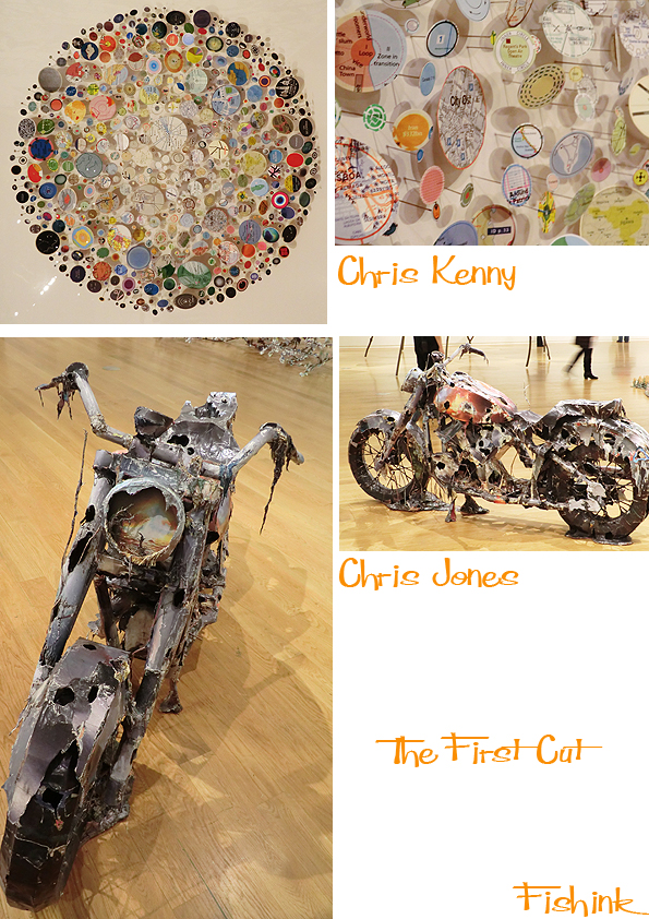
There was a circular collection of found objects on pins from Chris Kenny and a robust looking motorbike, entitled “Upon The End Of Your Ferel Days” by Chris Jones.
Nicola Dale made us look at nature and thoughts of recycling and collecting with her specially commissioned piece ‘Sequel’
Here’s a few of the artists talking about their working styles. I must say that I was pretty amazed that my paper cutting friend Sarah Morpeth wasn’t included in this exhibition. I somehow think the organisers missed out there.
You may also be interested to know that there is another section to ‘The First Cut’ exhibition over in Rusholm, at the Manchester Gallery of Costume. Both well worth a visit, and the show is on until the 27th of January 2013 so plenty of time to see it.
